PHASE 1 | RESEARCH
Painting the Plan
The foundation of ColorTok began with a detailed project proposal that transformed a creative spark into a structured roadmap. This first phase allowed me to clarify my goals, define my audience, and establish a strategy for delivering an 11-part TikTok series on the psychology of color. Drawing on my background in interior design and current studies in UX/UI, I positioned the series at the intersection of digital and physical experience, where color profoundly influences emotion, decision-making, and perception.
I designed the project to merge research with storytelling. Each video would focus on a single color, using visuals, voiceovers, and TikTok-native features to make complex concepts both accessible and engaging. I also mapped out goals, from educating viewers to encouraging interaction, and defined my audience as a mix of creatives, students, marketers, and everyday users curious about design.
With a clear framework in place, ColorTok was poised to evolve from an idea into a dynamic, educational series.
Bibliography + Research
Bibliography
With the plan in place, the next step was diving into research. I pulled together a full bibliography of sources, ranging from academic texts to design blogs and marketing case studies, that helped me understand color psychology from multiple perspectives.
Research highlights
From there, I organized everything into detailed notes that became the backbone of my content. This phase grounded the project in solid research, giving me the confidence that each video would be both engaging and accurate.
Phase 2 | Pre-production
Project Planning
Getting Organized
I swapped my usual sticky notes and scattered checklists for Trello, which quickly became a lifesaver. It was satisfying to break things down into small steps and watch the board shift from red “to-dos” to green “done.”
Structure
Laying out the entire series by research, pre-production, production, and post-production helped me see the big picture without feeling overwhelmed.
What I Learned
Using Trello to break down a creative project like this has helped me realize how much clarity and flexibility good planning can provide. Visual Planning = Clarity
Next Steps
By the end of the week, I felt more grounded and ready to move into production, with a clearer sense of how to balance creativity with strategy.
PHASE 3 | PRODUCTION
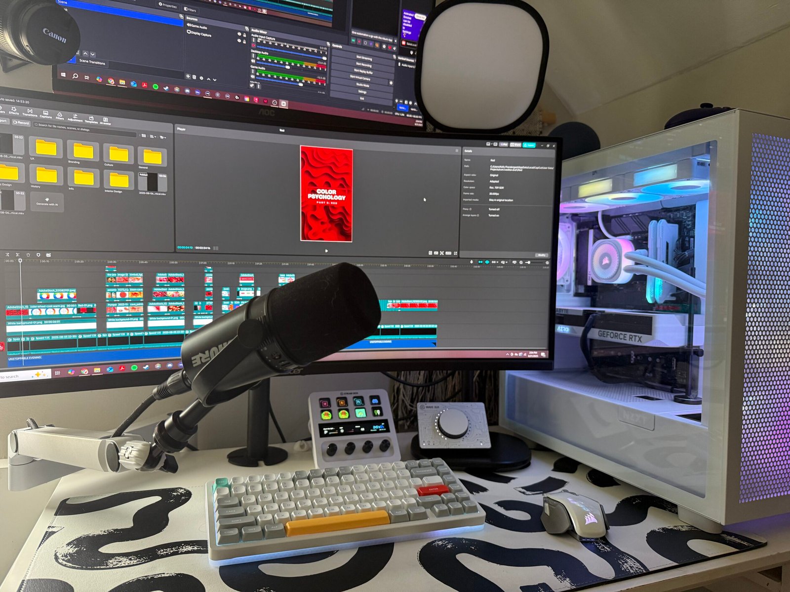
My Editing Setup
+ Process
To the right is a behind-the-scenes look at how my TikTok videos came to life. The photo shows my desk and monitor setup, complete with my microphone and the software I relied on, OBS, for capturing voiceovers and CapCut for video editing. To really illustrate my workflow, I’ve included a 20x speed video of my editing process in CapCut below, highlighting how clips, transitions, and effects were pieced together efficiently to create polished content.
Launching My TikTok Series
I kicked things off with an introductory video that laid the foundation for the series: what color is, how we see it, what color psychology means, its origins, and an overview of the color wheel. What I thought would be a quick project turned into hours of scriptwriting, gathering visuals, recording a voiceover, and teaching myself CapCut through tutorials and Creator Academy resources. Editing alone took about six hours, but the result was a polished 3.5-minute video that I was proud to share.
The response made it worth every minute. Within a week, my brand-new account (@designwithcolor) gained 35 followers, over 1,100 views, and multiple saves and shares. Feedback from users validated my approach and reassured me that the extra effort to make the video clear, visual, and accessible was paying off.
Moving forward, I planned to experiment with hashtags, refine my CTAs, and test how posting multiple times a week would affect growth. This launch week was both challenging and rewarding, it demanded more time and effort than expected, but it also set the tone for the series and gave me the confidence to keep building momentum.
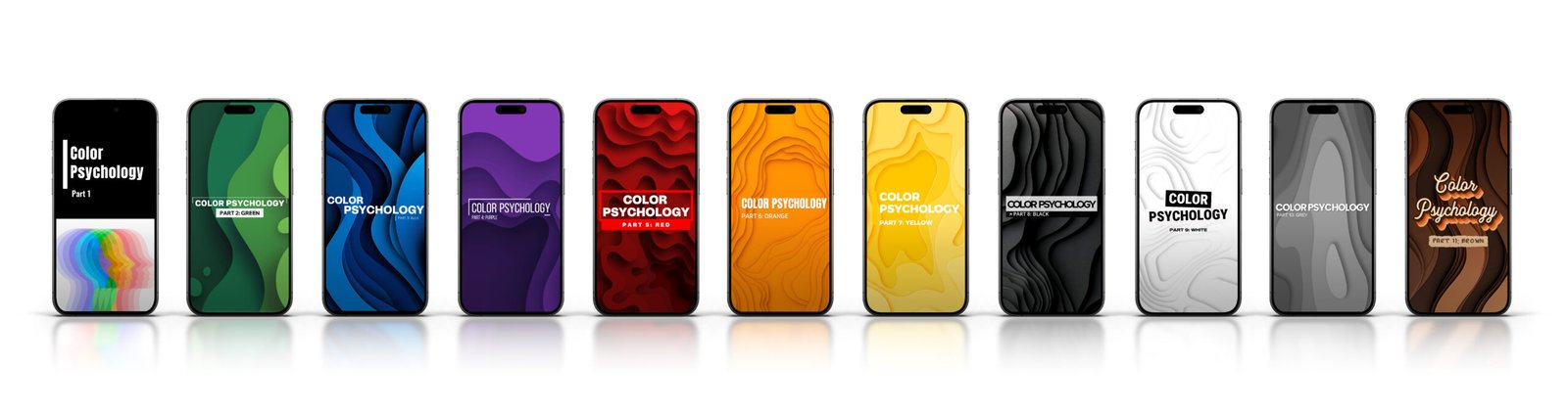
ColorTok – Part [2,3,4]
Cool Colors
I started off the series with three videos on the psychology of cool colors: green, blue, and purple, each one teaching me as much about TikTok strategy as it did about color itself. While green underperformed and blue highlighted the need for stronger early hooks, purple became an unexpected hit, earning my highest engagement yet. These experiments reinforced the importance of pacing, music, and timing, and set the stage for my next focus: warm colors and shorter, sharper videos.
ColorTok – Part [5,6,7]
Warm Colors
The following week, I turned up the energy with warm colors: red, orange, and yellow, while also experimenting with posting times, video length, and background music. The results were clear: shorter videos with upbeat pacing performed best for retention, while each color carried its own personality in how viewers responded. Overall, warm tones sparked both stronger engagement and fresh momentum for the series.
ColorTok – Part [8,9]
Black & White
Next, I focused on the timeless duo of black and white, exploring their contrasting psychologies… sophistication and power versus purity and simplicity. Both videos performed well, with white edging out black in retention, suggesting viewers connected more with its approachable associations. Overall, this week reinforced the importance of video length and pacing in keeping audiences engaged as my series continues to grow.
ColorTok – Part [10, 11]
Neutrals
Lastly, we explored the color psychology of neutrals, highlighting a shift from the sleek, modern appeal of grey to the warm, grounded vibes of brown in design. While the grey video reached more viewers and gained new followers, the brown video, posted at a less popular time, saw higher engagement through likes, comments, shares, and saves, showing that content resonance can outweigh reach. Overall, the series has been a learning experience in content creation, emphasizing the importance of timing, visuals, and engagement strategies.
PHASE 4 | POST-PRODUCTION
Final Numbers
Updated: August 23, 2025
Here are the final performance metrics for my TikTok series, @designwithcolor, per the date listed above.
Total Followers
325
Total
Views
+11K
Total
likes
+1K
Total Comments
20
Total
Shares
38
Total
SAves
197
Comments
These are a few comments from TikTok users that I’m especially proud of, showcasing the positive impact and engagement my series has generated.
I never knew how important color psychology is, thank you for this newfound knowledge.
This has to be the first educational video I’ve watched all the way through and completely comprehend in years. You have the perfect vocal tone and delivery.
Coca-Cola, Netflix, and Redbull all use Red CTAs… do you think if the brand is well established it has an effect on the users hesitation?
Love this! I wanna see all the colors!!!!
Looking Forward
Having completed seven weeks of content, totaling 11 videos and 22 minutes of material, this project has been an incredible learning experience in content creation from the ground up. I’ve gained a deeper understanding of what keeps viewers engaged; visuals, pacing, captions, and timing all play a critical role. Moving forward, I plan to continue expanding the series, experimenting with new content formats, and refining my approach to grow the platform while continuing to educate viewers on the psychology of color. This foundation sets the stage for even more creative and impactful content in the weeks ahead.