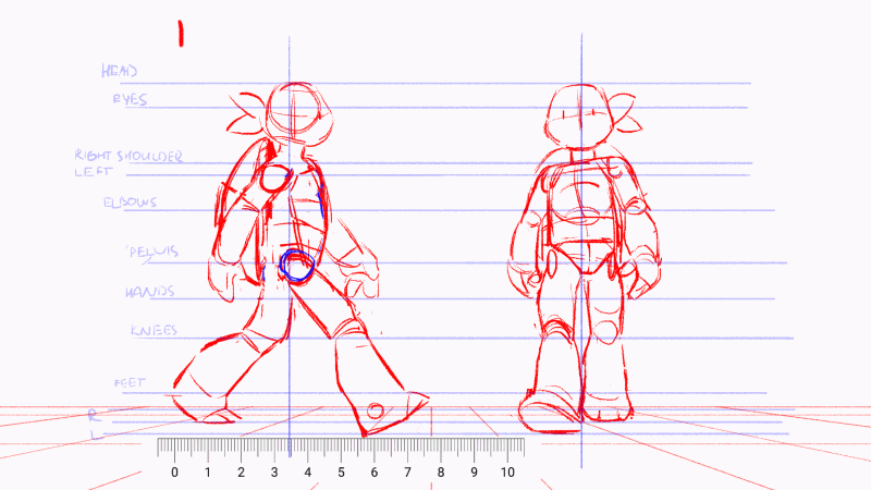
Chapter 9: Techniques from Animated Storytelling, by Liz Baker, emphasizes that choosing the right animation technique is a storytelling decision. The technique should support the format in which the work will be viewed and, most importantly, reinforce the story’s message and tone. Different techniques naturally evoke different emotional qualities, so selecting the right one can amplify the core idea of a project and set it apart. Flexibility and creative problem-solving are also essential, especially when limitations arise.
Animation Techniques
Hand-Drawn Animation
Created using a variety of materials and styles, from traditional cel animation to rotoscoping to grittier festival-film aesthetics. This technique is often expressive and well-suited for emotionally driven storytelling.
2D Stop Motion
Shot frame-by-frame with a camera positioned over a flat surface. It creates a handmade, flat look that can feel quirky and comedic (especially with paper) or lush and atmospheric (with sand or paint). It is emotionally expressive and highly adaptable.
3D Stop Motion
Also shot frame-by-frame, but on a physical set using a tripod. Objects are moved incrementally between frames. It can feel naturalistic like CGI while still maintaining a tactile, handcrafted charm depending on the materials used.
2D CGI (Computer-Generated Imagery)
Created in a flat, digital environment. Styles range from clean and minimal to textured and dimensional. It scales well, reads clearly with typography, and is commonly used in broadcast graphics. It often feels warmer and more innocent than 3D.
3D CGI
Built in a three-dimensional digital space where elements are modeled, rigged, textured, and animated. Similar in process to stop motion but without physical limitations like gravity. It offers immense creative freedom and is widely used in feature films, video games, and commercials.
Workarounds
The chapter highlights that strong animators know how to adapt when limitations arise. A common workaround is importing still images and using masking or camera movements to simulate motion. If still images are not enough, live-action footage can be used, capturing real fire, clouds, or other elements instead of animating them from scratch. When necessary, outsourcing specific tasks is also a professional solution. Overall, flexibility and resourcefulness are key traits in successful animation and motion graphics work.
Demonstrations of the 12 Principles of Animation
The Illusion of Life, by Cento Lodigiani
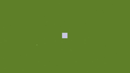
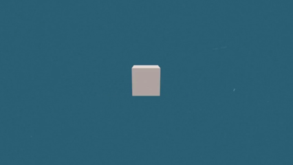
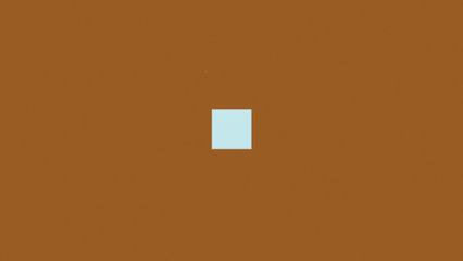
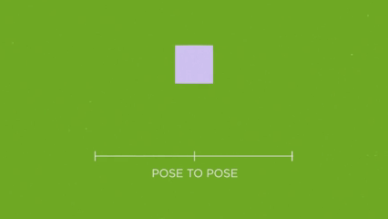

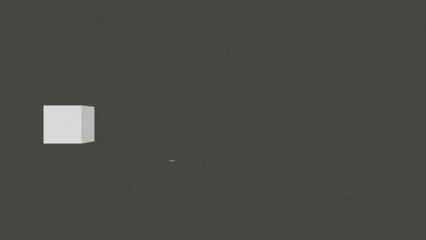

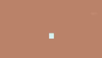
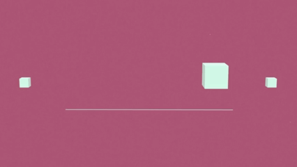


These simple examples of cube animations show the 12 Principles of Animation and make the concepts really easy to see. Without characters or detailed scenes, you’re just focusing on the movement itself. When a cube squashes on impact or slightly pulls back before jumping, you can clearly spot principles like Squash and Stretch or Anticipation without any distractions.
I liked these examples because they feel clean and straightforward. If it works with a basic cube, it’ll work with anything.
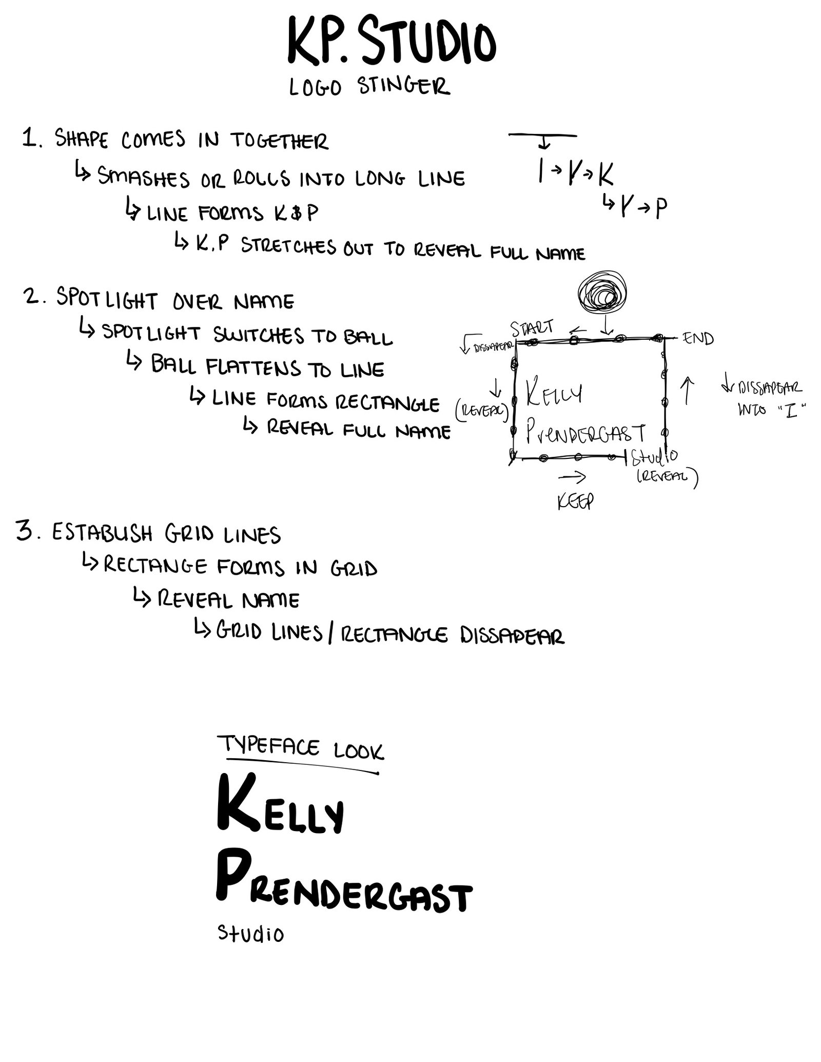
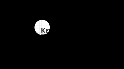
KP.Studio Logo Stinger
The grid lines play an important role in the animation and are incorporated as a structural element. Grids are foundational in both interior design and digital design; they guide layouts, structure space, and create alignment. Using animated grid lines to form the boundary of my wordmark reflects that structured design thinking. The line that moves across the screen reveals my name and then continues to spell out “studio,” reinforcing the idea of construction and process.
To create hierarchy, I added a subtle text effect to “studio” so it would stand out, since my name is larger and bolder. I finished the animation with a simple fade-out that smoothly loops back to the beginning. The final result feels much more aligned with my design background and overall aesthetic.
I intentionally incorporated several of the 12 Principles of Animation into my logo stinger to make the motion feel purposeful and refined. These include: Staging to clearly direct attention to the wordmark as it’s revealed. Anticipation occurs as the moving line approaches the text before revealing it, preparing the viewer for what’s coming next. The continuation of the line into “studio” acts as a subtle Secondary Action, adding interest without distracting from the main focus. Finally, the clean typography and smooth motion contribute to overall Appeal, keeping the animation simple but engaging.
Process
I started by brainstorming personal logos and decided to create a simple wordmark to represent myself. I wanted something clean and contemporary, and using my name felt straightforward and timeless. I added the word “studio” because it best reflects the range of disciplines I work in: interior design, graphic design, web design, and UX/UI, all under one cohesive identity.
I designed the logo in Adobe Illustrator first, focusing on typography and overall balance. Before moving into animation, I developed three different concepts for the logo stinger. I initially began creating my second idea in After Effects, but halfway through, I realized it felt more like a film production intro than a design-focused brand. It didn’t align with the direction I wanted. (Example shown below) I then pivoted to my third concept for final production.
References
Blazer, L. (2019). Animated Storytelling (2nd ed.). Peachpit Press.
No responses yet