Product labels are silent storytellers. They whisper to us from the shelves, promising something refreshing, something indulgent, something you. In today’s crowded market, labels don’t just identify a product; they define its vibe. Great brands use label design to speak to different audiences and moods, all while keeping their identity intact.
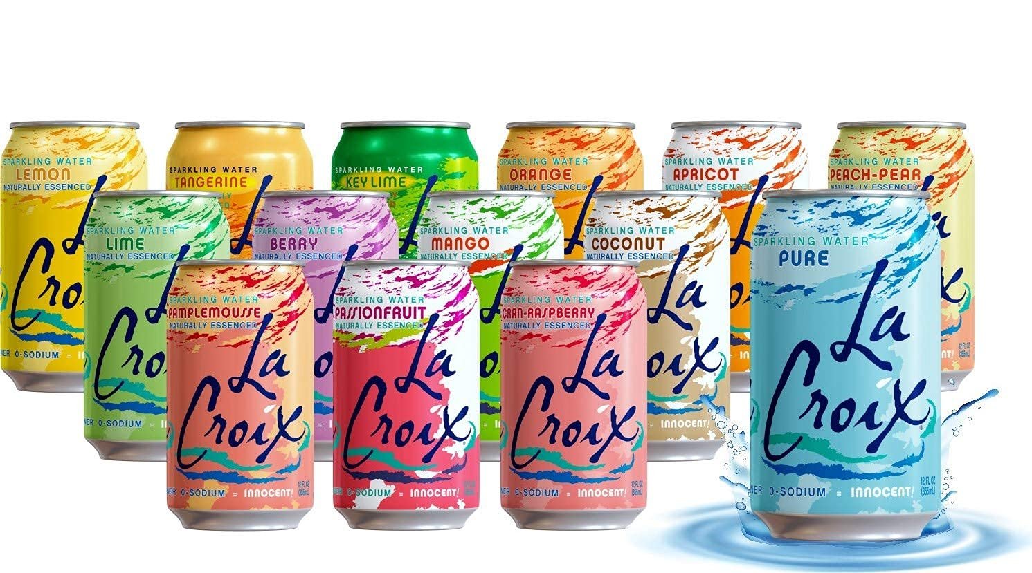
A perfect example? LaCroix. Whether you love it, hate it, or just enjoy pronouncing “Pamplemousse” for kicks, LaCroix has created a packaging system that’s both unified and wildly expressive. Each can has the same DNA (signature logo, sweeping brushstrokes), but the color schemes and patterns are completely distinct per flavor. Limoncello’s creamy yellow palette suggests sweetness and luxury, while Passionfruit screams tropical with bold purples and oranges. It’s a brilliant way to express different personalities under one cohesive brand.
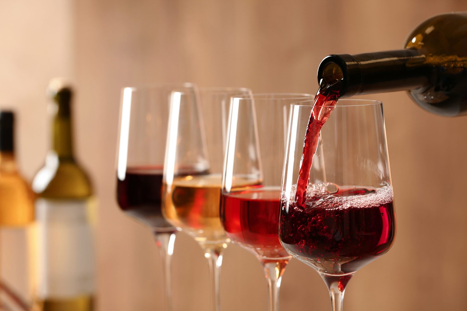
That design flexibility was the exact approach I wanted when creating my modern wine label concept, SIPP: a minimalist yet expressive take on wine packaging where each bottle speaks its own emotional language while staying rooted in a clean, unified brand system.
The Spark: From Sketch to Shelf
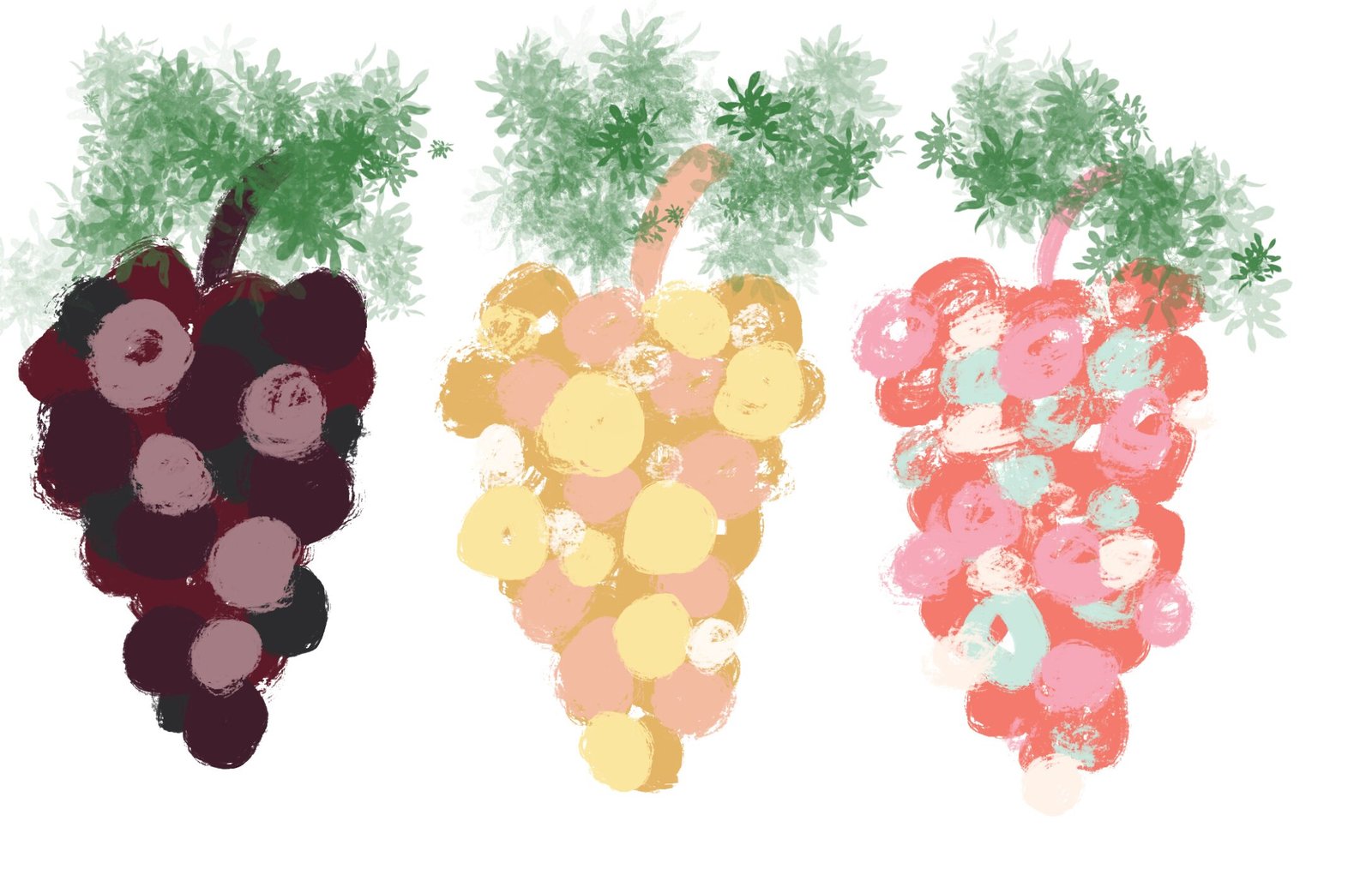
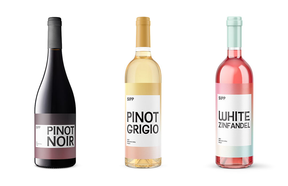
It all started with my iPad and three abstract sketches of grapevines. I wasn’t trying to be literal; I was going for mood, movement, and essence. From those sketches, I pulled three distinct color palettes that became the foundation for my label gradients: a deep, romantic burgundy for Pinot Noir; a warm, golden hue for Pinot Grigio; and a playful rosy blush for White Zinfandel.
Why Modern? Why Minimal?
In Graphic Design for Everyone by Cath Caldwell, there’s an emphasis on design that’s both emotionally resonant and easy to understand. I ditched the ornate flourishes often found on traditional wine bottles in favor of bold, sans-serif typography and clean spacing. The wine varietal is the hero here: big, bold, and readable at a glance.
This approach is backed by Shopify’s guide on label design, which points out that consumers often make decisions in seconds, so clarity and shelf appeal are crucial. That’s also echoed in 99designs’ resources: the best labels are confident and simple, not cluttered.
Letting Color Do the Talking
I used gradients not as decoration, but as emotional shorthand. Drawing inspiration from the vibes each wine evokes, I chose colors that subtly influence perception:
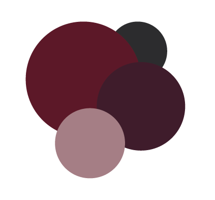
Pinot Noir – Deep Burgandy Gradient
Mood: Moody, Deep, Romantic
Pinot Noir has this rich, velvety persona. Burgundy conveys luxury, depth, and seriousness. It has weight. According to the Meyers blog on packaging design, deeper reds often signal richness and sophistication, which perfectly aligns with Pinot Noir’s profile.
Pinot Grigio – Warm Gold Gradient
Mood: Smooth, Balanced, Inviting
Pinot Grigio is the ultimate “easy breezy” white. It’s crisp, refreshing, and goes with just about anything. I leaned into a warm, buttery golden palette that communicates freshness. It’s bright enough to stand out on the shelf, but soft enough to feel elegant.
White Zinfandel – Rosy Blush Gradient
Mood: Flirty, Nostalgic, Floral
White Zinfandel has a personality. It’s pink, it’s a little sweet, and it definitely doesn’t take itself too seriously. For this label, I leaned hard into a rose-toned blush gradient that screams fun while still looking elevated.
This tactic aligns with color psychology insights from Meyers and STTARK. People react to color first, even before they read a word. Like LaCroix does with its flavor-based can art, I used color abstractly to tell the story of each wine.
Brand Unity, Product Variety
While each bottle in the SIPP lineup has its own vibe, they’re clearly related, thanks to consistent typography, layout, and logo placement. It’s a tactic brands like LaCroix have mastered: every can is different, but you always know it’s LaCroix. That’s the sweet spot… diversity with discipline.
The Final Pour
At its core, the SIPP wine label series is about capturing emotion through design. It’s clean but expressive. Sophisticated, but totally approachable. It’s modern without being cold, and minimal without being boring. By leaning into bold typography, emotional gradients, and a unified brand structure, I created labels that don’t just look good… they communicate.
Designing SIPP wasn’t just about packaging wine; it was about distilling the personality of each varietal into something visual, emotional, and market-ready. If a can of LaCroix can make you feel like you’re on a tropical island, then a bottle of SIPP can tell you whether your evening’s about romance, relaxation, or a little rosé-fueled nostalgia.
References
Caldwell, Cath. Graphic Design for Everyone: Understand the Building Blocks so You Can Do It Yourself. National Geographic Books.
“Product Label Design Guide: How to Design a Product Label.” Shopify, 29 Mar. 2023, www.shopify.com/blog/product-label-design.
99designs. “How to Design Design Product Labels.” 99designs, 99designs.com/designer-resource-center/designing-product-label.
“10 Characteristics of a Well-Designed Product Label.” Sttark, 29 Sept. 2020, www.sttark.com/blog/10-characteristics-of-a-well-designed-product-label.
Dillon, Michael. “The Elements of Effective Product Labels: Design Tips and Trends.” Meyers, 3 Aug. 2022, meyers.com/meyers-blog/elements-of-effective-product-labels-design-tips-and-trends.
2 Responses
I’ve been browsing on-line more than 3 hours lately, but I by no means discovered any fascinating article like yours.
It is pretty worth sufficient for me. Personally, if all site owners and bloggers made just right content material as you did, the net shall be a lot more useful
than ever before.
Feel free to surf to my homepage :: unicode whitespace
I all the time used to read paragraph in news papers but now as I am a user of internet thus from now I am using net for posts,
thanks to web.