
If you’ve ever tried to navigate a government website and felt like you were trapped in a maze of dead links and clunky design, congrats – you’re not alone. That’s exactly why we have user flows. They’re the unsung heroes of the UX world, quietly streamlining chaos into clarity.
So, What Is a User Flow, Anyway?
A user flow is basically a map. But instead of guiding you through a forest, it’s showing you how a user interacts with your app or website to complete a goal. Think of it like digital choreography: every tap, swipe, or scroll is part of the dance between the user and the interface.
It’s not just for show. User flows help us:
- Visualize user decision points
- Pinpoint potential roadblocks
- Optimize efficiency
- Improve overall user satisfaction (which, yes, means fewer angry calls to customer service)
Creating a Flowchart: It’s Not Just Boxes and Arrows
Designing a user flow chart isn’t about making something pretty. It’s about making sense.
Here are a few things I kept in mind while crafting mine:
- Start with the User Goal – Are they applying for a job? Reporting a pothole? Registering for a town event? You need to know where they’re headed before you map how they’ll get there.
- Stick to One Flow at a Time – Multitasking is for chaos. Each chart should cover one goal or path.
- Use Consistent Symbols – Decision diamonds, process rectangles, start/end ovals… there’s a visual language here.
- Limit Complexity – If your flow looks like spaghetti, it probably is. Break it down, simplify, and make sure every step has a purpose.
- Label Everything Clearly – Assume your viewer is reading this with one eye open at 3 a.m. (realistic, right?). Be kind. Label your icons and actions.
Mapping the NaugatuckConnect Mobile App
If you’ve been following along with my previous posts, you’ll remember I started this NaugatuckConnect project by breaking down the information architecture of the existing town website; an experience that was… let’s just say, rich in opportunities. I followed that up by site mapping out both the current and proposed site structures, and even concepted a companion mobile app to better serve residents, visitors, and business owners. Those foundational exercises set the stage for this next step: diving into user flows to make sure each digital path is as smooth and purposeful as possible. If you missed those earlier posts, definitely check them out to see how the full ecosystem is evolving!
For this exercise, I created detailed user flows for the NaugatuckConnect app; an all-in-one mobile platform designed to connect residents and visitors to town services in Naugatuck, Connecticut. Think of it as a digital concierge for the borough.
The app serves up everything from job applications and event sign-ups to road closure alerts and online payments. In short, it’s the town hall in your pocket, without the long wait times or fluorescent lighting.
Stories and Scenerios
I created three user flows based on real-world scenarios for distinct user types:

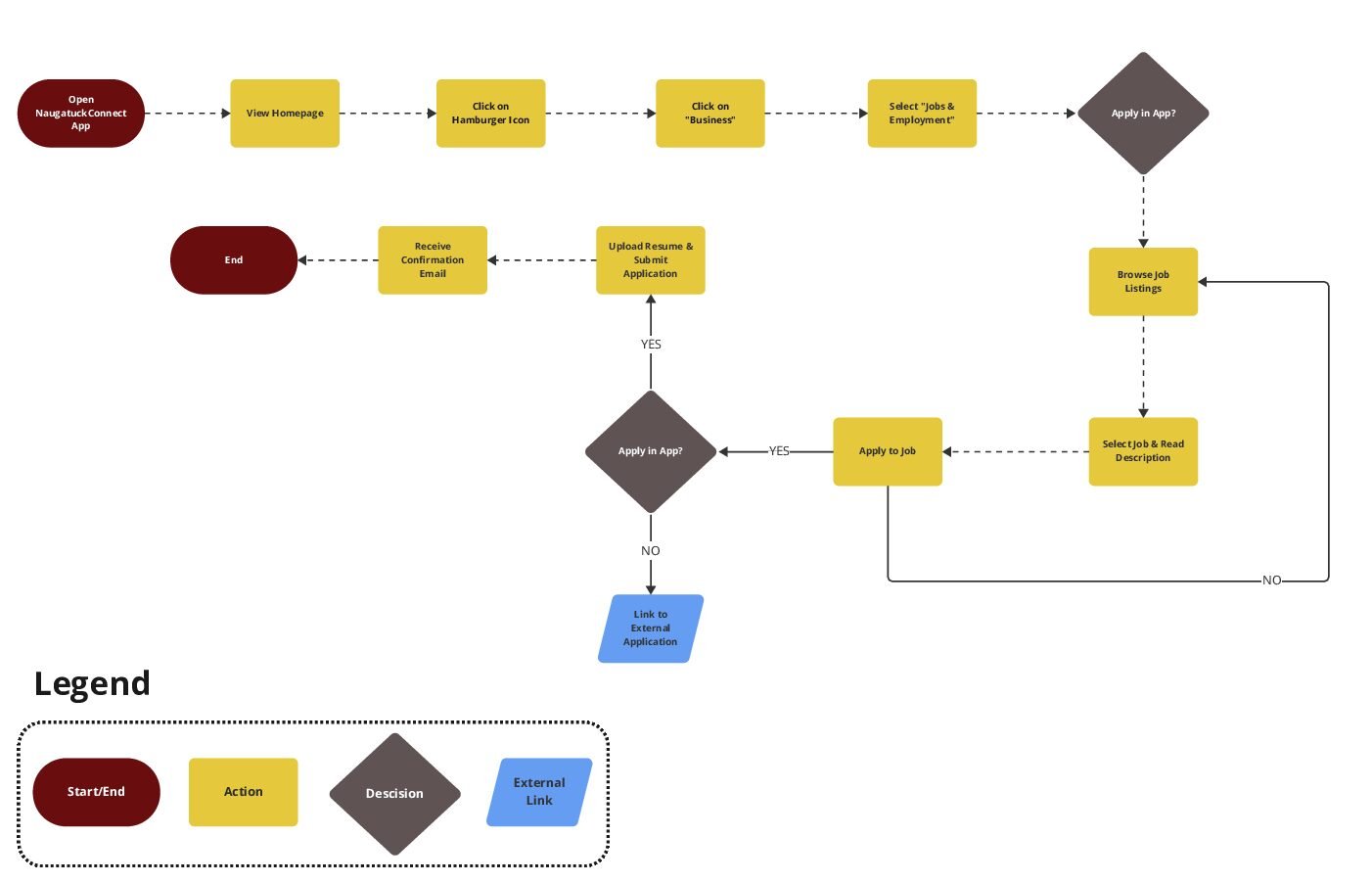
Lisa – The Longtime Resident Job Hunter
Lisa wants to find a new job closer to home. Instead of using the popular job posting companies, she heads straight to the NaugatuckConnect. In a few quick taps, she finds a role, uploads her resume, and applies… right from her phone.
Lisa’s User Flow:

David – The Commuter Who Hates Surprises
David’s just about to hit the road when bam, a push notification alerts him to a road closure. Thanks to the app, he checks the alternate routes in seconds, adjusts his commute, and skips the traffic jam.
David’s User Flow:
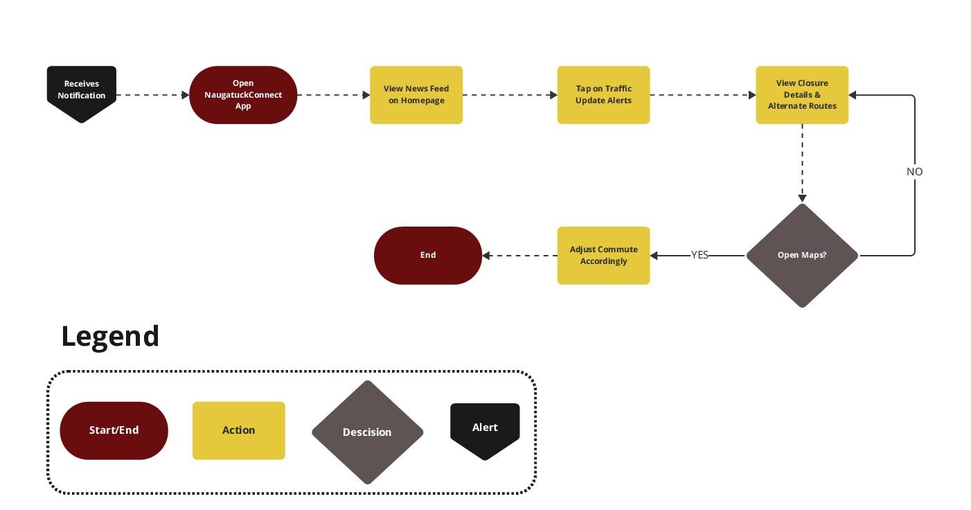
Short, sweet, and oh-so-satisfying.

Mark – The New Guy in Town
Mark just moved to Naugatuck and wants to make friends. He hears about a “Meet Your Mayor” event through the app, registers with one tap, and gets a reminder before the event.
Mark’s User Flow:
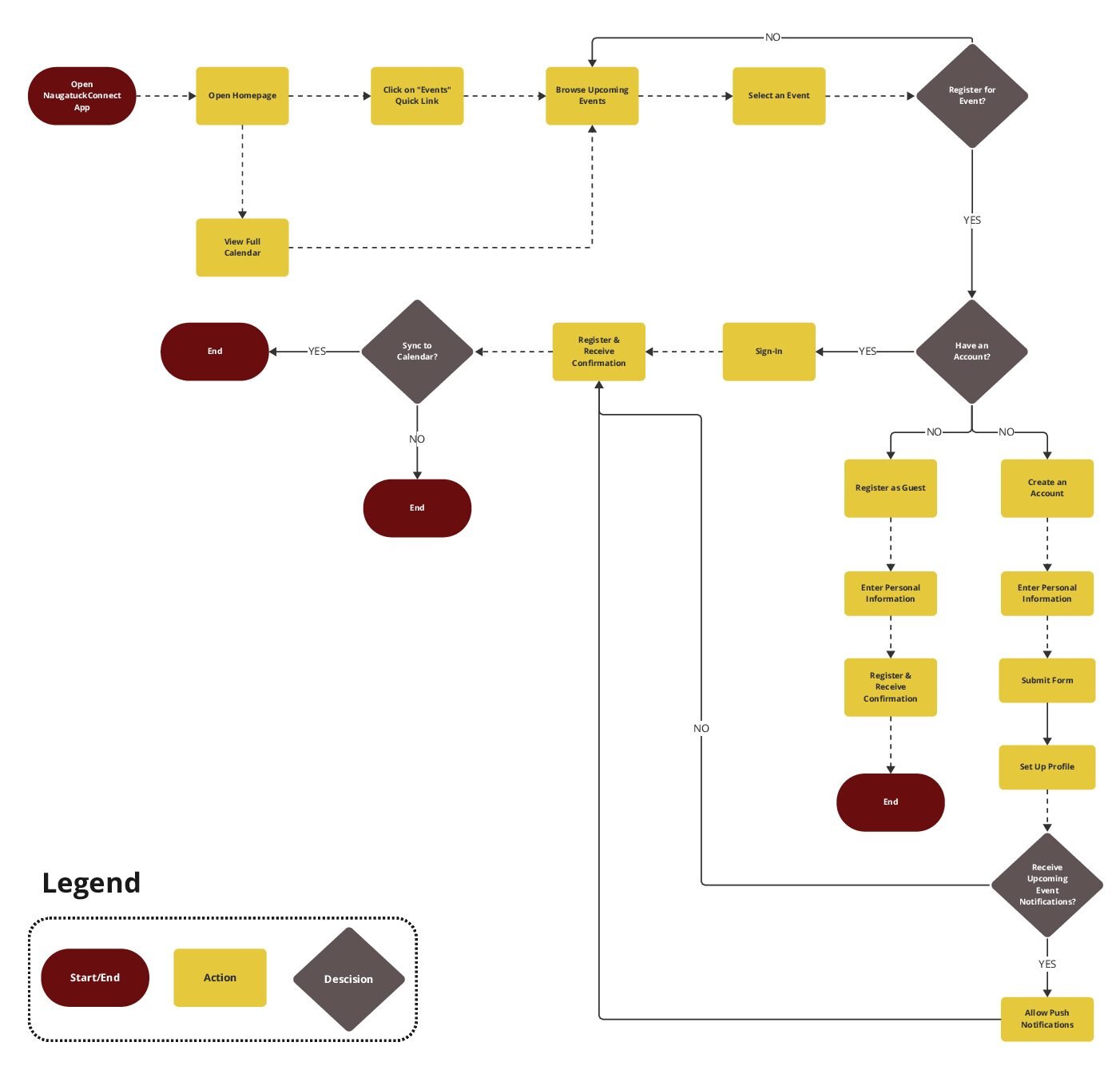
This flow had more decision points, like “Do you have an account?” and “Allow push notifications?” which made it a bit more complex, but totally doable with a clear layout.
Final Thoughts: Why This Matters
User flows aren’t just a design exercise; they’re a way of thinking. They force you to see the product through the user’s eyes, anticipating every twist and turn. And when it comes to civic tech, where users range from teens to tech-averse retirees, it’s absolutely crucial to get it right.
This assignment helped me solidify my understanding of UX mapping, improved my ability to design for multiple personas, and gave me an appreciation for all the behind-the-scenes work that goes into the apps we take for granted.
So next time you tap a button and something just works, remember: that didn’t happen by accident. Someone sat down, probably late at night, and mapped it out. Flow by flow.
One response
[…] reminded me of my earlier thoughts from “Choose Your Own Adventure, but Make It UX”: users are the heroes, and good design lets them choose their own way forward, without a […]