When my friend Antonio founded MoveWise in Connecticut in 2021, he had a powerful mission: to provide seamless, stress-free packing, moving, and real estate services with a personalized touch. What he didn’t have, however, was a cohesive brand identity. That’s where my final project begins: transforming MoveWise from a logo-less, undefined business into a visually compelling, trusted brand.
Step 1: Starting from Scratch
The project began with a blank slate. MoveWise had no logo, no typography, no color palette; just a name and a mission. I approached this challenge by immersing myself in brand research, beginning with audience demographics. I surveyed MoveWise’s primary audience:
To gain deeper insights, I conducted a four-question poll with potential customers to understand their biggest challenges when moving. Here are some key findings:
The responses were consistent: trustworthiness, reliability, and clarity in communication mattered most.
Step 2: Competitor Analysis
Next, I analyzed industry leaders like Two Men and a Truck, U-Haul, Bellhop Movers, and Coldwell Banker. Each had a distinct personality: from friendly and reliable to bold and industrial. I examined their logos, color schemes, and tone of voice. This helped identify industry norms and, more importantly, opportunities for MoveWise to stand out while remaining trustworthy.
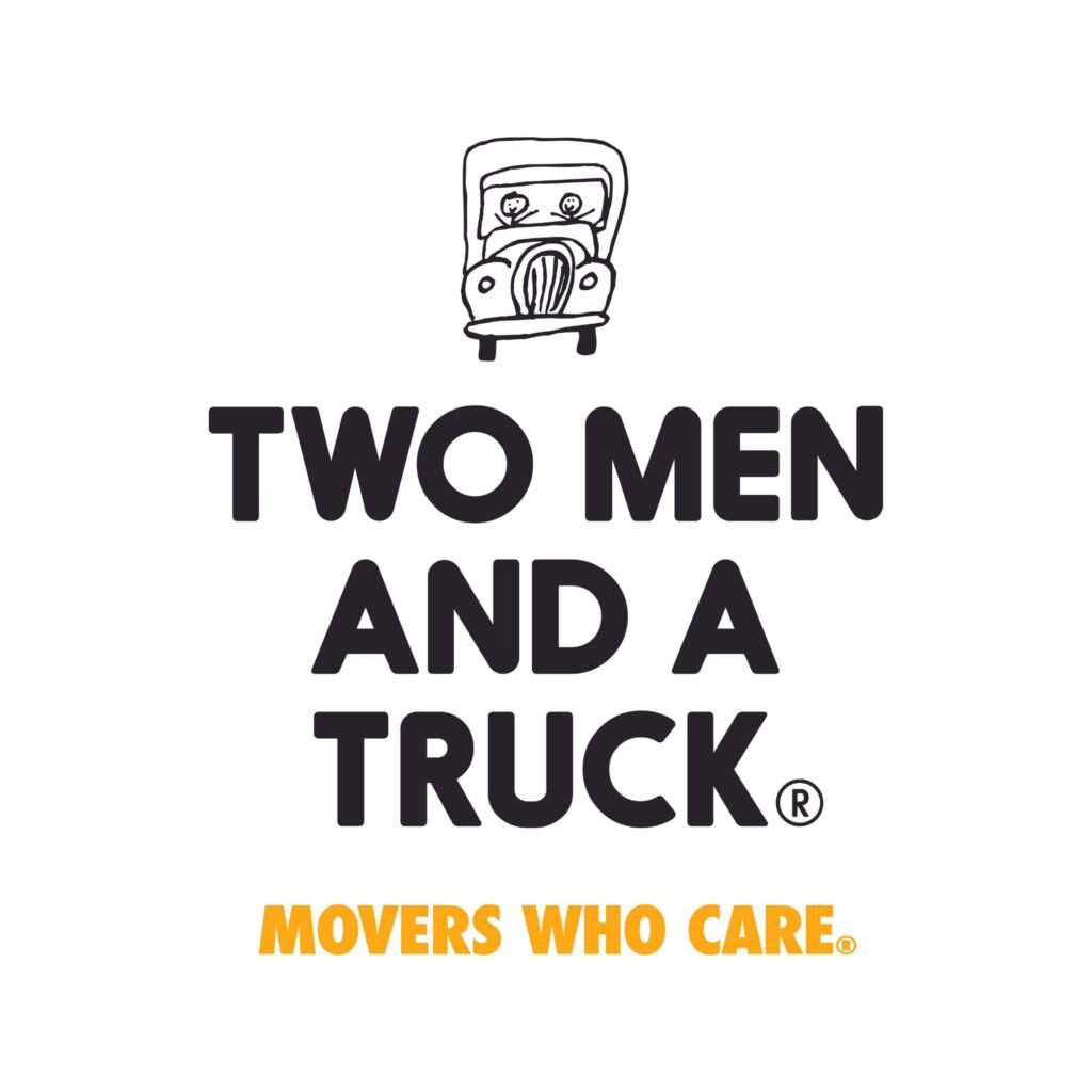
Two Men and a Truck focuses on friendly, personal branding, using simple logos and warm messaging.
U-Haul stands out with bold orange branding, making them instantly recognizable.
Bellhop Movers appeals to a younger audience with modern, sleek design and a fresh green color scheme.
Coldwell Banker (a real estate giant) relies on classic blue tones and professional typography to establish trust.
MoveWise needed to differentiate itself by combining trustworthiness with a sleek, modern feel that appeals to both homeowners and real estate professionals.
Step 3: Building the Brand Foundation
With research in hand, I developed the foundational elements of the brand:
- Slogan: “Smart Solutions for Every Step of Your Move”
- Brand Story: Emphasizing simplicity, personalization, and trust.
- Core Values: Reliability, efficiency, and customer-centric service.
- Tone of Voice: Friendly, reassuring, and positive.
This groundwork ensured that every visual and written element would align with MoveWise’s identity and purpose.
Step 4: Developing the Visual Brand
A custom mood board helped visualize the emotional tone of the brand – clean, calming, and modern. From there, I selected the typography system, establishing a hierarchy with Montserrat for headings (bold and confident) and Lato for body text (clean and readable).

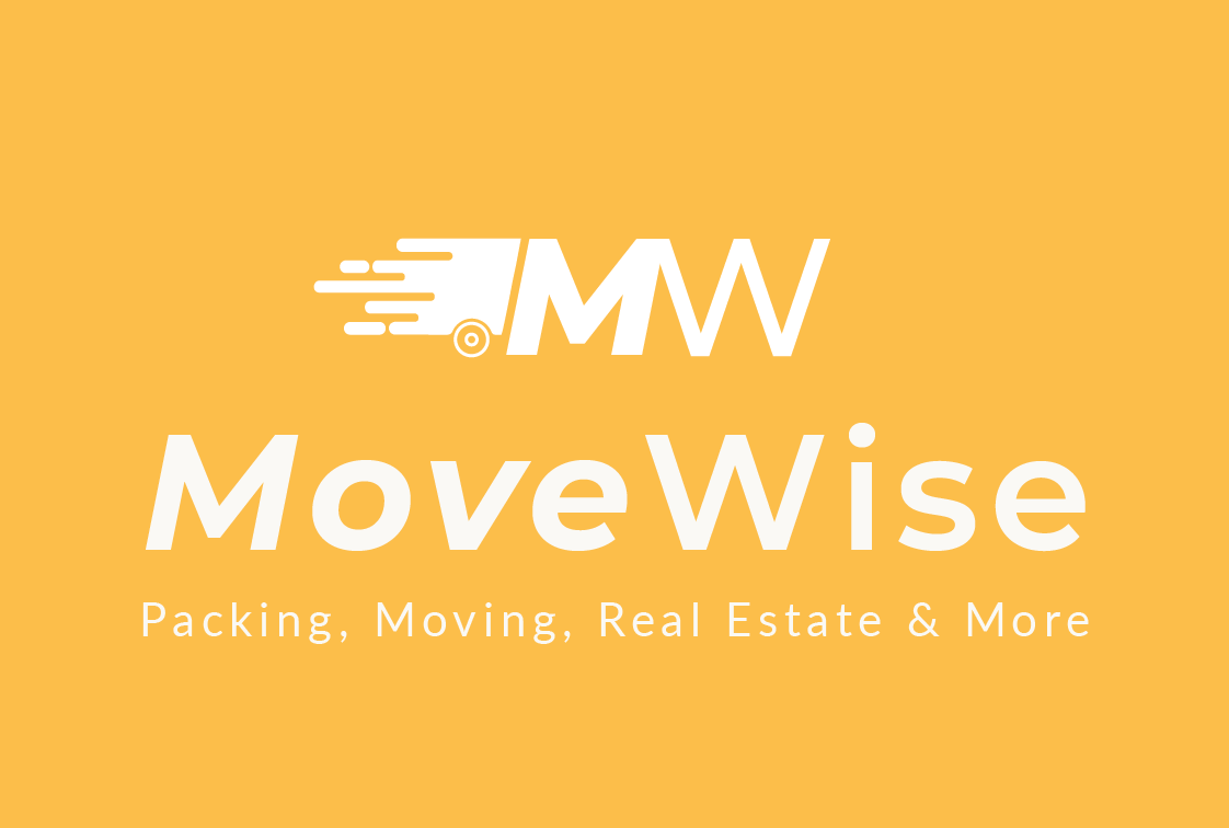
I explored multiple logo directions, balancing motion, structure, and clarity, before finalizing a clean, modern logo that represents professionalism and ease. I experimented with several color palettes and ultimately selected a deep blue, yellow and warm beige pairing: colors that suggest trust and approachability.
Logo Variations:
Final Logo in B&W & Brand Colors:
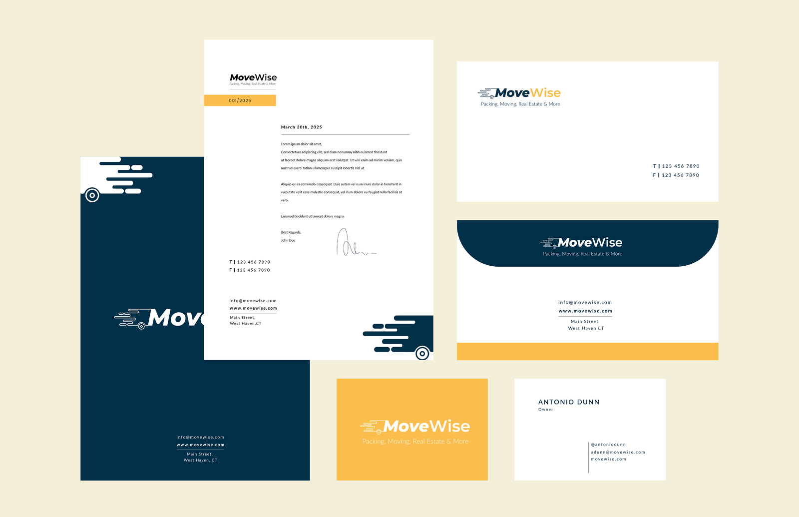
Step 5: The Business Identity System
To create a strong first impression in professional settings, I designed a full business identity system. This included:
- Business cards
- Letterhead
- Envelope design
- Letter design
Each element was built with consistency in mind, reflecting MoveWise’s new brand values and visual clarity.
Step 6: Marketing Materials
To showcase how the brand would function in real-world outreach, I created a range of marketing material. All of these pieces used the established typography, colors, and tone of voice to create a unified experience.
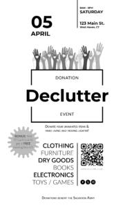
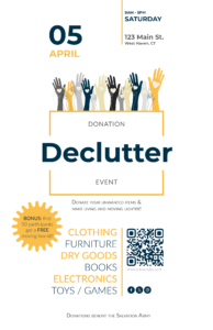
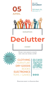
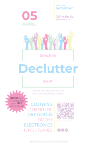
1. A special event poster promoting a MoveWise-sponsored donation drive
This event poster promotes a community donation drive hosted by MoveWise, encouraging individuals to declutter their homes and donate unwanted items to benefit The Salvation Army. The event is scheduled for April 5th in West Haven, CT, and offers a bonus moving box kit to the first 50 participants. To enhance visual impact and appeal, the poster was designed in four color variations: a grayscale base version, a version using the MoveWise brand colors, a warm earthy palette blended with cool muted tones for a fun yet sophisticated feel, and a pastel themed version inspired by Easter, aligning with the event’s April timing
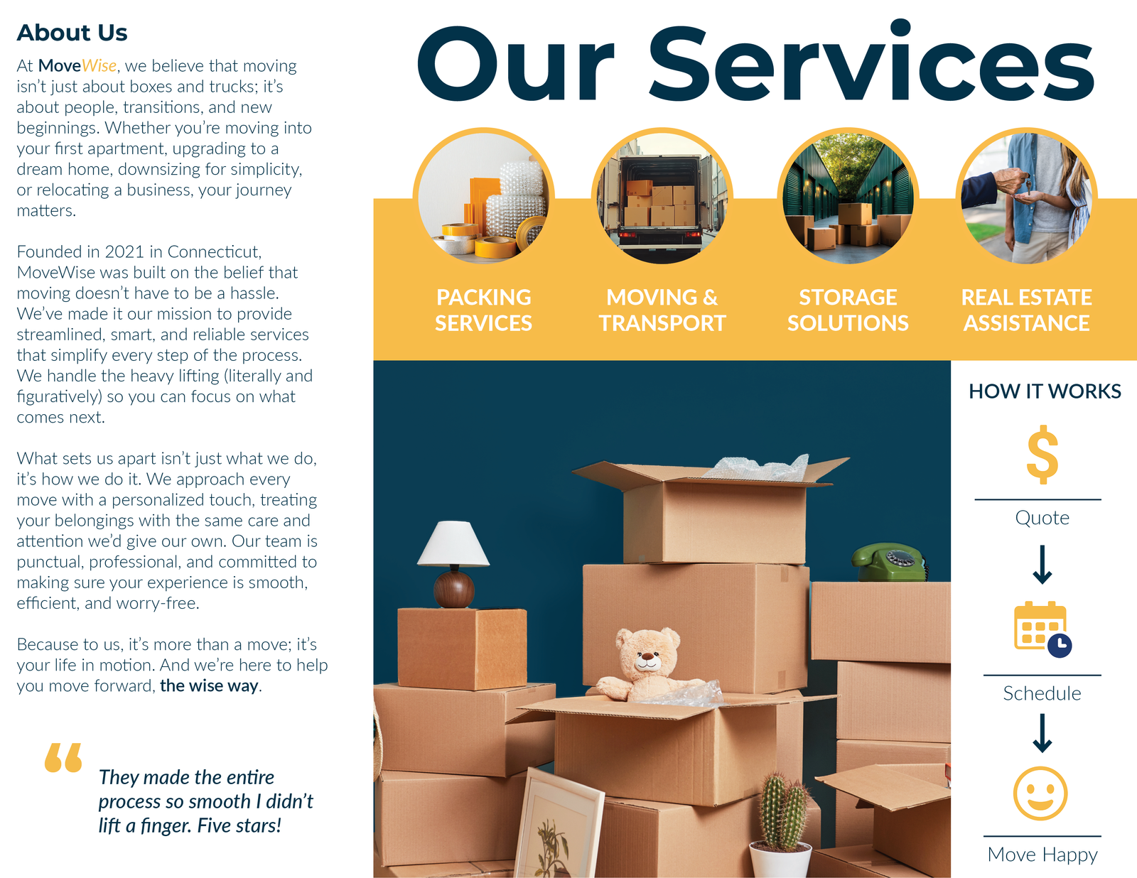
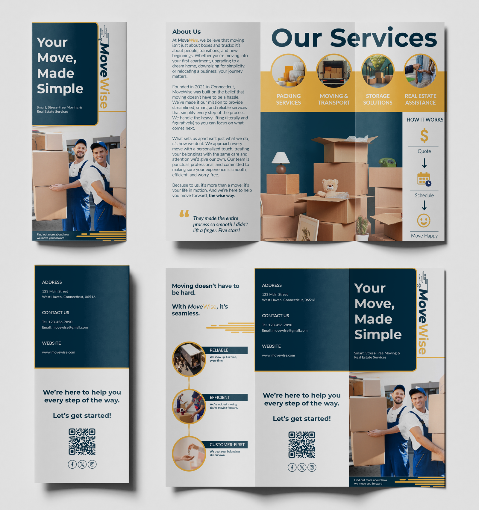
2. A letterfold brochure introducing services and company values
Front and Back of Brochure:
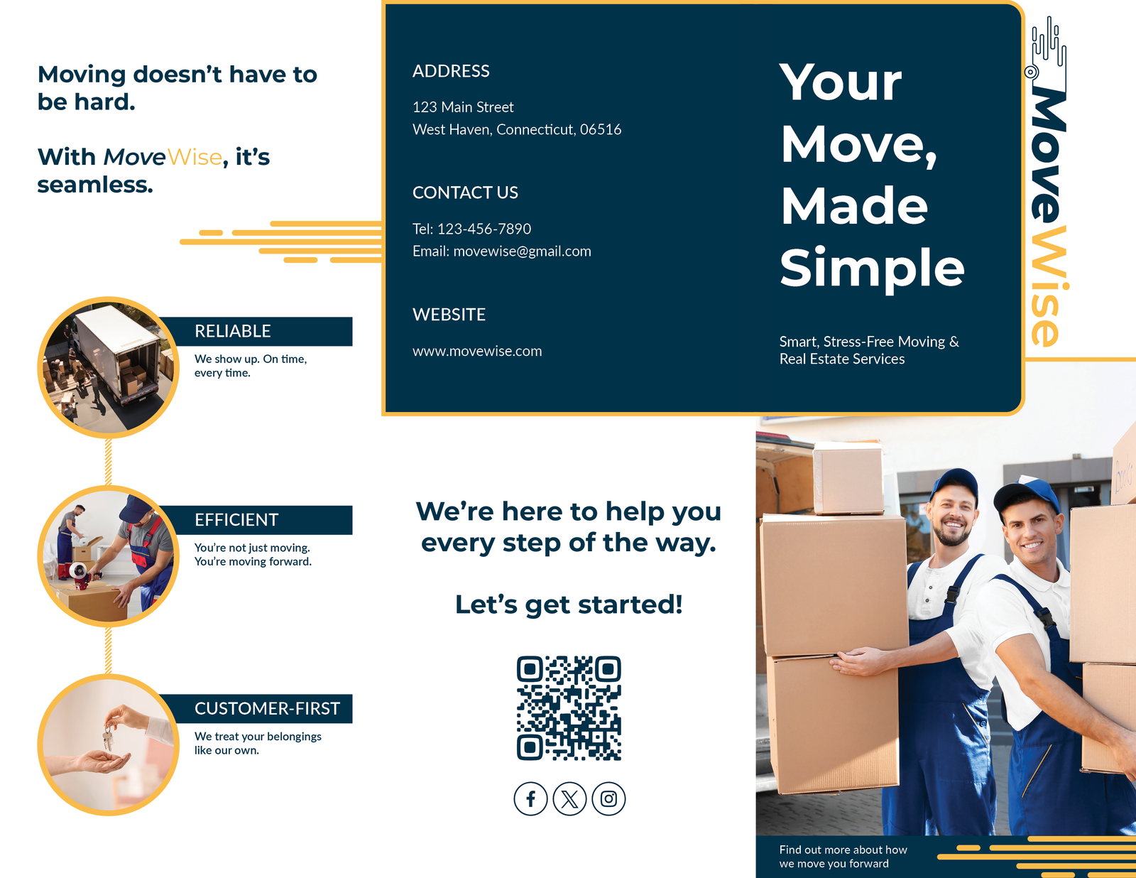
- Front Cover: Clean, traditional layout. Stuck to brand colors of yellow and blue that keeps it looking trustworthy.
- Back: Clear contact info and call-to-action. The address, phone number, email, website, QR code, and social icons are easy to find. The “Let’s get started!” is warm, but actionable.
- Inside Panel: Brand pillars to display the company’s core values.
- Panel 1: An “About Us” section for who we are and why we matter to help create trust with the client.
- A short, punchy 5-star review is another way to help strangers establish trust with the company.
- Panel 2 + 3: A clear, simple, “our services” breakdown with minimal text and images to display what MoveWise offers. This gave a snapshot of what we do without a wall of text. The bright imagery helps people skim and absorb fast. The “How It Works” is a step-by-step graphic to make the process feel easy and achievable, leaving out the logistics.
We chose to design and display the information on the brochure in this way because we respect the classic rules of good marketing – to tell a strong story, focus on trust, make the process feel simple, and get out of
Brochure Mockup:
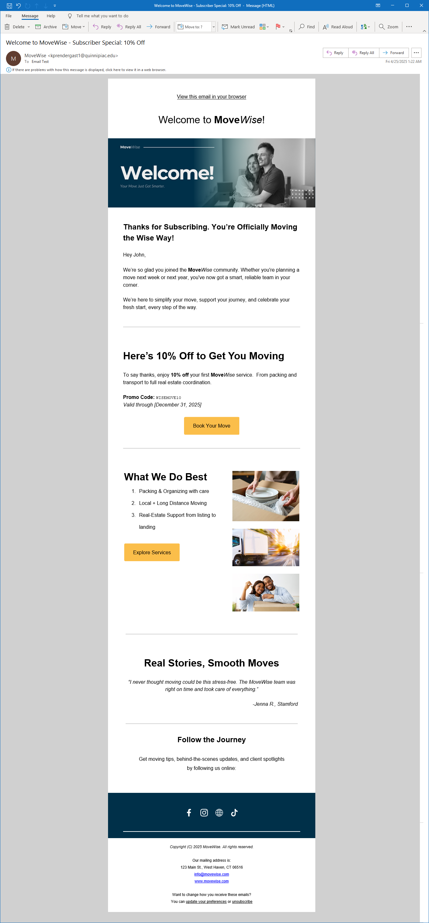
3. An Email Newsletter for a sign-up promotion
For the email newsletter, my goal was to reintroduce the company’s services with a clean, modern aesthetic that reflects trustworthiness and friendliness while also encouraging engagement. As a thank you to those who subscribed, the newsletter included a 10% off special, an exclusive reward for joining the email list.
I used Mailchimp to build and send the newsletter, taking advantage of its flexible templates and design tools to stay consistent with the brand identity. I set up the layout using a modular grid to establish a clear hierarchy: headlines, subheads, body copy, and CTA buttons were all aligned within this structure. This made the design not only visually consistent but also functional across devices.
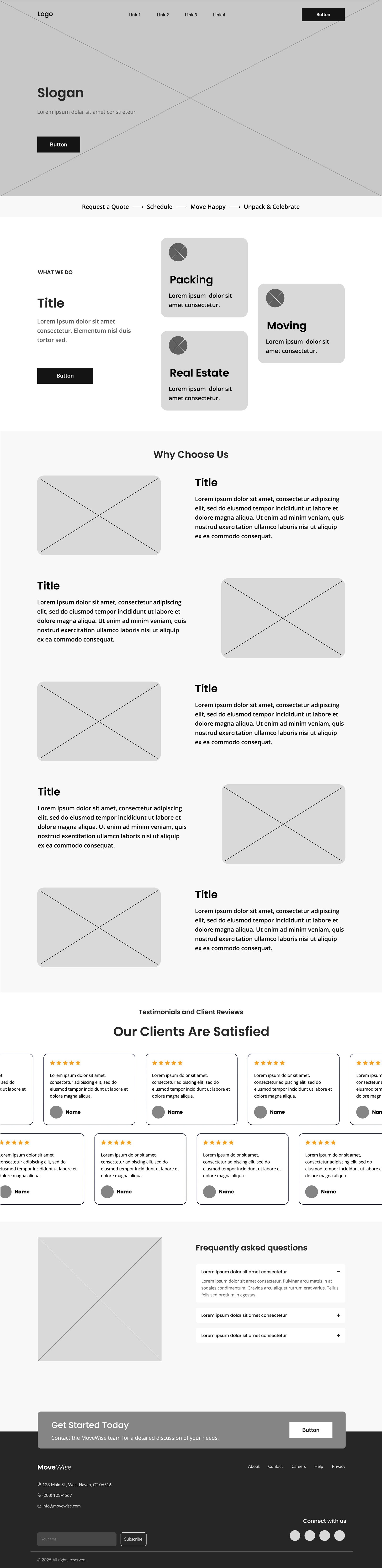
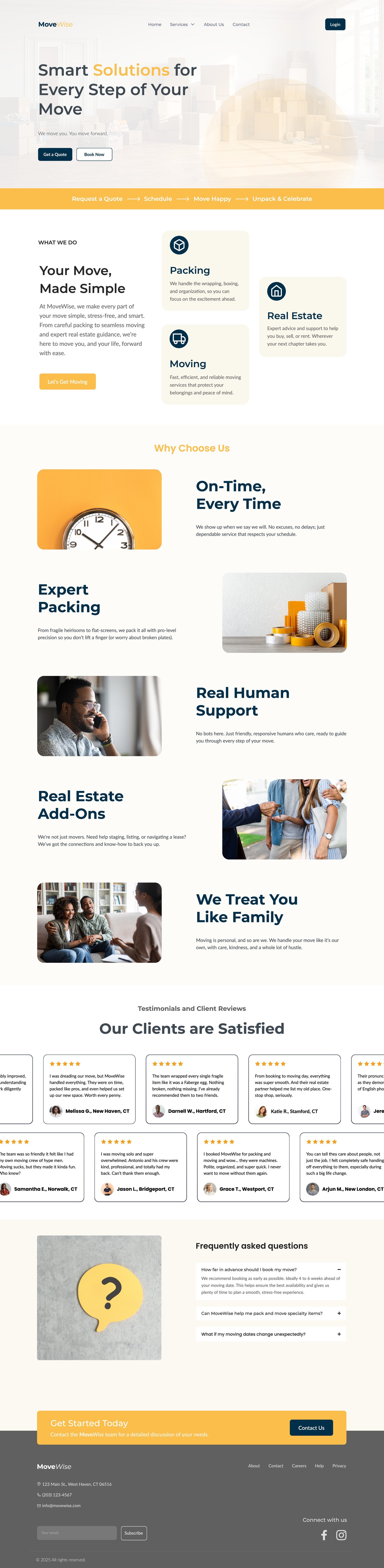
Step 7: Website Design
Finally, I tackled the digital presence. Starting with wireframes, I mapped out the user experience, focusing on simplicity and clear calls to action. From there, I created a full website comp with polished UI, consistent brand elements, and thoughtful visual storytelling. The site is designed to convert interest into trust, and trust into action.
Conclusion
What began as a brandless company is now a fully realized identity. Through strategy, design, and storytelling, MoveWise now communicates its mission visually and verbally at every touchpoint. This project represents not just a design transformation, but a business now ready to grow with purpose.
No responses yet