
One of the most essential yet often invisible tools in great design is the grid. Grids provide the structure and rhythm that keep a composition feeling balanced and intentional. As Cath Caldwell explains in Graphic Design for Everyone, grids help designers create harmony and clarity, making layouts both visually appealing and easy to navigate. Whether it’s a newsletter or a website, grids are the backbone that tie all visual elements together cohesively.
Wireframes: The Quiet Hero
When designing both the email newsletter and website landing page for the brand, MoveWise, I started with wireframes. This made the design process smoother and more strategic. Instead of designing reactively, I was able to make choices with intention, deciding what the user should see first, where their eyes should travel, and what actions they should take. As a result, the final pieces feel more thoughtful and user-friendly.
Starting with the Newsletter
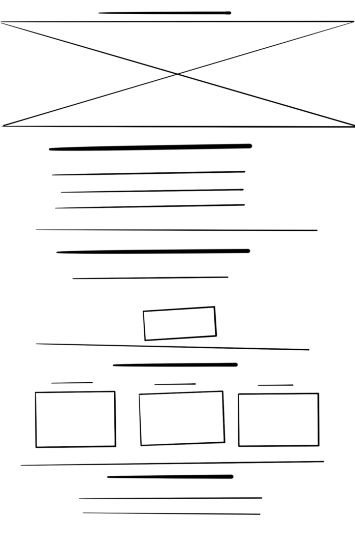
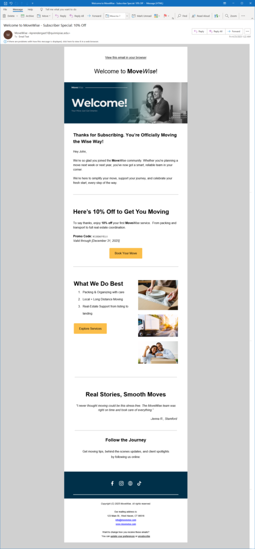
For the email newsletter, my goal was to reintroduce the company’s services with a clean, modern aesthetic that reflects trustworthiness and friendliness while also encouraging engagement. As a thank you to those who subscribed, the newsletter included a 10% off special, an exclusive reward for joining the email list. I used Mailchimp to build and send the newsletter, taking advantage of its flexible templates and design tools to stay consistent with the brand identity. I set up the layout using a modular grid to establish a clear hierarchy: headlines, subheads, body copy, and CTA buttons were all aligned within this structure. This made the design not only visually consistent but also functional across devices.
Before I began designing, I created a paper wireframe to block out where content would go. This preliminary sketch helped me test layout ideas quickly without getting distracted by color, typography, or imagery. According to UX experts at Experience UX and Figma, wireframes help designers focus on user flow and structure before adding polish. I found that incredibly helpful when deciding how to sequence content, from the opening value statement to the call to action at the end.
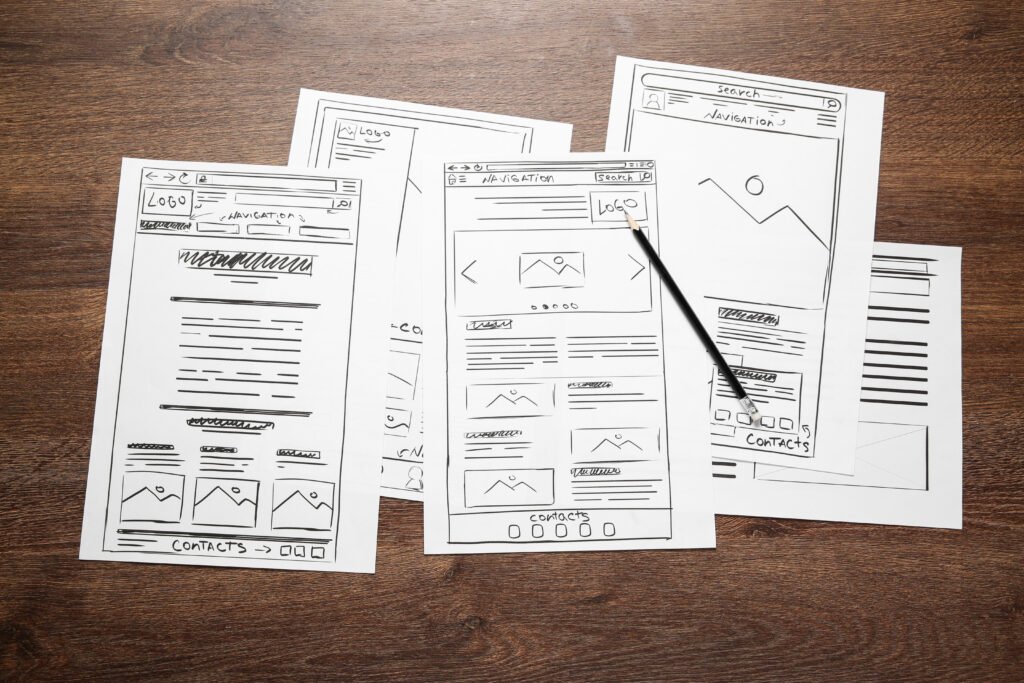
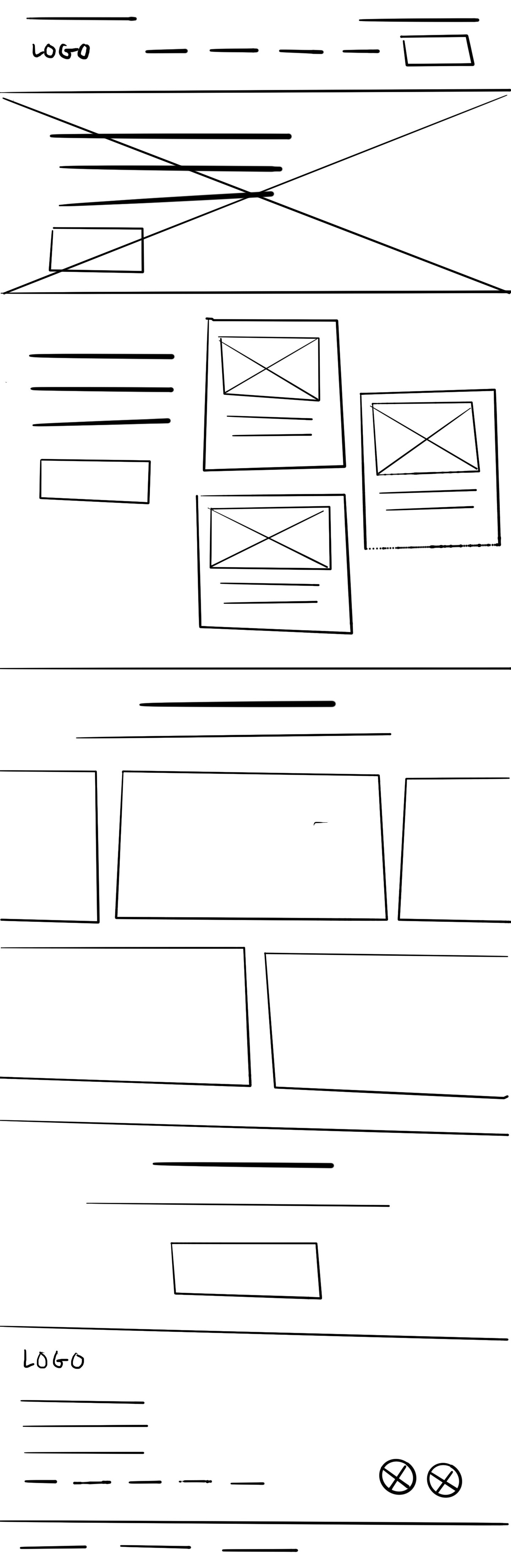
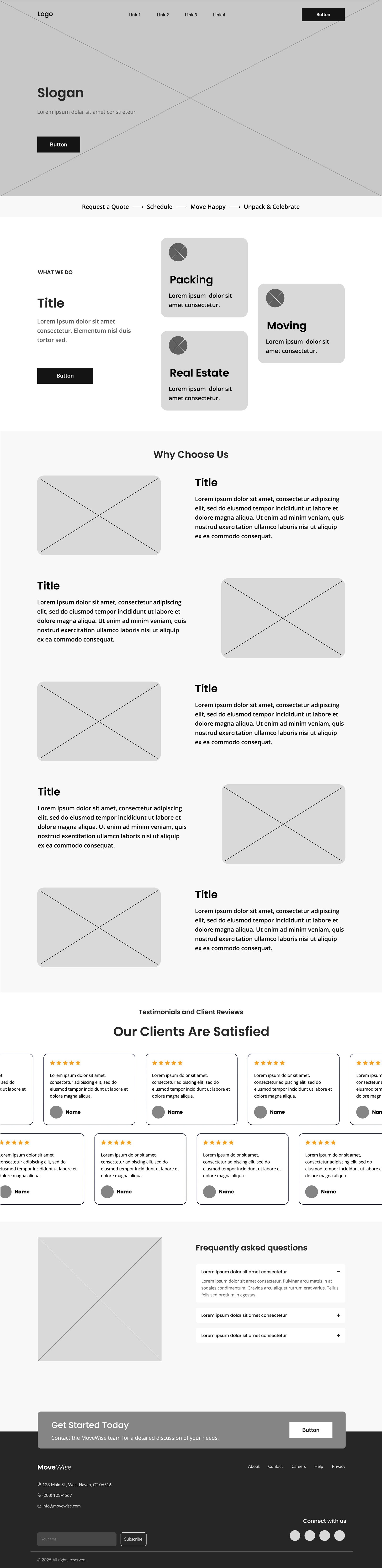
Website Landing Page: Structure Meets Storytelling
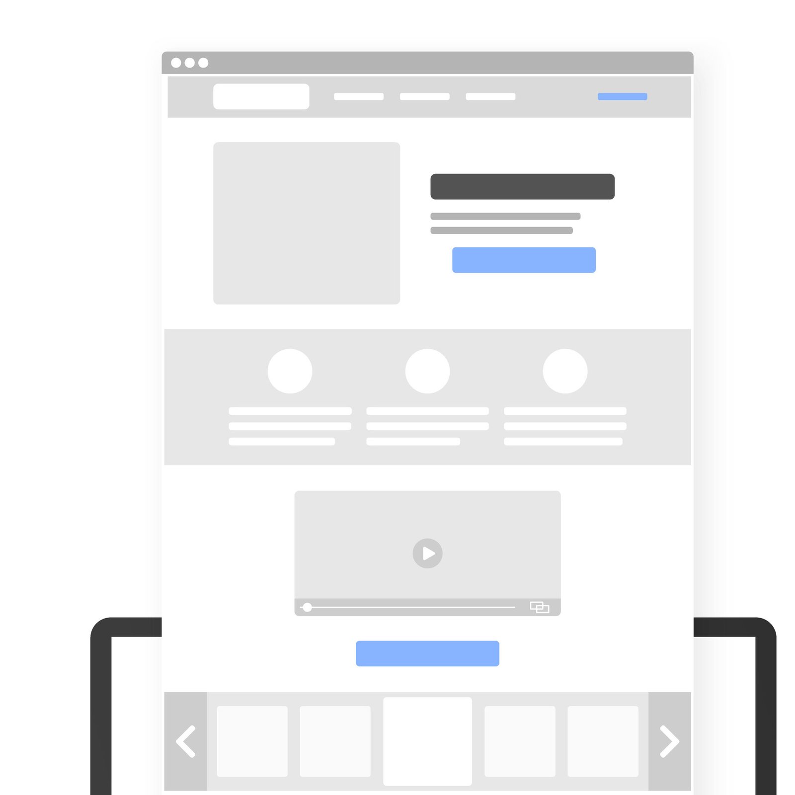
The website landing page design started with a simple paper wireframe. Sketching by hand allowed me to quickly map out the user journey, planning how visitors would move from the headline to the service offerings, and eventually to the call to action. From there, I translated the paper version into a digital wireframe in Figma, using column guides to establish consistent alignment and to experiment with different layout options. Having the flexibility to shift elements around digitally helped me refine the structure and pacing of the page before getting into the details.
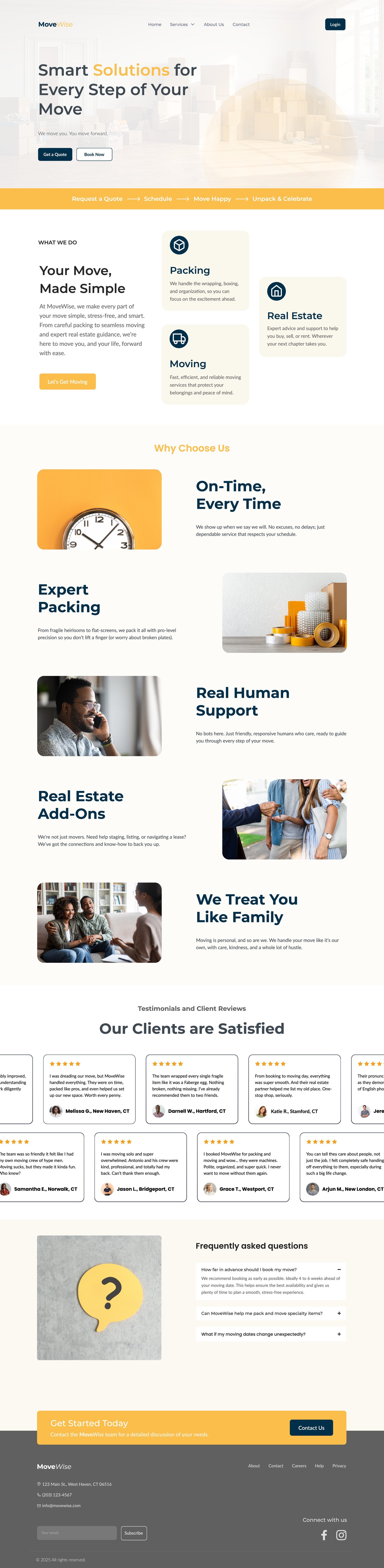
Once the basic layout felt strong, I started layering in brand elements: adjusting colors to match MoveWise’s identity, adding real images, and refining the copy to better reflect the company’s voice: friendly, supportive, and professional. While the final design did evolve slightly from the original wireframe (reordering some sections and adjusting spacing for better flow), the groundwork laid by the paper sketch and Figma wireframe made those changes easier and more intentional. This structured approach helped the site feel cohesive, approachable, and polished, all critical traits for building trust with potential customers.
Using a grid system here was crucial. As NNGroup and Clio Websites explain, grids in interface design create alignment, reduce visual clutter, and enhance readability. For MoveWise, I needed the site to feel reliable and professional, so consistent alignment and clear spacing made all the difference. The grid also ensured that text blocks and images worked harmoniously on desktop and mobile.
Final Thoughts
This week’s project highlighted how foundational tools like grids and wireframes shape not just the look, but the clarity and usability of a design. Whether I was crafting a promotional newsletter or building out a full landing page, starting with structure allowed me to design with purpose and flexibility. As Graphic Design for Everyone emphasizes, good design doesn’t happen by accident; it’s the result of thoughtful planning and a deep understanding of how people interact with visuals. Through this process, I’ve seen firsthand how even small strategic decisions, like reordering content blocks, can enhance brand impact. MoveWise is more than a moving company, and now its design communicates that clearly from the first click.
References
Caldwell, Cath. (2019). Graphic Design for Everyone: Understand the Building Block so You can Do It Yourself. DK.
Rees, Damian. “What Is Wireframing?” Experience UX, experienceux.co.uk/faqs/what-is-wireframing.
“What Is Wireframing?” Figma, www.figma.com/resource-library/what-is-wireframing.
Gordon, Kelley. “Using Grids in Interface Designs.” Nielsen Norman Group, 17 July 2022, www.nngroup.com/articles/using-grids-in-interface-designs.
Nikola. “The Importance of Grids in Web Design: Complete Guide.” Clio, 15 July 2023, cliowebsites.com/the-importance-of-grids-in-web-design.
No responses yet