
Designing a type specimen poster may seem like a straightforward task, but it’s a journey that demands both creative intuition and deep research. My process starts with inspiration, evolves through multiple iterations, and concludes with a polished design that reflects the essence of the typeface itself. In this post, I’ll walk you through my thought process behind researching and creating a type specimen poster, with Montserrat as the star of the show.
Inspiration
Before diving into the design process, I spent time researching existing type specimen posters to understand the different ways designers structure and present typography. I explored posters of various typefaces, analyzing the elements that made each specimen effective. I looked for trends in layout, the balance of text and imagery, and the types of information typically included, such as typeface history, intended use, and unique characteristics.
Once I had a solid understanding of how others approached type specimen design, I was ready to select the typeface for my poster.
Choosing Montserrat
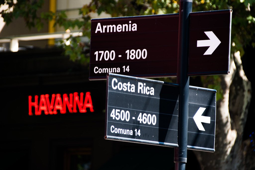
I chose Montserrat for my type specimen poster because of its distinct history and popularity. Montserrat, a geometric sans-serif typeface designed by Julieta Ulanovsky in 2010, was inspired by the urban typography of the Montserrat neighborhood in Buenos Aires, Argentina. The area’s early 20th-century signage provided the creative spark for the font, and I was immediately drawn to its clean, modern aesthetic with a touch of vintage charm.
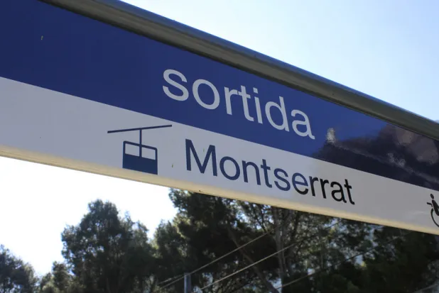
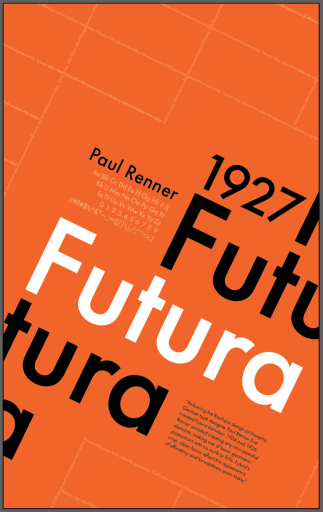
Similar in feel to other geometric sans-serif fonts like Gotham and Futura, Montserrat has its own distinctive personality that I felt would make for an intriguing subject for the poster.
A Fun and Unexpected Discovery
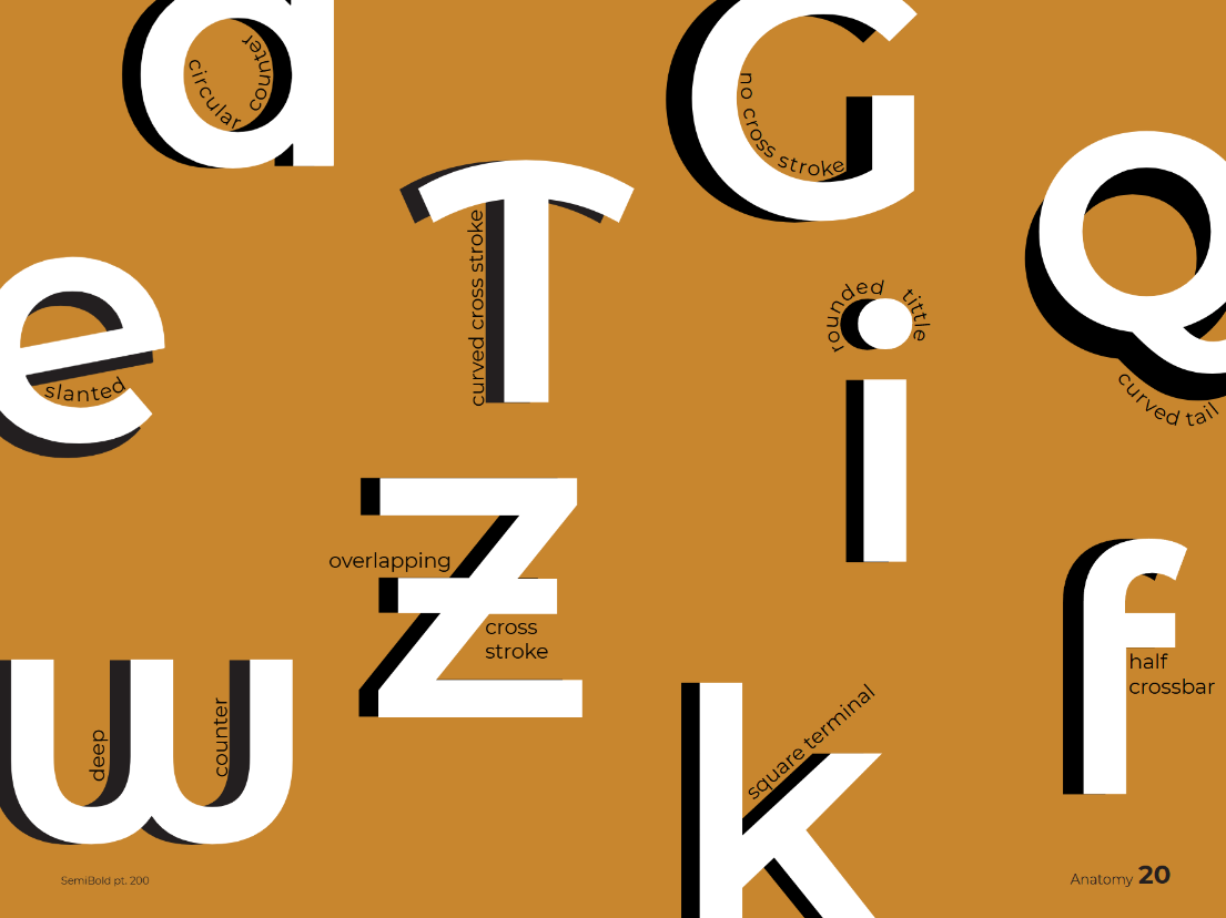
While working on this assignment, I stumbled upon something I found both fun and interesting. I learned about the subtle differences between the standard Montserrat typeface and the Montserrat Alternates. Initially, I didn’t realize just how much these alternate characters could change the overall feel of a design. The more I compared them, the more I appreciated the little quirks, like the rounder shapes and softer curves in the alternate version. It was a fascinating reminder of how small design changes can drastically shift a typeface’s personality and the impact it has on the viewer. This discovery helped me better understand Montserrat’s versatility and gave me another way to approach the poster’s design.
A Deep Dive into the Typeface
After selecting Montserrat, my next step was to dive deeper into the history and technical details of the typeface. I researched Julieta Ulanovsky’s inspiration behind Montserrat, the neighborhood of Buenos Aires, and how the typeface fits into the context of early 20th-century Argentine typography. I made sure to explore the different weights and styles within the Montserrat family.
Summary of my findings:
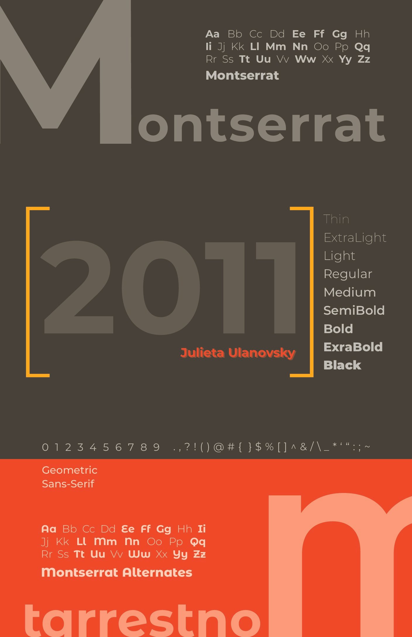
Montserrat is a geometric sans-serif typeface designed by Julieta Ulanovsky in 2010. Inspired by the urban typography found in the Montserrat neighborhood of Buenos Aires, Argentina, the typeface captures the essence of early 20th-century signage and posters that once adorned the city’s streets.
The design reflects a clean, modern aesthetic with a touch of vintage charm, making it similar in feel to Gotham and Futura, but with a distinctive personality rooted in its historical inspiration. Montserrat was originally released as a free and open-source font on Google Fonts, quickly gaining popularity for its versatility in branding, editorial design, and digital use.
Over time, the Montserrat family has expanded to include multiple weights, styles, and even alternate versions with subtle stylistic differences. It remains one of the most widely used sans-serif fonts due to its readability, geometric precision, and strong visual presence.
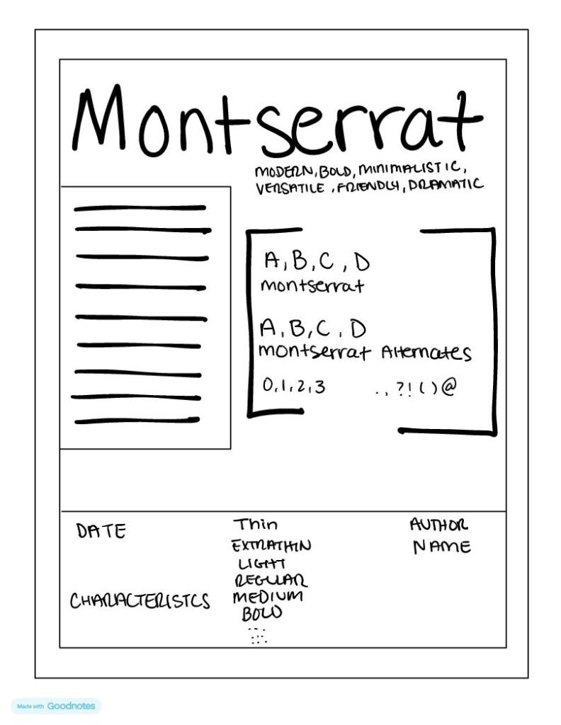
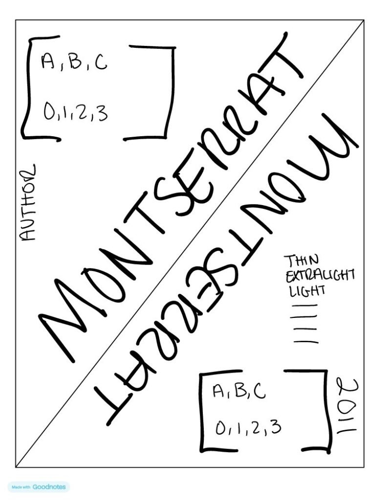
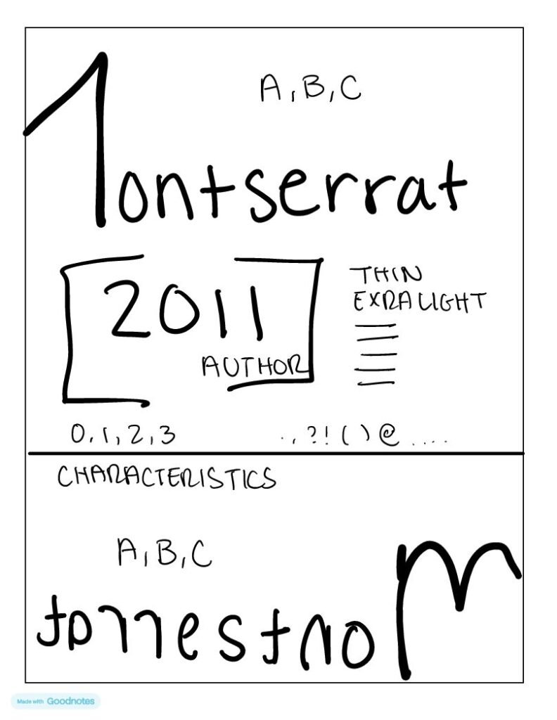
Concept Development & Sketching
The next phase was to start developing the concept and rough layout for the poster. I began by sketching multiple design options on paper, exploring different compositions and visual approaches. In these early sketches, I considered how best to display Montserrat in a way that highlights its clean, modern characteristics while also honoring its historical roots. I made sure to sketch layouts that allowed for a balance between the type’s design and its story.
Color Selection – Drawing Inspiration from Buenos Aires
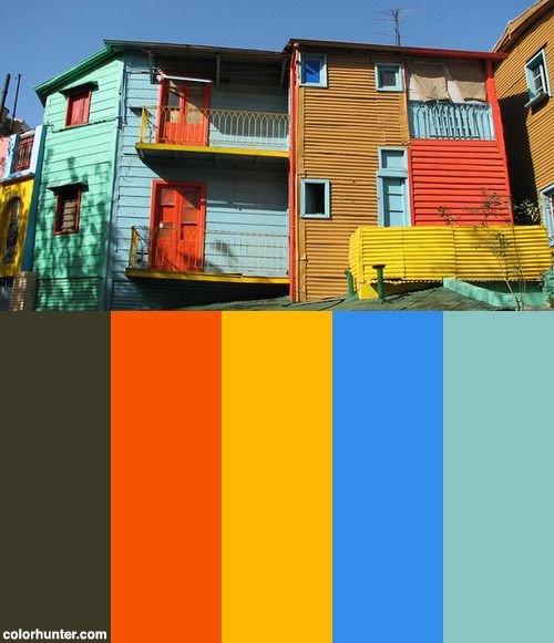
Color was another key consideration. To tie the design back to the inspiration behind Montserrat, I looked to Buenos Aires. The vibrant and eclectic palette of the city’s urban signage, architecture, and street art became the perfect reference point for my color choices. I chose muted tones of brown, red, and yellow to give the poster a feeling of both modernity and vintage flair, colors that reflected the vibrancy and history of Buenos Aires itself.
The goal was for the colors to evoke the feel of the city, creating a visual harmony between the typography and its inspiration.
Refining the Design
Once I had a solid concept and layout, it was time to refine the design. Using Adobe InDesign, I began digitizing my sketches and experimenting with different type treatments, adjusting kerning, line spacing, and alignment to ensure readability while maintaining the geometric precision that defines Montserrat.
Throughout this process, I made sure to incorporate both the primary Montserrat typeface and the alternate version, showcasing the differences between the two. It was important for me to highlight these stylistic nuances, as it adds depth and variety to the specimen poster, demonstrating the versatility of the font family.
Final Iterations
As the design took shape, I continued iterating, testing different layouts, adjusting colors, and refining the overall composition.
After several rounds of revisions, I finalized the design. The poster not only serves as a functional specimen for Montserrat but also as a visual celebration of the typeface’s roots and its place in the modern design world.
A Typeface Journey
Creating a type specimen poster for Montserrat was more than just a design exercise; it was an opportunity to immerse myself in the history and essence of a typeface. Through research, iteration, and creative exploration, I was able to bring Montserrat to life in a way that’s visually compelling.
Ultimately, this project reinforced for me the power of design in storytelling. A typeface isn’t just a collection of letters, it’s a reflection of culture, history, and intention. As a designer, it’s our job to help bring those stories to the forefront.
I’d love to hear your thoughts on the design! Looking forward to feedback from my professor and peers to see how I can push this project even further. Drop your comments below!
No responses yet