
From Idea to Innovation
Have you ever wished for an app that doesn’t just list restaurants but actually remembers your dining experiences, helps you discover hidden gems, and personalizes recommendations based on your tastes? That’s the idea behind Fork & Found, a food adventure companion that makes every meal an experience worth savoring.
The Spark of an Idea
My boyfriend and I love trying new restaurants, but we kept running into the same problem: forgetting where we’ve been, what we loved, and where we still wanted to go. Traditional review apps felt cluttered, filled with biased opinions, and lacked a personal touch. We needed something more tailored to our own preferences, a tool that didn’t just help us find places but let us track our culinary journey.
Ideation: Developing the Concept
To refine this idea, I used two key brainstorming techniques: Mind Mapping and The Worst Possible Idea. These methods helped define the features of Fork & Found while ensuring a seamless and enjoyable user experience.
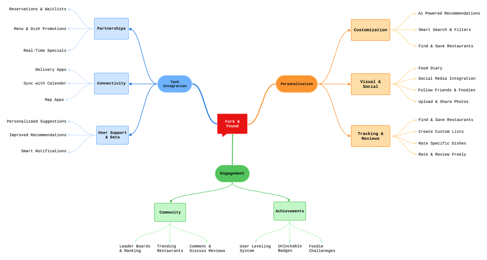
Mind Mapping: Structuring the App’s Features
By visually mapping out the app’s structure, I identified the core elements that would make Fork & Found stand out:
Full MindMap:
Worst Possible Idea: Turning Bad into Brilliant
The “Worst Possible Idea” technique helped challenge assumptions and improve design choices. For example:
By flipping flawed ideas into functional features, we ensured Fork & Found would be user-friendly, intuitive, and frustration-free.
Moving Forward
This ideation phase was crucial in shaping Fork & Found’s core mission: helping users discover, save, and share their food experiences effortlessly. The next step is refining the user interface, testing prototypes, and making sure the app feels as seamless as the dining experience it enhances.
Fork & Found isn’t just about finding good food; it’s about curating a personal food diary, making every meal count, and connecting with fellow food lovers.
No responses yet