
What is Color Psychology?
Color psychology is the study of how colors affect human emotions, behavior, and decision-making. In branding and marketing, colors are carefully chosen to evoke specific feelings and associations that influence consumer perception. Color plays a crucial role in branding by creating a strong emotional connection with consumers, often influencing purchasing decisions subconsciously. Adobe Express Understanding how different colors impact emotions allows brands to shape their identity and communicate their message effectively. Let’s explore the psychology behind various colors in branding, along with notable examples and the emotions they elicit.
Red: Passion and Urgency
Red is a color of extremes, symbolizing passion, excitement, and urgency. It’s known to stimulate appetite and create a sense of urgency, making it a favorite in the food and retail industries. Red increases heart rate and creates a sense of urgency, which is why it’s often used in clearance sales. Hubspot

Coca-Cola: The iconic red branding of Coca-Cola evokes feelings of excitement and happiness, aligning with the brand’s association with joy and celebration.

Target: The brand’s striking red bullseye symbolizes energy, excitement, and passion, reinforcing its strong presence in the retail industry.
Blue: Trust and Tranquility
Blue exudes calmness, trust, and reliability. It’s commonly used by financial institutions and tech companies to convey stability and professionalism. Blue is the color of dependability, which is why so many banks and social networks incorporate it. Help Scout

Facebook: The blue logo fosters a sense of trust, which is essential for a platform handling vast amounts of personal data.

Intel: Uses blue to project reliability and professionalism in the tech industry.
Green: Growth and Health
Green is synonymous with nature, health, and tranquility. Brands that focus on environmental friendliness or health often use green to emphasize these values. According to Help Scout, Green is often associated with growth because of its clear connections to nature. It also represents prosperity, which is why many financial brands use it.

Spotify: The green logo reflects growth and vitality, resonating with its dynamic and ever-expanding music library.

Tropicana: Uses green to highlight freshness and a connection to nature, aligning with its fruit-based products.
Yellow: Optimism and Cheerfulness
Yellow radiates warmth, optimism, and happiness. It’s attention-grabbing and can evoke feelings of joy and energy. As Forbes Tech Council states, Yellow is energetic and attention-grabbing, but it also needs to be used carefully to avoid overwhelming the audience.
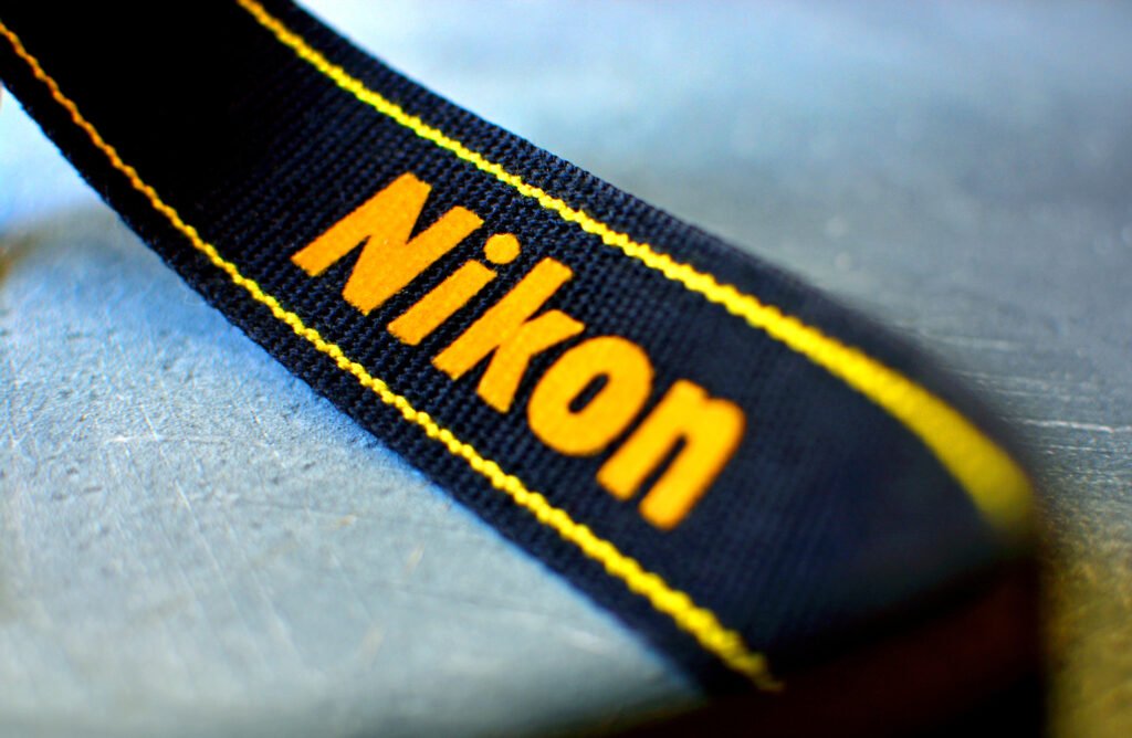
Nikon: The yellow in Nikon’s logo conveys creativity and optimism, appealing to photographers’ artistic aspirations.

DHL: The international shipping company uses yellow to project speed, positivity, and efficiency, making their brand feel approachable and energetic.
Purple: Luxury and Creativity
Purple is often associated with royalty, luxury, and creativity. Brands use it to convey a sense of sophistication and imagination. Purple is a color that’s traditionally linked to royalty and luxury, but it also conveys creativity, uniqueness, and ambition, which makes it perfect for brands seeking to inspire and stand out. Forbes

Cadbury: The rich purple packaging underscores the brand’s premium quality and indulgent experience.

Twitch: Utilizes purple to represent creativity and imagination, aligning with its focus on science fiction and fantasy content.
Orange: Friendliness and Energy
Orange combines the energy of red and the cheerfulness of yellow, symbolizing enthusiasm, creativity, and warmth. Orange is often associated with creativity, enthusiasm, and fun. It is a color that naturally grabs attention but does so in a playful and energetic way. Help Scout
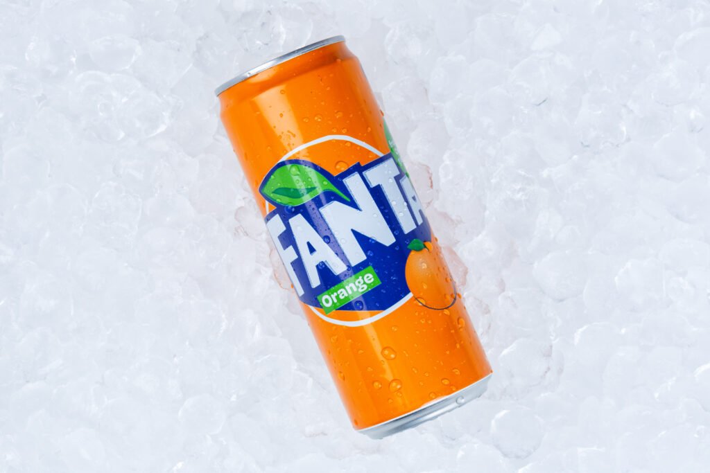
Fanta: The vibrant orange reflects the brand’s playful and fun image, appealing to a younger demographic.

Nickelodeon: Uses orange to project a friendly and energetic vibe, resonating with its youthful audience.
Multi-Color: Diversity and Inclusivity
Some brands employ multiple colors in their logos to represent diversity, inclusivity, and a wide range of offerings. Multicolor branding can be effective in showcasing diversity and creativity. Adobe Express

Google: The use of blue, red, yellow, and green in its logo signifies the brand’s dynamic and diverse range of services.

eBay: Similarly, eBay’s multi-colored logo reflects a diverse marketplace with a variety of products and sellers.

McDonald’s: Combines yellow with red to stimulate appetite and evoke a sense of happiness and urgency.

IKEA: The combination of blue and yellow in IKEA’s branding reflects a balance of trust (blue) and friendliness (yellow), reinforcing an accessible and cheerful shopping experience.

Peacock: The peacock logo features a rainbow of colors, symbolizing creativity and entertainment.
Understanding the psychology of color in branding is crucial for creating a visual identity that resonates with the target audience. By strategically selecting colors that align with the desired emotional responses, brands can effectively communicate their values and influence consumer behavior.
References
Maybray, Bailey. “Color Psychology: How to Use It in Marketing and Branding.” HubSpot, 11 July 2023, blog.hubspot.com/the-hustle/psychology-of-color.
Ciotti, Gregory. “Color Psychology in Marketing and Branding Is All About Context.” Help Scout, 8 Aug. 2024, www.helpscout.com/blog/psychology-of-color.
Abaev, Boris. “The Psychology of Color: 5 Ways You Can Use Color to Build Brand Identity.” Forbes, 3 Aug. 2023, www.forbes.com/councils/forbestechcouncil/2023/08/03/the-psychology-of-color-5-ways-you-can-use-color-to-build-brand-identity.
Adobe Express. “Colour Psychology in Marketing: Choosing the Right Palette.” Adobe, 26 Mar. 2024, www.adobe.com/uk/express/learn/blog/colour-psychology-in-marketing.
No responses yet