In my last blog post, I outlined my early ideation for a mobile companion app for the Borough of Naugatuck. Inspired by the community’s needs and the clunky realities of many municipal websites, I started mapping out how to bring clarity and simplicity to the fingertips of residents, visitors, and local businesses. This week, I made the leap from planning to prototyping.
Using my iPad, I created a series of low-fidelity “paper” prototype screens to explore how users might navigate key features. This phase is all about functionality over aesthetics. The question isn’t “Does it look good?” it’s “Does it make sense?”
What is Paper Prototyping?
Watch this video to learn the basics of paper prototyping from the Nielson Norman Group:
The Case for Low-Fidelity Prototyping
Low-fidelity prototyping is the design equivalent of sketching in the margins. It’s fast, forgiving, and focused. Using my iPad let me move quickly between iterations while still keeping that hand-drawn, no-frills vibe that keeps the focus on structure rather than style.
Instead of coding or designing in high-fidelity software, I sketched each screen in a way that could be easily interpreted by users during testing, without any explanation from me. That’s the key. If someone gets lost in a lo-fi flow, the design isn’t working, and that’s gold-level feedback.
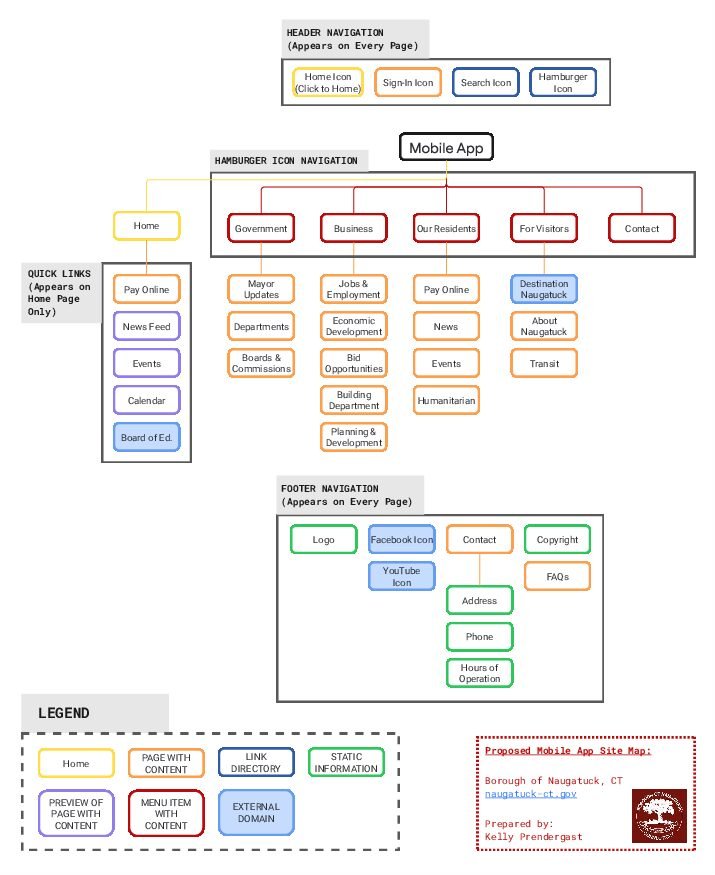
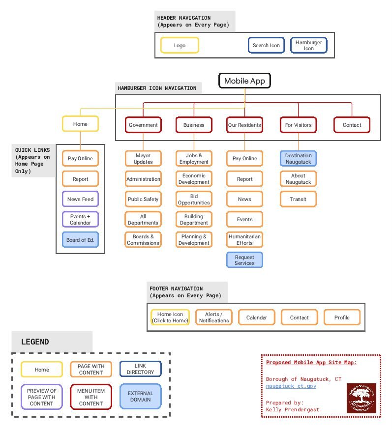
The Sitemap Got a Makeover
As I started building out the screens, I realized that some of my original sitemap decisions just weren’t working in practice. What looked logical on paper didn’t always translate into a usable flow on-screen. For example, I wanted to include “Make a Report” to the quick link menu since that is something users would use more frequently and I included more pages with content under the dropdown menu that I felt were important for users to have when navigating the mobile app. So I updated my sitemap mid-process; a move that’s very much in line with iterative UX design.
This revision helped me realign the navigation structure around real user tasks rather than just organizational categories. It’s a reminder that architecture isn’t static; it evolves when tested against reality.
Before
After
Key Flows I Prototyped
Based on my sitemap and flowcharts, I focused on four common and useful mobile app tasks:
1. Home Screen Guide
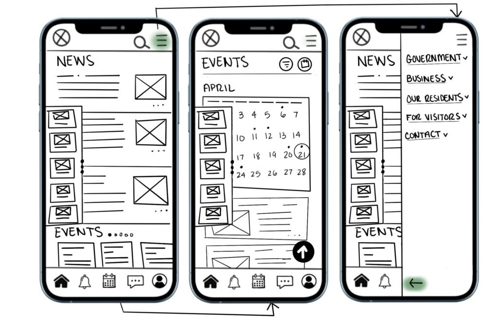
- Screens: Home layout → Hamburger Menu
- Highlights: Priority was given to scannability and easy access to main sections like News, Events, Pay Online and Report.
2. Navigate Events Flow
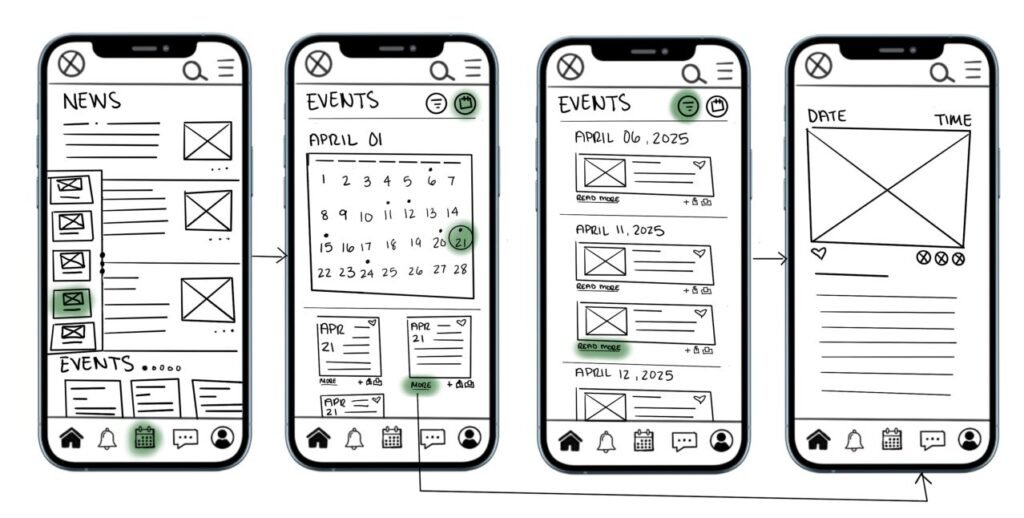
- Screens: Home layout → Monthly calendar → Events list → Individual event detail
- Highlights: I tested layouts for calendar views and considered event categories, using icons and minimal labeling to support understanding.
3. Set Up Notifications (from Profile Settings)
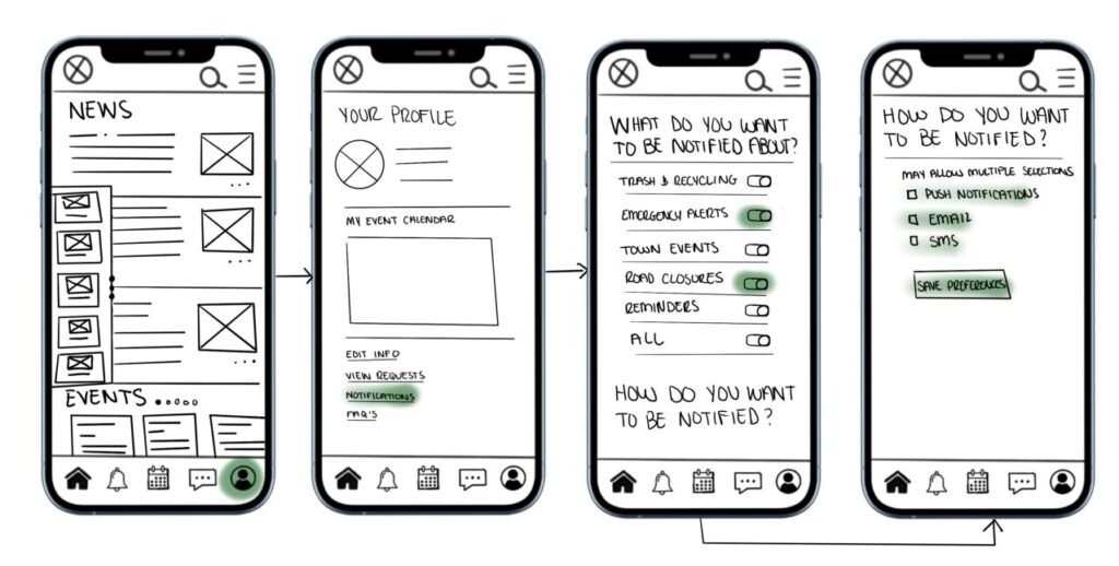
- Screens: Home layout → Profile → Toggle Notifications → Choose alert types
- Highlights: Toggle design variations and label clarity were a focus, since municipal alerts need to be intuitive and unobtrusive.
4. Pay an Online Bill
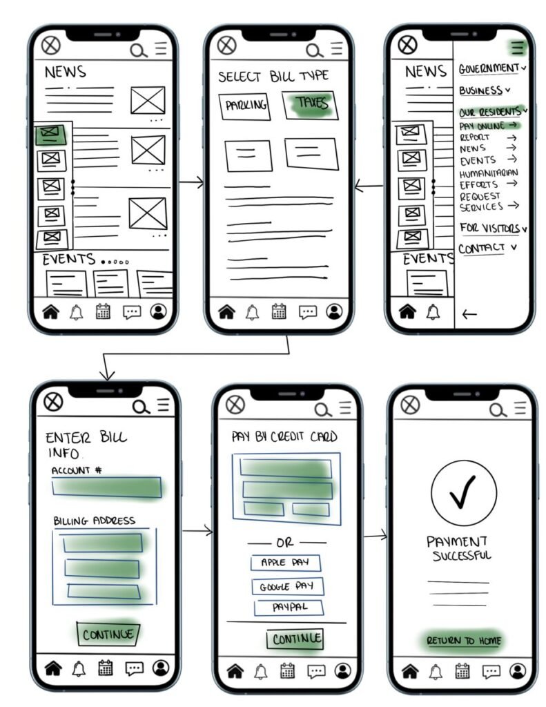
- Screens: Home – Pay Online Quick Link → Select bill type → Home – Pay Online Hamburger Menu → Enter Bill info → Enter Payment info → Confirmation
- Highlights: Streamlined steps to prevent drop-off, clearly marked form fields, and bold confirmation messages for reassurance.
5. Contact the Mayor
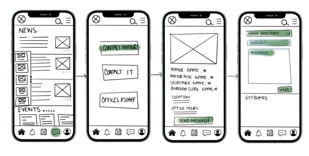
- Screens: Home – Message Icon → Select who to contact → Selection Info with Send Message Option → Select who to contact, Compose Message, Send
- Highlights: Quick, in-app messaging with full staff directory access, no external links. Messages are stored under your profile for easy reference and follow-up.
Design Language & Navigation
Even in lo-fi form, consistency is key. I used a simple color-coding system in the iPad sketches to help users during testing:
- Green: Interactive areas (buttons, links)
- Blue Outlines: Input fields (forms)
Navigation features carried across all screens:
- Persistent header with logo, search, and Hamburger menu
- Hamburger menu for full-site access
- Footer with quick actions like Home, Alerts, Calendar, Contact and Profile
These choices were based on what I observed in successful civic and utility apps; accessibility, predictability, and responsiveness always come out on top.
Why These Screens?
While I created 21 screens total, many are slight variations to test things like layout, labeling, and user decision points. By focusing on only four flows, I was able to go deeper into task-based interactions, aligning with user needs like paying bills, getting alerts, and staying informed about community events.
I based my screen breakdown on what I know about information architecture and mobile UX; minimizing cognitive load, chunking information into digestible formats, and keeping interaction paths short and sweet. (Tap, don’t scroll forever.)
Lessons from Sketching
Creating low-fidelity prototypes, even digitally, forces clarity. It’s not about making things pretty; it’s about making things possible. And sometimes the most basic version of a screen can reveal the biggest usability hiccups.
Some of my takeaways:
- Users need clear labels; ambiguity leads to user dropoffs fast.
- Form fields need to be spaced for thumbs, not cursors.
- Navigation should always feel like a loop: no dead ends.
This reminded me of my earlier thoughts from “Choose Your Own Adventure, but Make It UX”: users are the heroes, and good design lets them choose their own way forward, without a guidebook.
No responses yet