Designing digital products for municipalities isn’t exactly sexy, unless you’re like me and get excited about civic engagement and interface flow. This week, I dove into the world of low-fidelity prototyping and user testing with a project centered around NaugatuckConnect, a proposed companion app for the bourough of Naugatuck, Connecticut.
What Is Usability Testing?
(and Why Should You Care)

Before we get into the nitty-gritty, let’s talk usability testing. In the UX world, usability testing is a process where real users interact with your design to complete specific tasks. The goal? Catch friction points, understand behaviors, and see if your app is intuitive before you’ve sunk time and budget into full development.
And it’s not the same as user testing, even though people often use the terms interchangeably. Usability testing is laser-focused on how easy (or painful) it is to use your design. User testing, on the other hand, is more about gauging overall need, preference, or reaction to a concept or product. UX Tweak breaks it down perfectly in this article.
Nielsen Norman Group, basically the UX gods, outline the core steps of usability testing here. And if you’re still not convinced this is crucial, check out this comprehensive guide from UserTesting that lays out how it can make or break your final product.
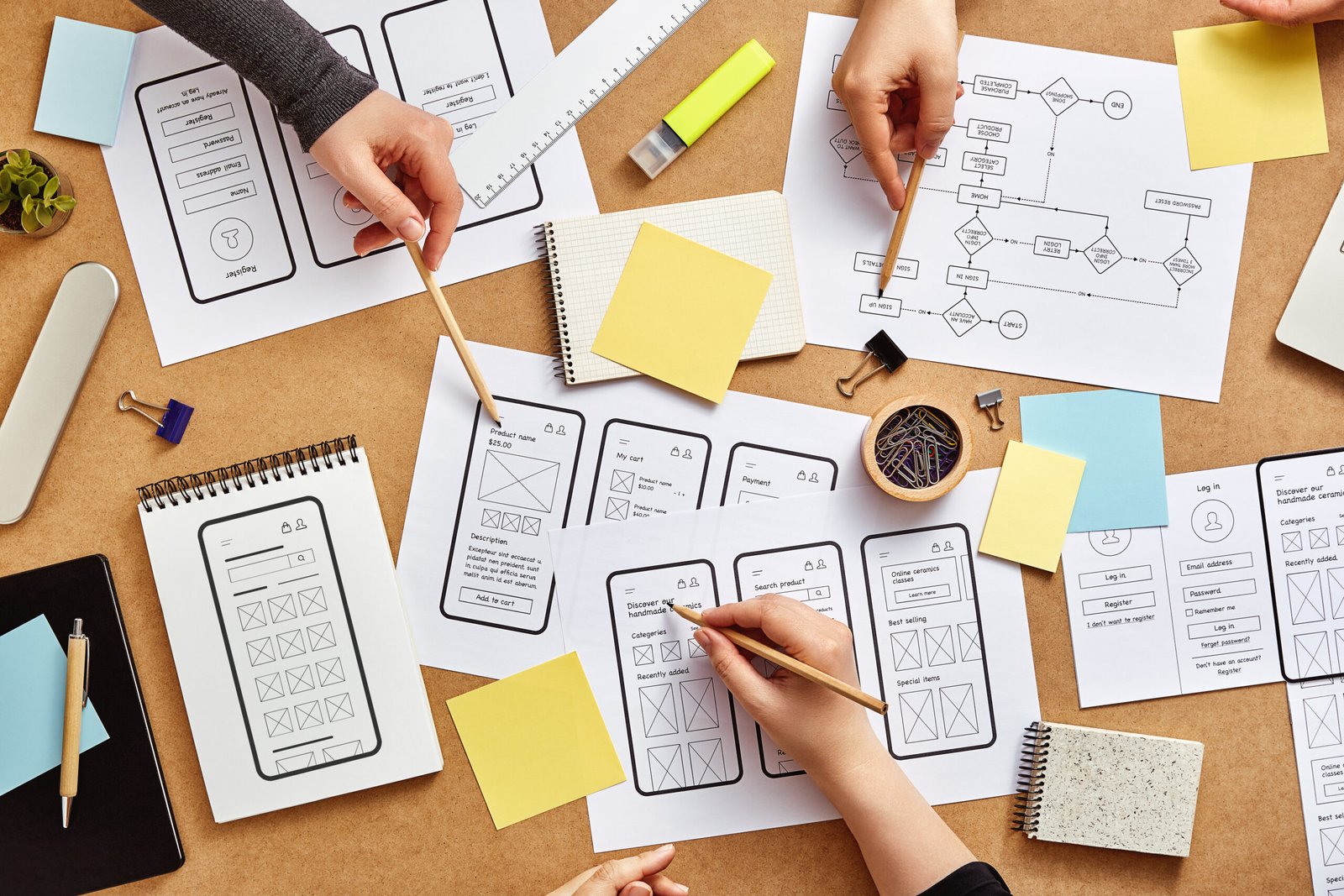
Testing a Low-Fi Prototype for NaugatuckConnect
Enter NaugatuckConnect. This prototype is built to streamline how residents interact with their local government. Think service requests, event sign-ups, emergency alerts, pothole reports, and online payments, all in one app. The vibe? Practical, clean, and no fluff.
For this round of testing, I created a low-fidelity prototype using Marvel. It wasn’t flashy, intentionally so. This kind of testing focuses on structure and flow, not colors or pretty UI. My goal was to learn: Can people actually use this thing?
Test Setup
I conducted remote usability testing with three participants. They had varying degrees of tech fluency.
Each participant completed three core tasks:
- Pay a Parking Ticket
- Register for the Mayor’s Charity Golf Scramble
- Report a Pothole to the City
They were asked to think aloud as they navigated the prototype, so I could understand their thought process (and catch any “What the hell do I click now?” moments in real time).
Here’s What I Learned
Task 1: Paying a Parking Ticket
Everyone got it done, but not without a moment of hesitation. Some users looked for a big, obvious “Pay Ticket” button on the home screen, it was actually under “Pay Online.” Good reminder: label your nav clearly, and don’t make users think.
Task 2: Signing Up for an Event
The Mayor’s Golf Scramble? No problem. Users breezed through it and appreciated the calendar add-on and weather widget on the confirmation screen. It’s the little touches that elevate UX.
Task 3: Reporting a Pothole
This was the surprise hit. Users loved being able to drop a pin and upload a photo. Everyone called out the confirmation and update-notification features as game-changers for civic trust.
Key Takeaways
- Core features are usable, which is the whole point of this test.
- Navigation labels need a touch-up for clarity.
- Confirmation screens build trust and make users feel like they accomplished something.
The takeaway here? Never skip usability testing. Especially for apps that serve entire communities, it’s critical to meet people where they are, technically, cognitively, and emotionally. No one wants to rage-click through a government app. Let’s design with intention and test like our reputations depend on it, because they do.
View the Full Breakdown and Prototype Screens:
Ready to Take It for a Spin?
Curious how you’d do with the tasks I tested? You can try out the NaugatuckConnect low-fidelity prototype yourself here:
View the Prototype
Put yourself in the shoes of a Naugatuck resident and see how easily (or not) you can pay a parking ticket, register for a local event, or report that pothole you’ve dodged 12 times this week.
Notice anything confusing?
Have an idea to improve something?
Ever used a city app that totally failed, or totally rocked?
Drop a comment below and let me know what stood out to you! Your feedback might just shape the next version of this app.
References
Strba, Marek. “User Testing vs. Usability Testing.” UXtweak, 22 May 2024, www.uxtweak.com/usability-testing/differences-user-vs-usability-testing.
Moran, Kate. “Usability (User) Testing 101.” Nielsen Norman Group, 1 Dec. 2019, www.nngroup.com/articles/usability-testing-101.
“The Complete Guide to Usability Testing.” User Testing, www.usertesting.com/resources/guides/usability-testing.
No responses yet