
Craigslist has been a popular online marketplace since 1995. Its simple design and easy access make it a common choice for buying, selling, job hunting, and connecting with the community. However, despite its functionality, the platform’s user experience leaves much to be desired. Through a comprehensive usability study, this project identified key areas where Craigslist falls short and proposed actionable recommendations to enhance its navigation, security, and overall usability.
Research Methodology
A multi-faceted research approach was employed to gather insights, including:
- Competitive Analysis – Comparing Craigslist to platforms like eBay, Mercari, and OfferUp.
- Personas – Developing user profiles to understand diverse user needs.
- User Interviews & Surveys – Collecting qualitative and quantitative feedback.
- Diary Studies – Tracking long-term usage patterns.
- Card Sorting – Evaluating how users categorize information.
- Heuristic Evaluation – Assessing Craigslist’s usability based on established design principles.
- Usability Testing – Observing users as they navigated and interacted with the site.
Key Findings + Pain Points

1. Outdated Interface and Cluttered Navigation
Craigslist’s design has remained largely unchanged for years. While simplicity is its strength, the outdated layout makes navigation difficult, especially for new users.
Recommendation: A clearer homepage with better organization, improved filtering, and a more user-friendly structure.
2. Lack of Security Measures
Scams and fraudulent listings are a significant concern. The lack of user verification, ratings, or secure payment options creates trust issues.

Recommendation: Introduce seller verification, user ratings, and stronger fraud prevention tools.

3. Poor Search and Filtering Options
Finding specific listings can be frustrating due to vague categories and weak search filters.
Recommendation: Improve the search function with advanced filters like price range, location radius, and keyword search.
4. Unclear Communication System
Craigslist relies on anonymous email forwarding, which can confuse users and create security risks.

Recommendation: Add a secure in-platform messaging system for easier and safer communication.
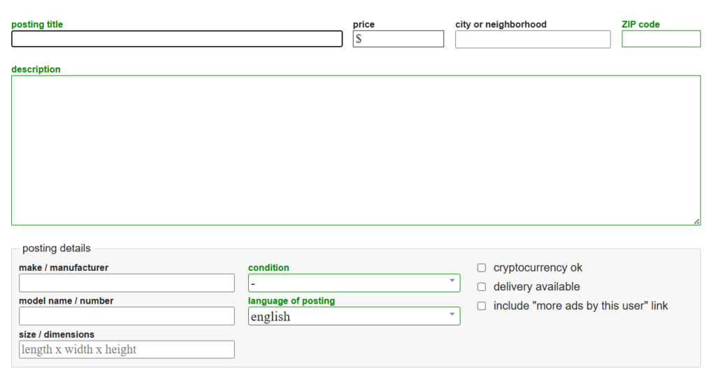
5. Disorganized Listings with Missing Information
Many posts lack key details, making it hard for users to find what they need.
Recommendation: Require essential listing information (such as price, location, and images) and encourage detailed descriptions.
Proposed Enhancements
To modernize Craigslist while keeping its simplicity, the following improvements are suggested:
Conclusion
This usability study highlights the need for a redesign that improves Craigslist’s security, navigation, and overall experience. By implementing these updates, Craigslist can remain a trusted marketplace while keeping up with modern usability standards. With these improvements, the platform can continue to serve millions while making the user experience much better.
For those interested in the full usability report and research findings, additional details are available upon request.
No responses yet