Designing a mobile app isn’t just about jumping into beautiful interfaces; it’s about building a journey. Prototyping is that journey. It’s how we bring structure to our ideas, test assumptions, gather feedback, and refine until the experience is not just functional, but fluid and user-focused.
Over the past few weeks, I’ve walked through the stages of this process, starting with low-fidelity wireframes, then user-testing, then medium-fidelity mockups, and finally arriving at a fully interactive, high-fidelity prototype created in Figma. This week was focused on developing those hi-fi screens based on everything I learned in earlier stages.
Why Prototyping Matters
Prototyping gives shape to ideas before investing too much time or effort into final development. Each phase plays a vital role:
Low-fidelity wireframes helped me sketch out the structure and navigation. View the prototype used for user testing
Medium-fidelity mockups allowed me to explore layout and functionality without distraction from design polish.
High-fidelity prototypes became the polished, interactive version of the app that closely simulates the real user experience.
Each stage invited feedback, helped surface usability issues, and led me to make smart, informed design choices.
User Feedback: The Driver of Change
After testing my low and medium-fidelity prototype with users, I gathered insights that directly influenced the changes I made for my high-fidelity version. Some of the major takeaways included:
- Clarity of labeling: I added more context to icons in the bottom nav for quicker navigation and renamed specific pages for even more clarity based on user feedback.
- Ease of access: Users preferred having critical actions (like reporting issues or making payments) front and center, so I elevated their visibility on the home screen.
- Consistency in UI: Users liked when active tabs were highlighted in the bottom nav, so I made sure that visual cue stayed consistent across the app.
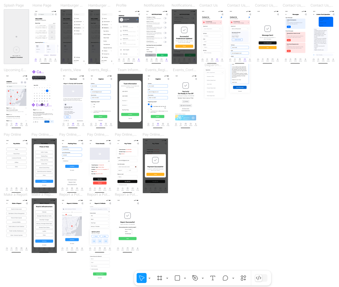
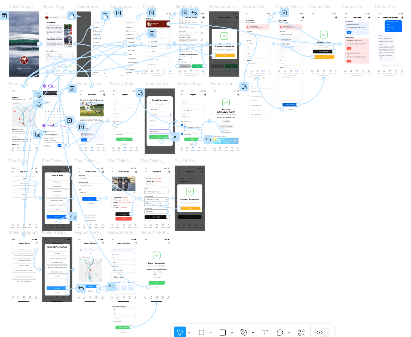
Screens & Key User Tasks
Below are the key tasks I designed for, shown through my high-fidelity screens created in Figma. These mockups represent the final evolution of my work, driven by feedback, iteration, and design thinking.
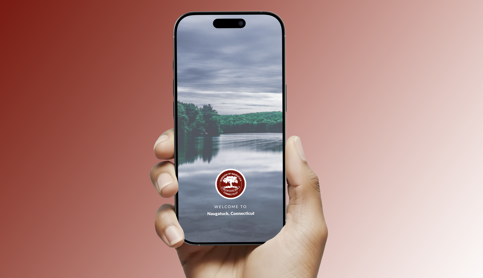
1. App Entry Point
Screens: Splash Page, Home Page, Hamburger Menu
The splash page introduces the app that refreshes after loading to the home page. The home screen features a news feed, event preview carousel, quick buttons for payments and reports, and a bottom nav bar for fast access. A hamburger menu offers additional tools not found in the main nav.
2. Setting Notification Preferences
Task: Customize Notification Settings via Profile Page
Users can toggle which types of notifications they want to receive and how they prefer to receive them (push, email, SMS). This screen was restructured to be more intuitive based on early feedback.
3. Sending a Message to a Department
Task: Contact Parks & Rec with a Question
From the contact page, users can select a department, view contact info, and send a message directly in app.
4. Viewing Sent Messages
Task: View Open or Closed Messages from Profile or Contact Page
Users can view all message threads with departments, similar to an SMS app interface. Threads show message status and allow ongoing conversations.
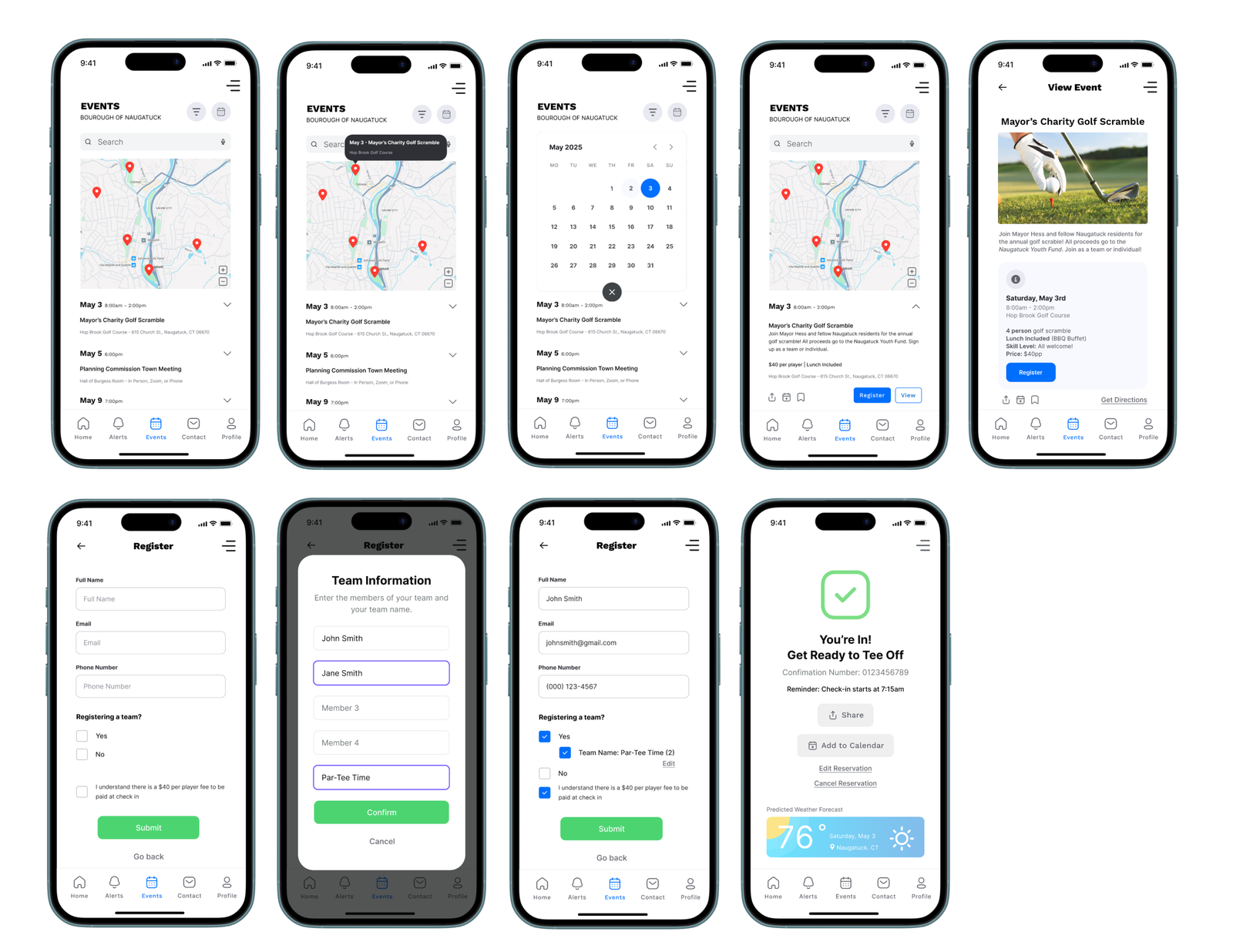
5. Registering for an Event
Task: Explore Calendar, Filter Events, and Register for the Mayor’s Charity Golf Scramble on May 3rd
Users can tap calendar pins, filter events, and view full event details. Registration includes a team sign-up option if applicable, confirmation, and calendar integration.
6. Paying a Parking Ticket
Task: Enter Ticket Details and Pay Online
A streamlined flow for users to pay fines, view ticket info, or dispute charges. Confirmation includes receipt delivery and reminders.
7. Reporting a Pothole
Task: Submit a Road Issue Report
Users select categories, drop a pin or enter an address, upload photos, and submit a report (optionally anonymously). They can also track reports through multiple notification methods.
Click here to view my walkthrough of the high-fidelity prototype for NaugatuckConnect
Experience the High-Fidelity Prototype Yourself!
Full Presentation:
Reflection
This process reminded me that great user experiences aren’t just built, they’re evolved. Creating prototypes in phases allowed me to test functionality without the pressure of perfection early on. It also helped me focus feedback; users responded differently to low-fidelity sketches than they did to polished, clickable screens.
User testing helped eliminate guesswork and build a better product. Small changes, like simplifying forms or clarifying navigation, made a huge difference in usability.
Tools like Figma made it easy to test and refine ideas quickly. From medium-fidelity wireframes to high-fidelity, interactive flows, the tool gave me the flexibility to iterate fast and collaborate effectively.
Prototyping is so much more than design; it’s how you build trust, usability, and clarity into your product. I’m proud of how far this app has come, and I’ve loved seeing a concept turn into something tangible that could genuinely serve the Naugatuck community.
No responses yet