Think of a grocery store. Imagine if all the products were placed randomly; milk next to chips, bread in the frozen aisle, and no signs to tell you where anything is. Shopping would be frustrating and time-consuming.
Information Architecture (IA) in web design is like organizing that grocery store so everything is in the right section, labeled clearly, and easy to find. It ensures that users can navigate a website effortlessly, just like how you instinctively know where to find cereal or produce in a well-organized store.
What is Information Architecture (IA)?
Information Architecture involves the strategic structuring, organizing, and labeling of content on a website to ensure that users can easily find and navigate information. Nielson Norman Group
It’s about understanding the relationships between different pieces of content and designing the navigation systems that guide users through the site intuitively.
Why Does IA Matter?
- Improves Usability – If visitors can’t find what they need, they’ll leave. A structured website keeps them engaged.
- Boosts SEO – Search engines prioritize well-organized content.
- Supports Growth – As a site expands, a solid IA helps integrate new content without confusion.
What is a Site Map?
A website or app’s structure can be illustrated through a site map, which acts as a blueprint for its organization. Think of it as the website’s “floor plan,” giving an overview of all the sections and subsections. Sitemaps are primarily used during the planning and design phases to ensure that the website’s content is organized logically.
Types of Site Maps:
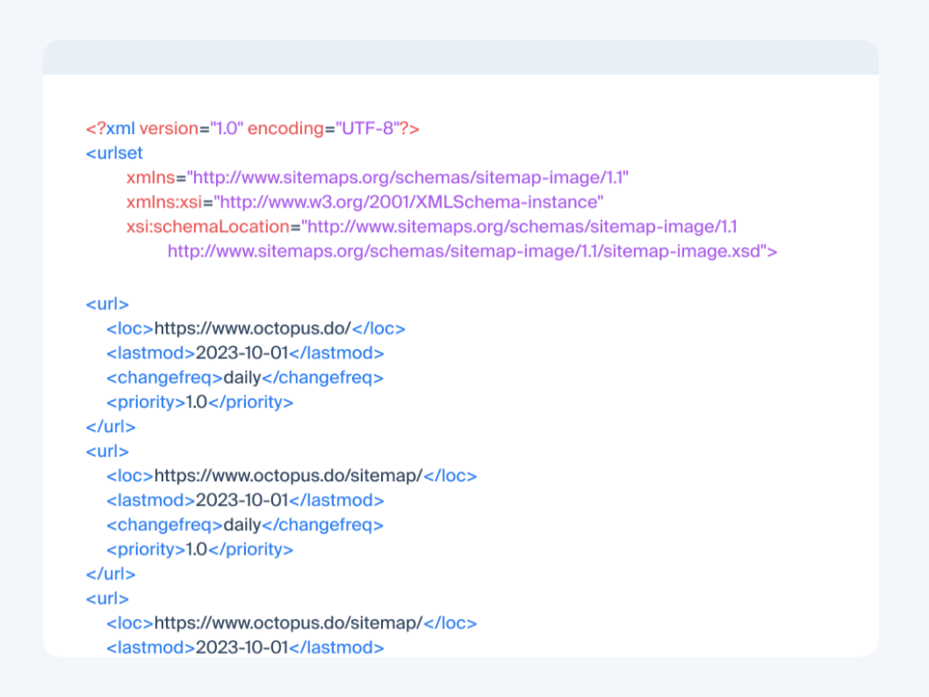
XML site maps: These are essential files designed for search engines, helping crawlers understand and index your website’s pages efficiently, aiding in search engine optimization (SEO).
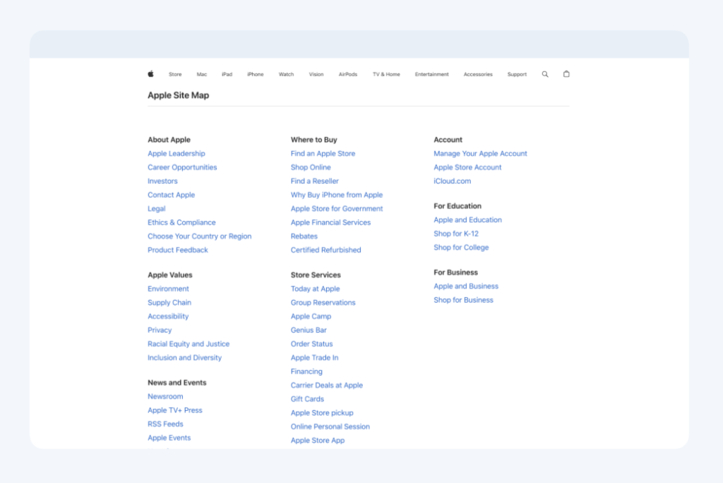
HTML site maps: Created for website visitors, these pages list important links to help users find their way around your site more easily.
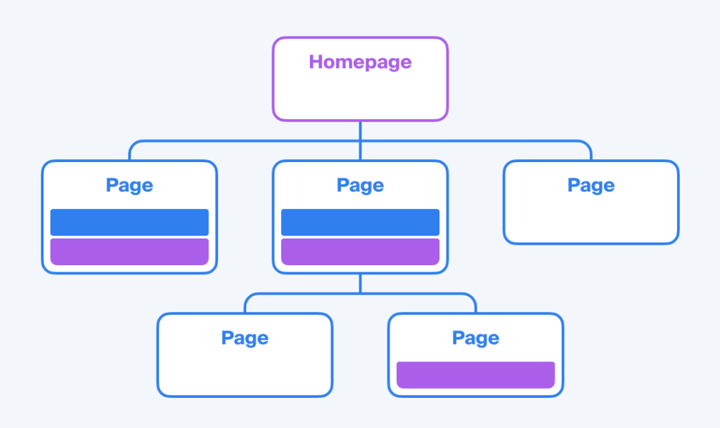
Visual site maps: Intended for human users, these diagrams offer a graphical overview of a website’s layout, showing how different pages connect and interact.
In the context of Information Architecture (IA), a sitemap visually outlines how a website is arranged and how users navigate through it. A visual sitemap uses shapes, colors, lines, and symbols to represent various IA components, such as pages, hierarchy, relationships, objectives, labels, content, and functionality. A legend typically accompanies the map to clarify the meaning of each visual element for easy interpretation.
Information architects create site maps to analyze a website’s existing framework, identify areas for improvement, or plan the structure of a new or redesigned site. Since websites often contain vast amounts of content, a site map provides a clear, high-level view of how everything is organized and the paths users follow to access information.
How Do They Differ?
While both sitemaps and Information Architecture deal with the organization of website content, they serve different purposes:
- Scope: Information Architecture is the comprehensive practice of organizing and structuring content across the entire website, focusing on usability and user experience. A sitemap, on the other hand, is a specific tool or deliverable that visually represents part of that structure.
- Purpose: IA is about creating a logical framework for content, ensuring that users can navigate the site intuitively. Sitemaps are used to document and communicate this structure, often serving as planning tools during the website development process.
- Visibility: The IA influences the design and navigation elements that users interact with, but it’s not something users see directly. Sitemaps may be used internally by designers and developers, and occasionally, a version is provided to users to aid in navigation.
In summary, Information Architecture is the strategic foundation that determines how information is organized and presented on a website, ensuring a seamless user experience. A sitemap is a visual representation of this structure, used primarily as a planning and reference tool.
Site Mapping Naugatuck’s Website
A well-structured site map is the foundation of any effective website, ensuring users can quickly find the information they need. For municipal websites like naugatuck-ct.gov, where diverse audiences seek a wide range of services, a clear and intuitive information architecture (IA) is essential. A strong IA improves usability, enhances accessibility, and ensures that content remains well-organized as the site evolves.
To guide the restructuring of Naugatuck’s site, I leaned on the Eight Principles of Information Architecture by Dan Brown, which serve as a framework for designing an intuitive and efficient digital experience:
- Objects – Treating content as living entities that evolve over time.
- Choices – Limiting options to prevent overwhelming users.
- Disclosure – Providing only necessary information at each step to avoid cognitive overload.
- Exemplars – Using examples to help users understand categories.
- Front Doors – Recognizing that users enter the site from various pages, not just the homepage.
- Multiple Classification – Offering different ways to access the same information.
- Focused Navigation – Ensuring menus and categories are clear and relevant.
- Growth – Designing the structure to accommodate future expansion.
With these principles in mind, I analyzed the current site map and identified areas for improvement to create a more effective structure.
Understanding the Existing Structure
The first step in the redesign process was conducting a deep-dive evaluation of the existing site. To fully understand how users interact with the current website, I took a hands-on approach by clicking through every single page. This allowed me to:
- Identify which pages are essential and frequently accessed.
- Pinpoint hard-to-find content that was buried under multiple clicks or poorly categorized.
- Analyze how content was structured, including how different sections connected.
Through this process, I discovered significant usability issues. Some of the most important resources required too many steps to access, while others were hidden within dropdown menus instead of having a dedicated landing page. Additionally, certain topics were scattered across multiple areas, making it harder for users to get a comprehensive view of a subject without excessive navigation.
Using Miro to Visualize and Optimize the Site Map
To create a more efficient and user-friendly structure, I used Miro, a visual collaboration tool, to map out both the current and proposed site maps. This allowed me to:
- See the full site hierarchy at a glance, identifying redundancies and content gaps.
- Test different navigation structures to determine the most intuitive organization.
- Ensure a logical flow from the homepage to key resources.
By leveraging Miro, I was able to strategically design a site map that simplifies navigation, eliminates unnecessary clicks, and prioritizes the most important content.
Current Website Site Map:
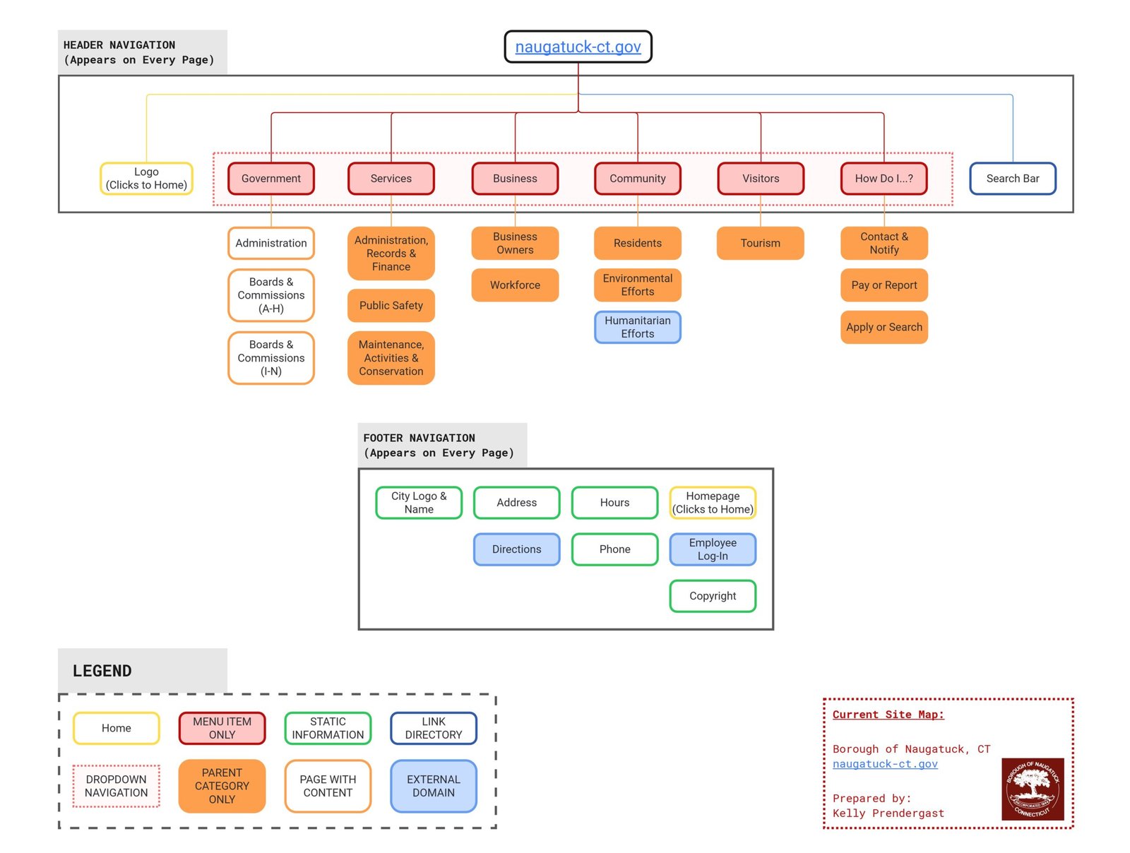
While the current structure provided access to a broad range of information, it lacked an intuitive and user-friendly approach. Some sections were too broad, leading to unnecessary clicks, while others scattered related content across multiple areas. Additionally, frequently accessed resources were not always positioned where users expected to find them.
One of the biggest usability issues was the reliance on dropdown-only menu items. In the current site map, many sections exist only within dropdown menus, requiring users to select from the dropdown without the option to click on a top-level category that leads to a dedicated landing page with all related content. This forced users to navigate multiple submenus to access information, making it harder to browse topics holistically.
Key Objectives for the Redesign
After identifying these pain points, I established clear objectives for restructuring the site map:
- Improve Navigability – Reduce the number of clicks needed to reach critical content.
- Enhance Logical Grouping – Align sections with how users naturally search for information.
- Eliminate Redundancy – Remove duplicate or overlapping pages for a more streamlined experience.
- Prioritize Essential Services – Ensure municipal services are easily accessible.
Proposed Website Site Map:
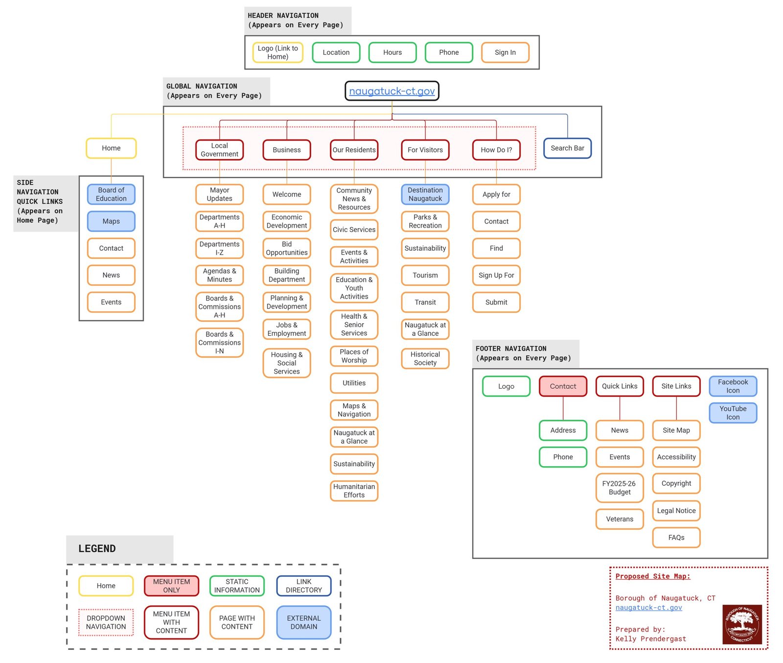
Strategic Changes in the Proposed Site Map
1. Structuring the Global Navigation Menu for User Needs
I carefully structured the global navigation dropdown menu in the following order to align with how different users approach the site:
- Local Government – Placed first because governance-related content is a priority for residents looking for administrative updates, departments, and public meeting agendas.
- Business – Positioned second to support local economic growth by making business resources like permits, licenses, and development programs easily accessible.
- Our Residents – Third in order to directly serve the primary audience—those who live in Naugatuck and need access to services like waste collection, health programs, and education.
- For Visitors – Fourth because visitors have different needs, such as tourism information, dining, and event listings, which are useful but not as immediately critical as resident and business services.
- How Do I? – Placed last as an action-oriented section to help users quickly complete tasks without searching through multiple menus. This provides a solution-driven experience.
This ordering ensures that the most frequently accessed municipal resources appear first, while also providing clear segmentation for different user types.
2. Enhancing the Header with Key Information
To improve accessibility and reduce the need for extra clicks, I added the following elements to the header:
- Location, Hours, and Phone Number – Placing this information at the top ensures that residents and visitors can quickly find essential contact details without searching through pages.
- Sign In Option – This allows users to access personalized or restricted content easily, such as government employees logging into internal systems.
This change enhances user efficiency by immediately presenting critical municipal contact details.
3. Implementing a Side Navigation on the Homepage for Quick Access
A new side navigation menu on the homepage was introduced to provide quick links to frequently accessed resources. This includes:
- Board of Education – Because many residents visit the site for school-related information.
- Maps – To help users locate government buildings, parks, and other key locations.
- Contact – Ensures easy access to department-specific phone numbers and email addresses.
- News & Events – So users can stay informed about municipal updates and upcoming activities.
This sidebar streamlines access to high-traffic sections and eliminates unnecessary steps in navigation.
4. Designing a Footer that Balances Quick Links & Essential Site Information
The footer was redesigned to serve two main functions:
- Quick Links for immediate access to:
- News & Events – Keeping residents updated.
- FY2025-26 Budget – Ensuring financial transparency.
- Veterans Information – Dedicated resources for veterans.
- Site Links for accessibility and compliance, including:
- Site Map – Providing a structured overview of all pages.
- Accessibility Statement – Ensuring ADA compliance.
- Copyright Information – Clarifying legal terms.
- FAQs – Answering common resident questions.
Additionally, Facebook and YouTube icons were included in the footer to encourage engagement with official borough social media channels for real-time updates and multimedia content.
Final Thoughts
A well-designed municipal website prioritizes usability, efficiency, and accessibility. The proposed site map represents a commitment to these principles, ensuring that naugatuck-ct.gov functions as a true digital gateway for the community.
The proposed site map reflects these principles by:
By structuring content around user needs and eliminating unnecessary complexity, this redesign creates a seamless and scalable digital experience for residents, businesses, and visitors alike. This isn’t just about aesthetics, it’s about function, usability, and ensuring that naugatuck-ct.gov serves as a true digital gateway for the community.
References
Brown, Dan and EightShapes, LLC. “Eight Principles of Information Architecture.” Bulletin of the American Society for Information Science and Technology, vol. 36, journal-article, 6, Aug. 2010.
Tankala, Samhita. “Information Architecture Vs. Sitemaps: What’s the Difference?” Nielsen Norman Group, 3 Sept. 2023, www.nngroup.com/articles/information-architecture-sitemaps.
Frantsman, Edgar. “What is a Sitemap: Everything You Need to Know (And More).” octopus.do, 27 Nov. 2024, octopus.do/sitemap/blog/what-is-a-sitemap-everthing-you-need-to-know-and-more.

22 Responses
[…] Read more about the website ia read more about the mobile app ia […]
Great information shared.. really enjoyed reading this post thank you author for sharing this post .. appreciated
This is really interesting, You’re a very skilled blogger. I’ve joined your feed and look forward to seeking more of your magnificent post. Also, I’ve shared your site in my social networks!
I like the efforts you have put in this, regards for all the great content.
Good post! We will be linking to this particularly great post on our site. Keep up the great writing
For the reason that the admin of this site is working, no uncertainty very quickly it will be renowned, due to its quality contents.
Great information shared.. really enjoyed reading this post thank you author for sharing this post .. appreciated
You’re so awesome! I don’t believe I have read a single thing like that before. So great to find someone with some original thoughts on this topic. Really.. thank you for starting this up. This website is something that is needed on the internet, someone with a little originality!
Pretty! This has been a really wonderful post. Many thanks for providing these details.
This was beautiful Admin. Thank you for your reflections.
I like the efforts you have put in this, regards for all the great content.
Excellent nice excellent great interesting excellent funny love perfect.
I do not even understand how I ended up here, but I assumed this publish used to be great
Great information shared.. really enjoyed reading this post thank you author for sharing this post .. appreciated
I’m often to blogging and i really appreciate your content. The article has actually peaks my interest. I’m going to bookmark your web site and maintain checking for brand spanking new information.
This topic is so relevant right now. Thanks for the timely post.
Short and to the point — exactly what I needed today.
Excellent explanation — the visuals were worth a thousand words.
Awesome! Its genuinely remarkable post, I have got much clear idea regarding from this post
Very well presented. Every quote was awesome and thanks for sharing the content. Keep sharing and keep motivating others.
This is my first time pay a quick visit at here and i am really happy to read everthing at one place
I very delighted to find this internet site on bing, just what I was searching for as well saved to fav