Before diving into the bold colors, retro-futuristic themes, and typography decisions, let’s talk about a quiet design hero: the Golden Ratio.
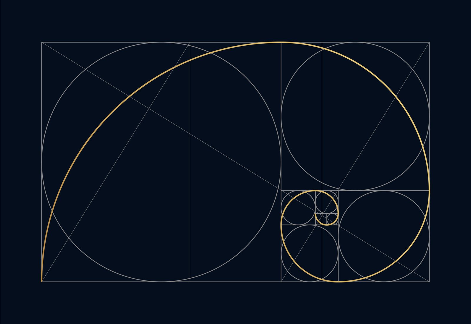
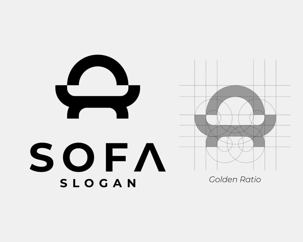
The Golden Ratio is nature’s own layout tool, a proportion found everywhere from seashells and sunflower seeds to Da Vinci’s sketches and modern-day logos. As Adobe puts it in their Golden Ratio guide, it’s about “achieving natural balance,” and it’s a game-changer when you’re trying to create designs that feel both polished and intuitive.
In my Burning Man 2025 promo materials, I leaned into that sense of balance and proportion, not just visually, but thematically. This year’s event is all about “Tomorrow Today”, a bridge between analog past and sci-fi future. Using layout principles (like the Golden Ratio), I aimed to give each design structure, flow, and just the right amount of visual breathing room. Whether it’s a poster or a social post, I wanted the eye to move naturally from one element to the next, like a spiral unfolding across the page.
In the words of Cath Caldwell, “Good layout leads the eye.” Layout isn’t just about placing text and images; it’s about directing attention, creating hierarchy, and telling a story. For my Burning Man 2025 promotional package, I focused on applying those exact principles, bringing cohesion and purpose to every piece I created.
This year’s theme is what inspired my creative direction: a fusion of retro, sci-fi, and modern aesthetics. Think: desert sunset meets futuristic analog tech. I chose this vibe because it reflects the surreal, otherworldly energy of Burning Man, while still hinting at optimism and transformation; a visual bridge between nostalgia and imagination.
Event Poster & Flyer: A Visual Manifesto
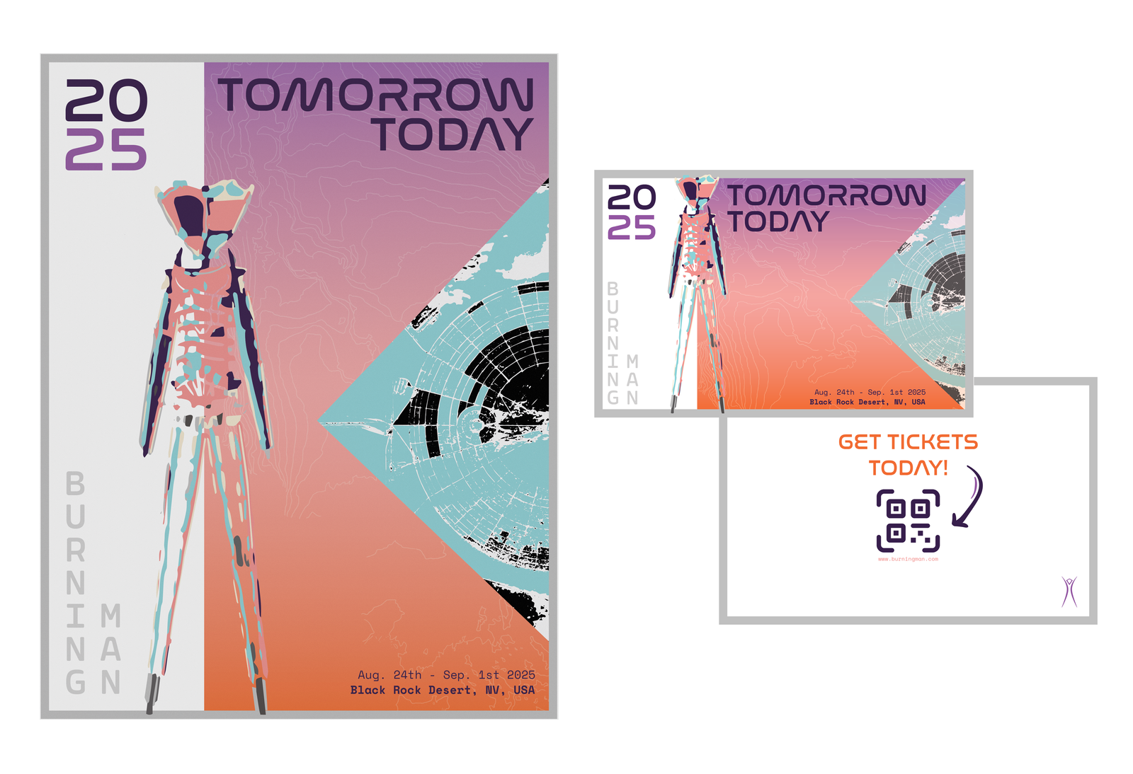
The poster is the hero of the set. It introduces the visual identity of the event through a bold layout: a gradient sky fading from desert orange to cosmic purple, echoing the sunset over Black Rock Desert. Overlaying that is topography, a nod to the land itself, and a triangular cropped aerial map of the festival grounds to give structure and balance.
Inspired by Caldwell’s emphasis on typographic hierarchy, I used two typefaces and color contrasts to clearly separate title, date, and location. This helps viewers quickly digest info whether they’re passing by or taking a closer look.
The flyer mirrors the poster’s design, but with slight adjustments for scale and purpose. Since flyers are handheld, I added a back side with a QR code for instant access to the website and ticketing, bridging analog and digital, which felt super appropriate for the theme of “Tomorrow Today.”
VIP Badges: Designating Access with Distinction
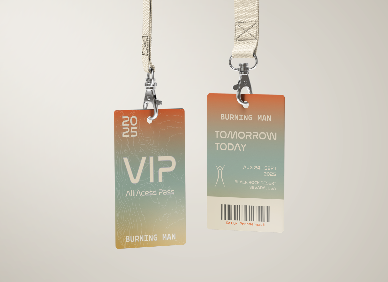
VIP badges needed to feel special, like a true exclusive pass. To set them apart while keeping them on-brand, I introduced a softer gradient with a teal-to-orange tone. It still references the desert, but it subtly shifts the vibe toward a more elevated, serene mood.
As Caldwell notes, scale and spacing are key to clarity. I gave plenty of breathing room around the text and barcode to avoid clutter and made sure the “VIP” label stood out boldly. It’s simple, sleek, and readable from a distance (which matters when someone’s flashing their pass to a gatekeeper at sunset with goggles on).
Facebook: Social-First Simplicity
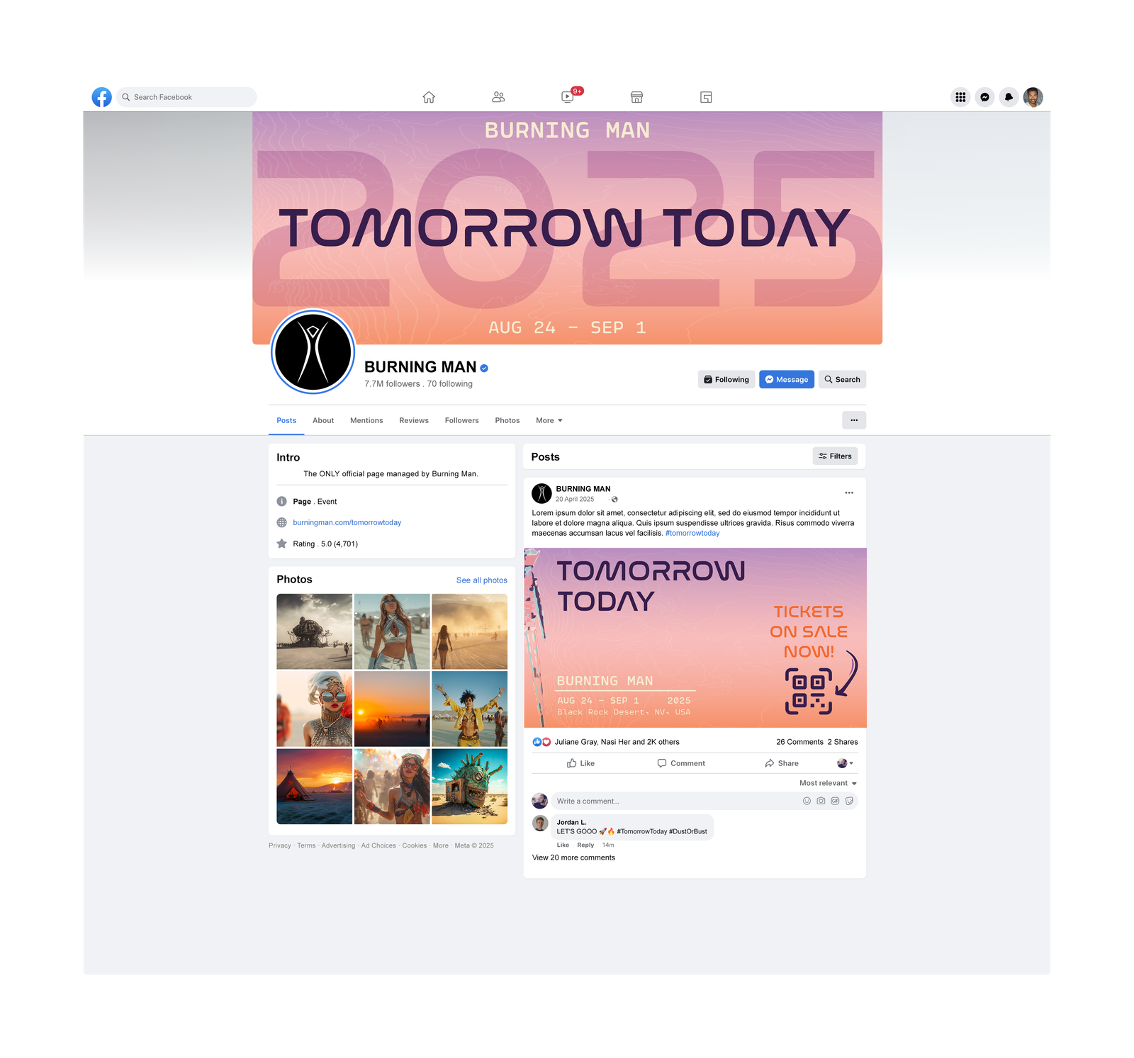
Digital layouts need to adapt to fast-scrolling behavior. With that in mind, I kept the banner minimal and text-centered: bold year in the background, title front and center, and a clean, color-forward aesthetic that’s instantly recognizable across devices.
The thumbnail takes a more promotional tone, “Tickets on Sale Now!”, designed with urgency and contrast in mind. The arrow and QR code are deliberate focal points to drive action, while still staying true to the overall visual theme.
Instagram: Image-Driven Engagement
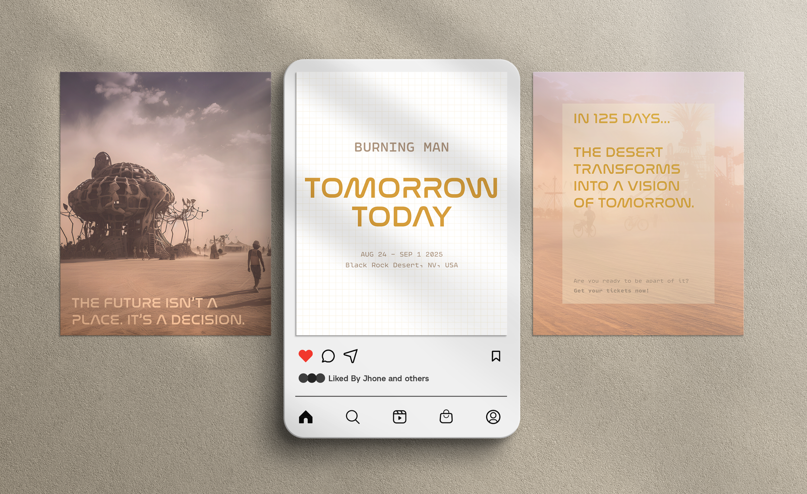
Instagram is a visual playground and Caldwell emphasizes the importance of pacing and rhythm in multi-page layouts. I took that to heart by designing a carousel series of promotional posts, two using real imagery from past events layered with type and textures from my poster design.
I kept the fonts consistent for brand unity, but used image-based backgrounds to catch the algorithm’s eye. According to engagement research, photo content performs better on Instagram, so this shift wasn’t just aesthetic, it was strategic.
The last post in the set is a countdown-style teaser, connecting to the anticipation and community-building aspect of the event. I wanted people to feel the build-up, not just see it.
Event T-Shirt: Wearable Identity
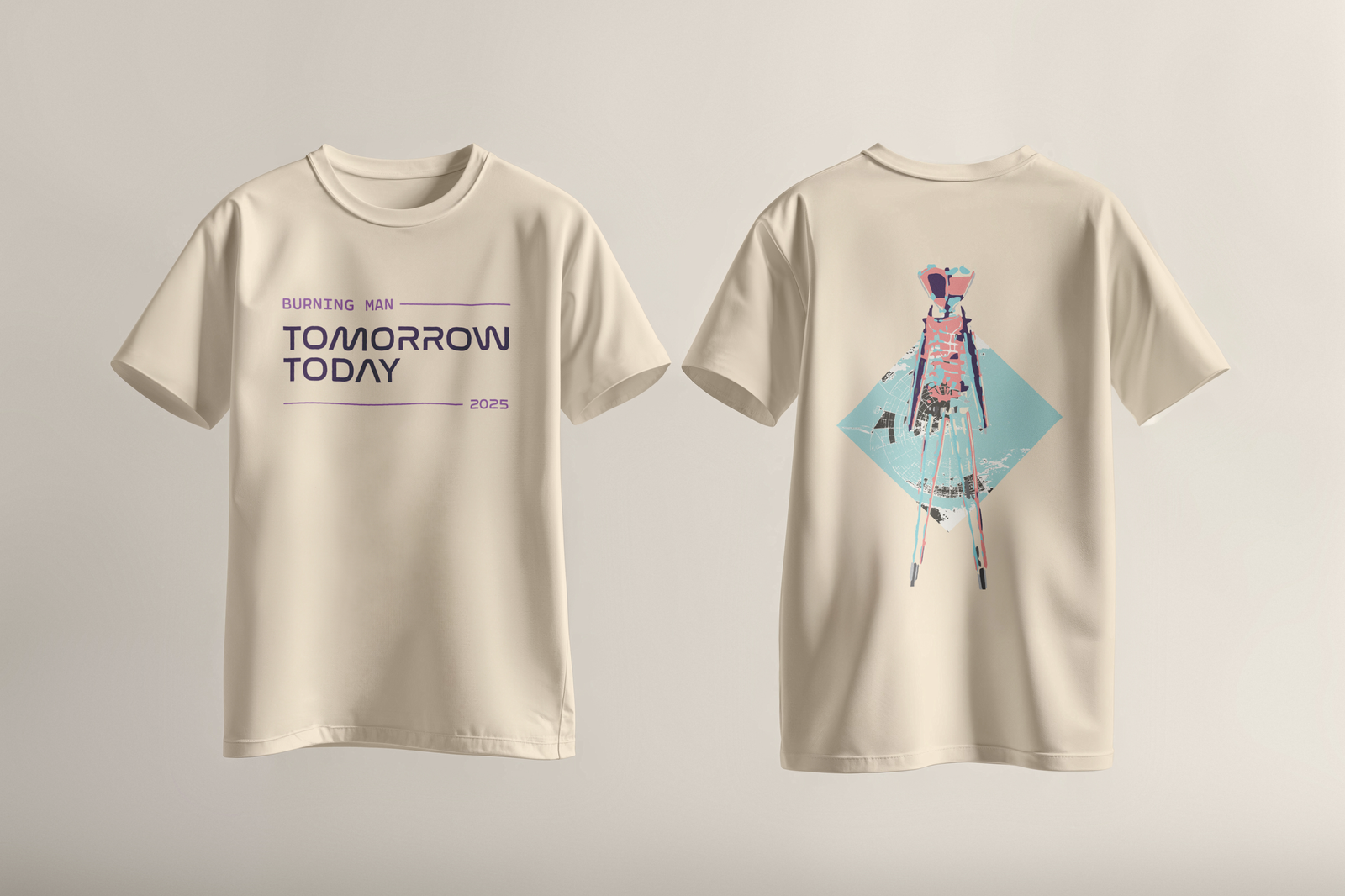
For the final piece, I designed a t-shirt that fans would actually want to wear, not just during the festival, but beyond. The front is clean: just the event name and year. The back, however, features my abstract Burning Man illustration and aerial triangle stage motif, tying it back to the original poster. It’s art-forward, bold, and rooted in the same visual DNA.
Final Thoughts: Layout as Language
Every piece in this set was designed with intention; using layout as the silent guide that tells viewers where to look and how to feel. Whether it’s directing attention with hierarchy, creating emotion with color, or leading the eye with structure, layout is the thread that ties the experience together.
As Cath Caldwell reminds us, design isn’t just about decoration, it’s about communication. For Burning Man 2025, I wanted every design to speak the same language: futuristic, bold, and unified in the spirit of Tomorrow Today.
References
Caldwell, Cath. (2019). Graphic Design for Everyone: Understand the Building Block so You can Do It Yourself. DK.
Obermiller, J., & Berndt, S. (n.d.). Golden ratio: A beginner’s guide | Adobe. https://www.adobe.com/creativecloud/design/discover/golden-ratio.html
No responses yet