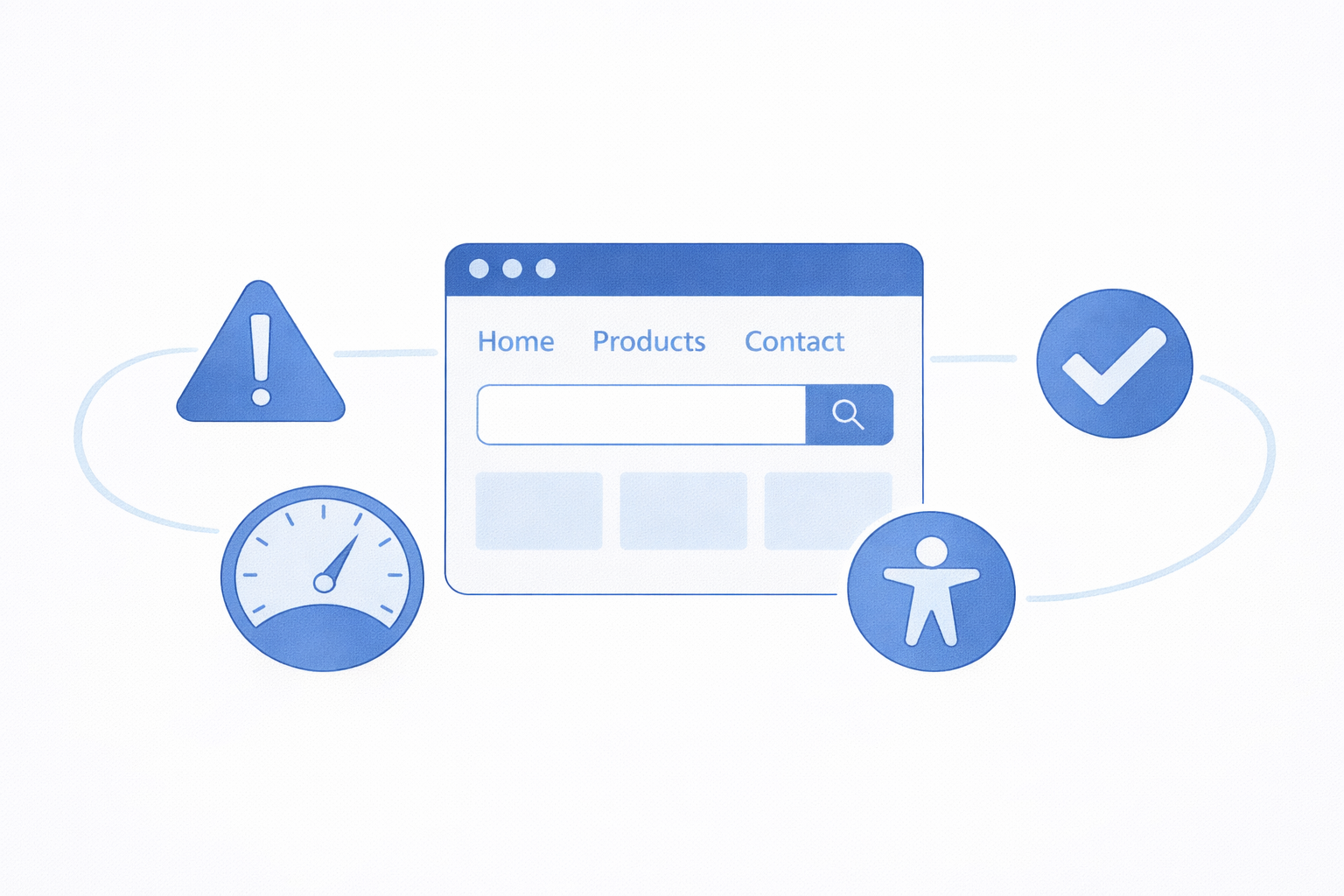
A practical breakdown of usability, clarity, efficiency, and accessibility
Ever landed on a website and thought, “Why is this so hard?” You’re not alone. A beautiful interface means nothing if users can’t figure out what to do… or worse, give up trying.
That’s where usability comes in. It’s not flashy. It’s not trendy. But it’s the difference between a website people use and one they abandon.
What Is Website Usability?
At its core, usability is how easy it is for people to accomplish what they came to do.
A usable website answers three questions immediately:
- Where am I?
- What can I do here?
- How do I do it?
If users have to think too hard about any of those, you’ve already lost points.
Clarity
Clarity is the foundation of usability. If users can’t understand your site, nothing else matters.
What clarity looks like:
Clear Navigation Labels
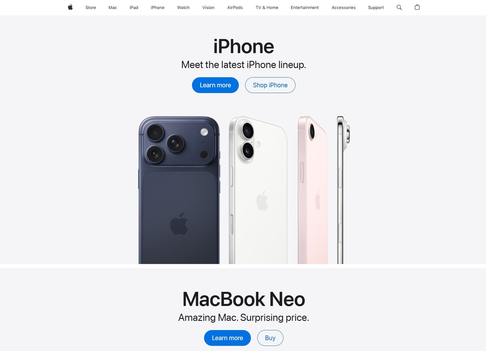
Apple’s website keeps things simple and focused. Its clean navigation highlights key product categories, making it easy to browse without distraction.
Clear visuals and minimal text guide users quickly to the information or product they’re looking for without guessing.
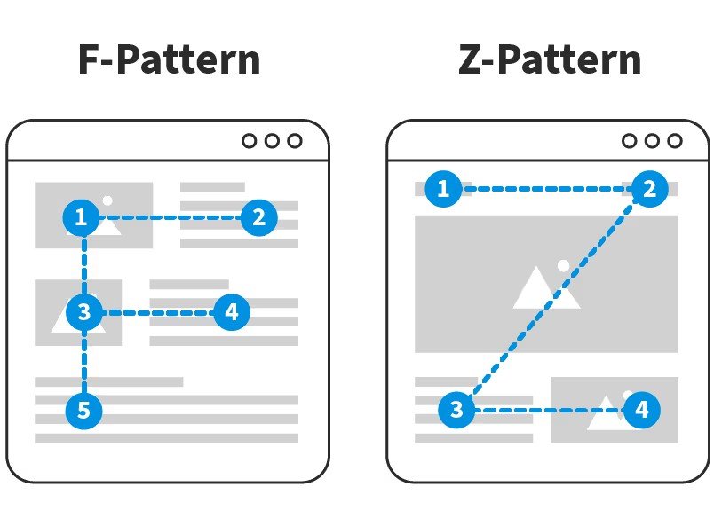
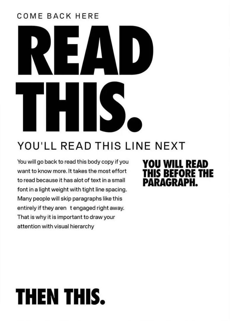
Visual Hierarchy
We typically scan content in an F-pattern (top to bottom, left to right) or a Z-pattern (top left → top right → bottom left → bottom right). Placing key information along these paths helps ensure it gets seen.
Key Principles for Creating Clear Hierarchy include: Size, Contrast, Spacing & Grouping, Typography, and Alignment
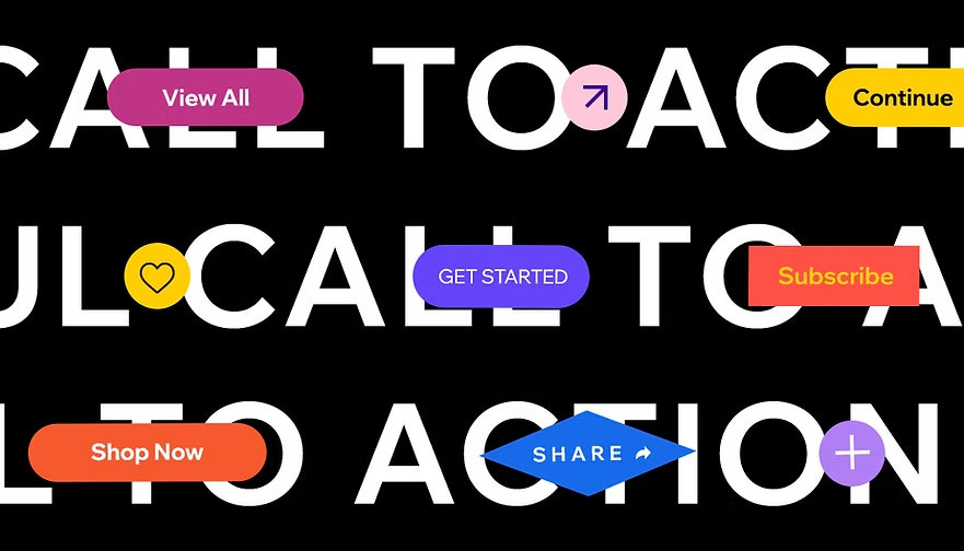
Straightforward messaging
A strong call-to-action (CTA) tells users exactly what to do and what they’ll get: no guessing, no fluff. Instead of vague phrases like “Learn More,” effective CTAs use clear, action-driven language like “Download the Guide,” “Start Your Free Trial,” or “Book Your Appointment.” The goal is simple: make the next step obvious and easy to take.
What kills clarity:
- Vague menu names like “Explore” or “Discover”
- Walls of text with no structure
- Overdesigned layouts that hide important info
Rule of thumb: If a first-time visitor can’t scan and understand your page in 5 seconds, it’s too complicated.
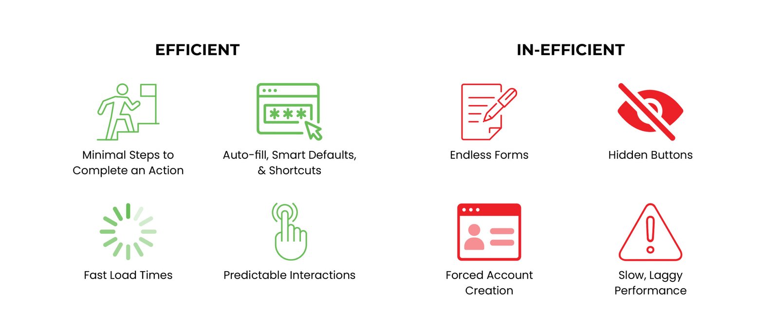
Efficiency
Efficiency is about how quickly and easily users can complete tasks.
People don’t visit websites for fun (well, usually). They have a goal. Your job is to get them there fast.
Every extra click is a chance for someone to leave.
Accessibility Basics
Accessibility ensures your website can be used by people of all abilities, not just the “average” user. Good design works for everyone.
Accessibility essentials:
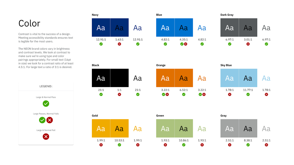
High color contrast for readability
Keyboard navigation support
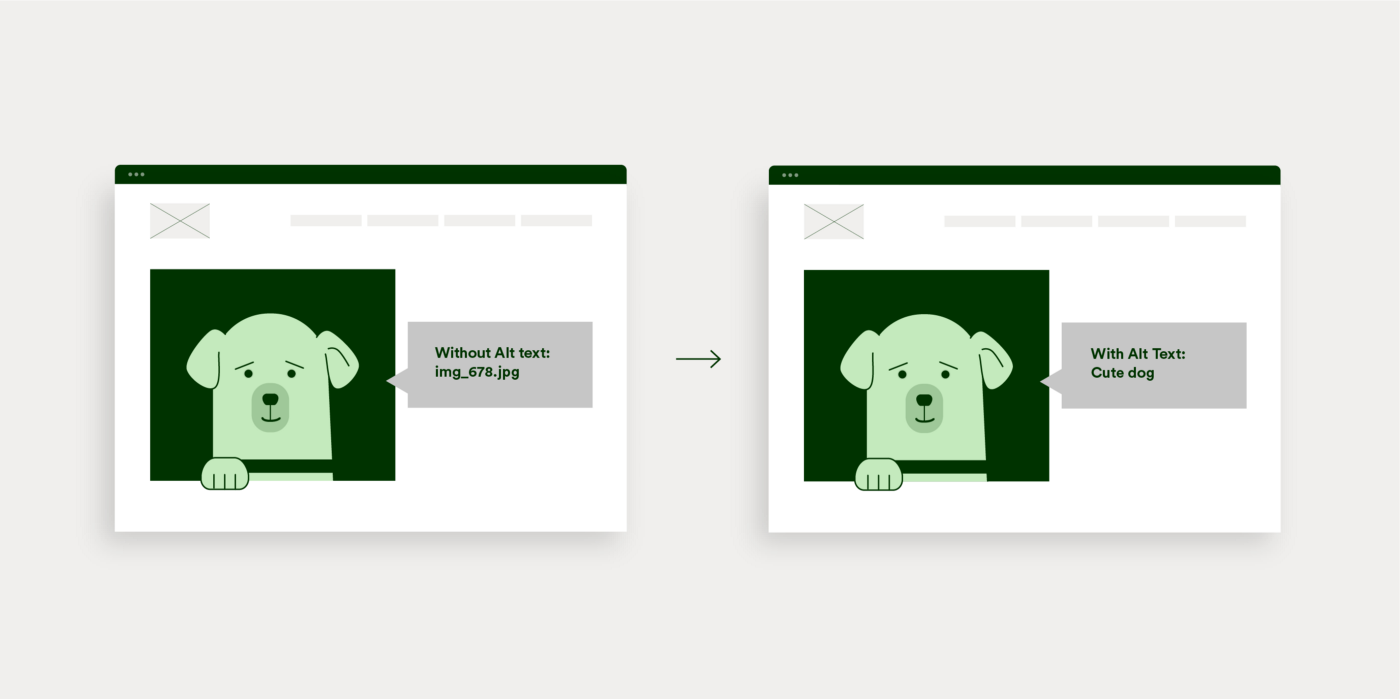
Alt text for images
Common accessibility mistakes:
Designing for accessibility isn’t a “nice to have.” It’s baseline quality.
Good vs. Bad Usability
A good experience:
You land on a site. Within seconds, you understand what it offers. You find what you need, complete your task, and leave without thinking twice.
A bad experience:
You land on a site. You’re confused. You click around. Nothing makes sense. You get annoyed… and leave.
Why Usability Matters
Usability directly impacts:
- User satisfaction – People remember how easy (or painful) something felt
- Conversion rates – Confused users don’t convert
- Trust – A messy site feels unreliable
- Retention – If it’s frustrating, they won’t come back
Good usability feels invisible. Bad usability is unforgettable.
Website Usability Checklist
Structure & Navigation
Content & Clarity
Efficiency
Accessibility
Heuristics
Heuristics are general usability principles used to evaluate how easy and intuitive a website or interface is to use. Instead of strict rules, they act as practical guidelines that help designers identify common issues, like confusing navigation, lack of feedback, or inconsistent design, before users run into them. By applying heuristics, designers can create more user-friendly experiences that feel natural, predictable, and efficient.
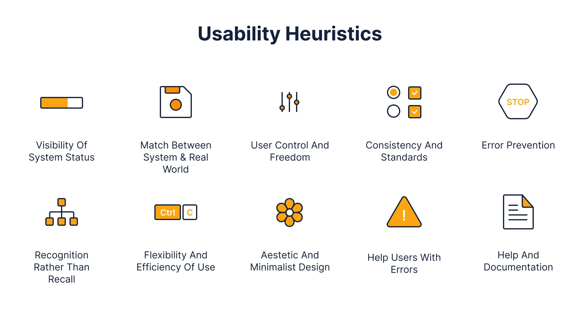
Classic Usability Principles:
Visibility of system status → Keep users informed
Match between system & real world → Use familiar language
User control & freedom → Make undo/exit easy
Consistency & standards → Don’t reinvent common patterns
Error prevention → Stop problems before they happen
Recognition over recall → Don’t make users remember things
Flexibility & efficiency → Support both beginners and power users
Aesthetic & minimalist design → Cut the clutter
Help users recover from errors → Clear, helpful messages
Help & documentation → Provide support when needed
Top Website Usability Mistakes
Design trends come and go. Usability problems stick around.
Let’s Talk
What’s the most frustrating website you’ve ever used? And what made it so bad? Let me know in the comments.
References
IxDF – Interaction Design Foundation. (2016, August 31). What is Visual Hierarchy?. IxDF – Interaction Design Foundation. https://ixdf.org/literature/topics/visual-hierarchy
Afolabi, P. (2025, May 16). The Quiet Power of Visual Hierarchy. Medium. https://medium.com/@peafolabi/the-quiet-power-of-visual-hierarchy-a291fdec9bbc
Wang, H.-H. (2025, May). Test Keyboard Accessibility On Your Website. Nielsen Norman Group. https://www.nngroup.com/videos/no-mouse-keyboard-accessibility
Lederman, M. (2023, February 1). 6 Guidelines for Accessible Website Design. Aten Design Group. https://atendesigngroup.com/articles/6-guidelines-accessible-website-design
Furlough, C. (2022, August 16). 8 mental model design heuristics. Medium. https://uxdesign.cc/8-mental-model-design-heuristics-85d2e3133128
No responses yet