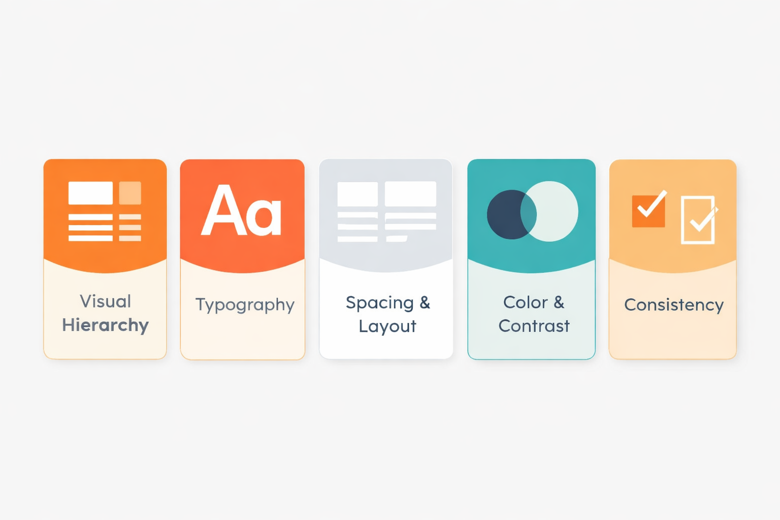
The best interfaces feel effortless because they guide you without you noticing. That doesn’t happen by accident. It comes down to a handful of core visual principles working together behind the scenes.
When hierarchy, typography, spacing, color, and consistency work together, the interface becomes clear, usable, and even enjoyable.
And most users won’t notice why… it’ll just feel right.
Let’s break down five essentials that separate confusing screens from clean, usable ones.
1. Visual Hierarchy
– Show What Matters First
If everything screams for attention, nothing gets heard.
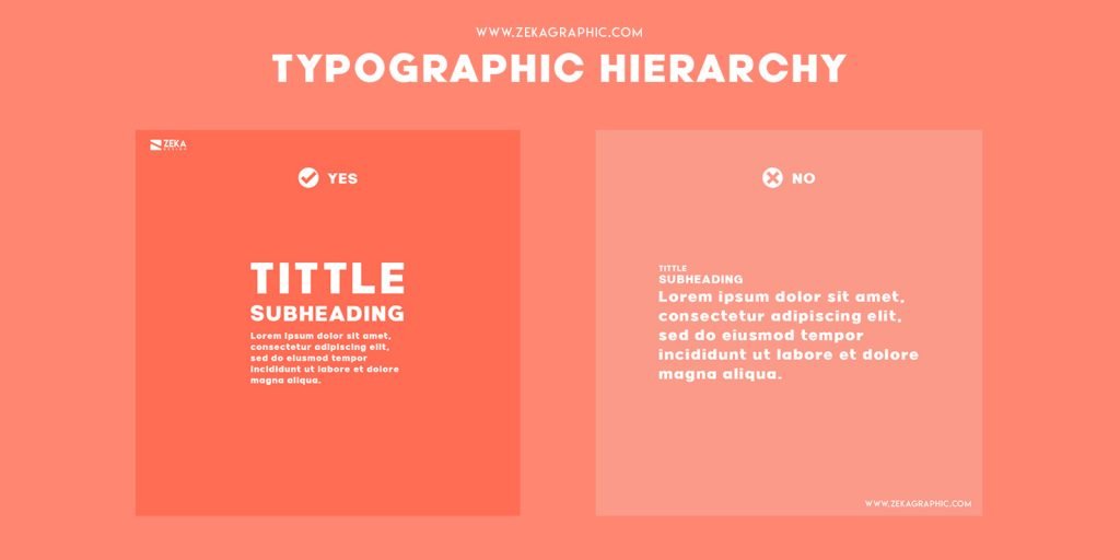
Visual hierarchy is how you guide the user’s eye. It tells people what to look at first, second, and third without them thinking about it.
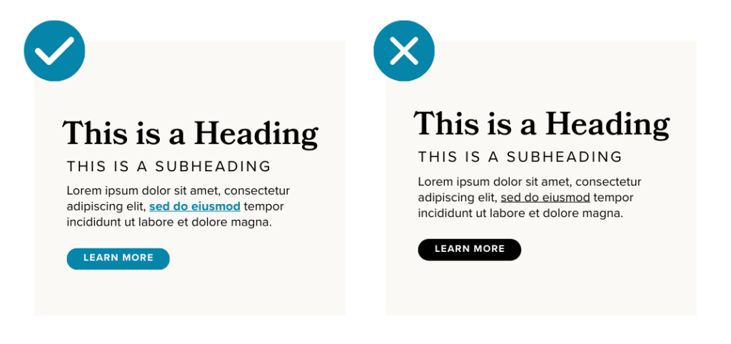
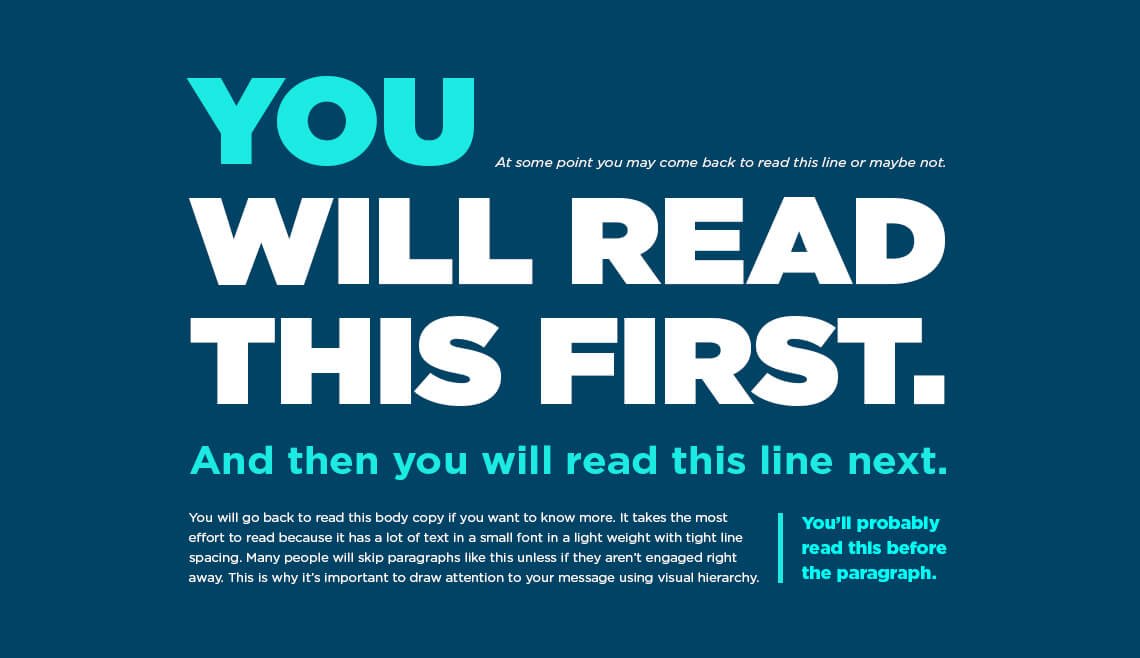

A strong hierarchy makes it obvious what to do next. A weak one makes users hesitate, and hesitation is where people drop off.
2. Typography
– Make It Easy to Read
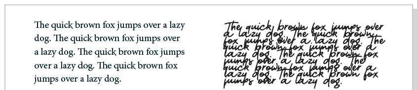
Typography
Typography is the bigger picture. It’s the design practice of arranging text so it’s readable, clear, and visually appealing.
Font
A font is the actual file or style of text.
Think: Arial Bold, Roboto Regular, Times New Roman Italic.
It’s the specific version of a typeface; weight, size, and style included.
Good typography feels invisible. Bad typography feels like friction.
Focus on:
Readable fonts (skip overly decorative styles)
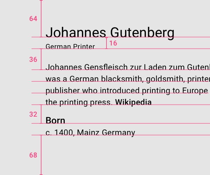
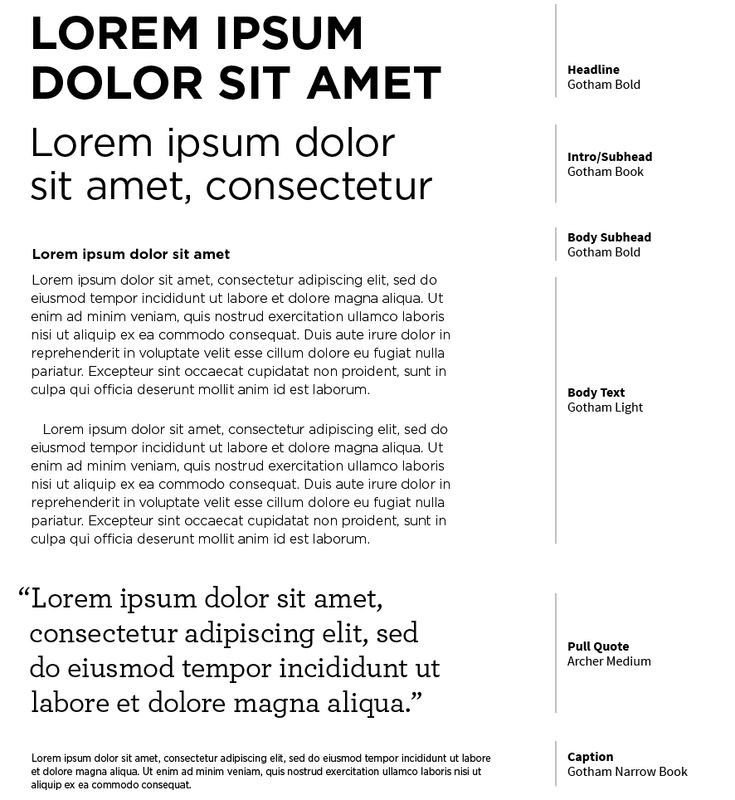
Clear size differences (headings vs. body text)
Line spacing that doesn’t feel cramped
Consistent text styles
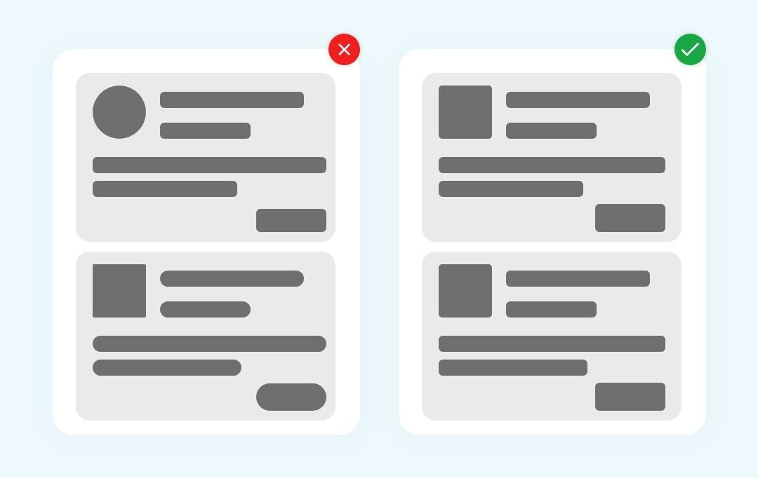
3. Spacing & Layout
– Give Things Room to Breathe
Crowded interfaces overwhelm people. White space (or negative space) is what keeps everything digestible.
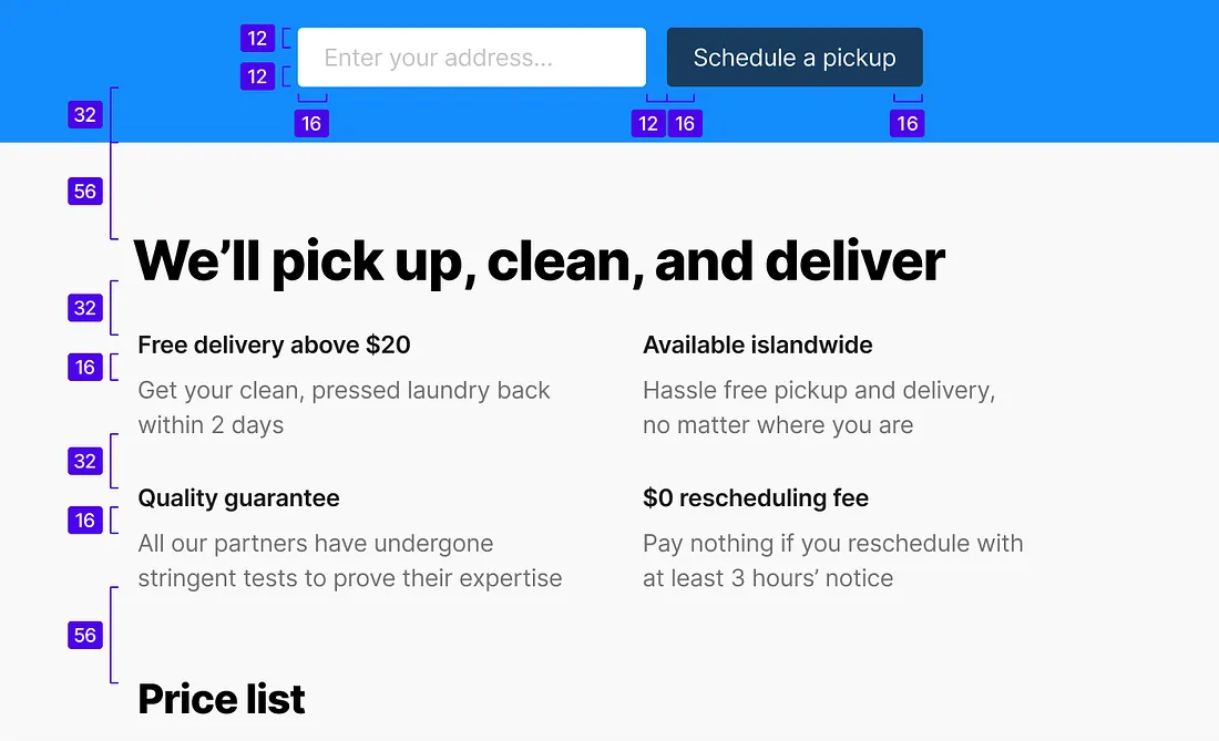
Spacing helps separate different sections, group related elements, reduce visual noise, and improve focus.
A clean layout isn’t empty. Every gap has a purpose.
If your design feels “off,” it’s usually a spacing problem, not a color problem.
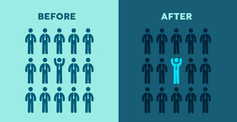
4. Color & Contrast
– Guide Attention and Improve Usability
Color is powerful, but only when used with control.
It should help users understand the interface, not decorate it.
Use color to:
Highlight important actions (like buttons)
Show states (error, success, warning)
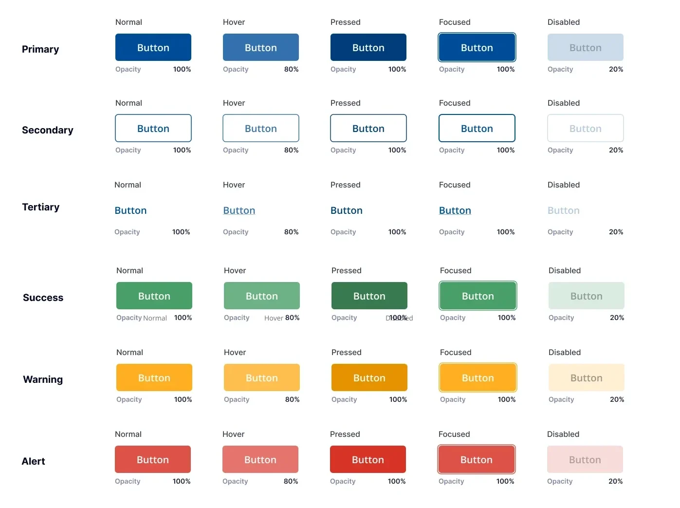
Create contrast between elements
Contrast is especially important for readability and accessibility. If users can’t clearly see or distinguish elements, the design fails… no matter how good it looks.
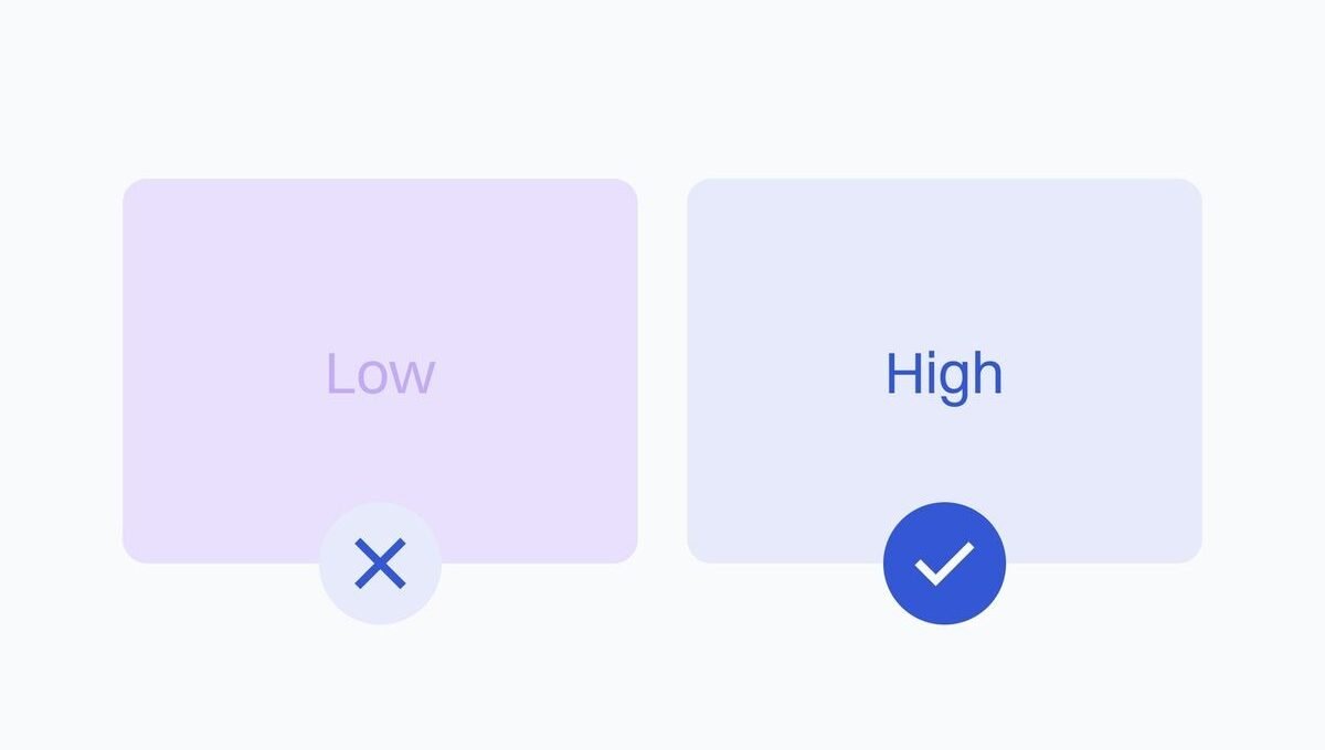
If everything is colorful, nothing stands out.
5. Consistency
– Make It Feel Familiar
Consistency is what makes an interface feel intuitive.
When elements behave the same way across a product, users don’t have to relearn anything. They just move.
Consistency applies to:
- Buttons and interactions
- Colors and styles
- Spacing and layout patterns
- Typography rules
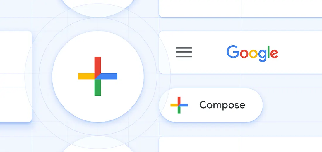
Google’s Material Design System
A great example of consistency in action is Google’s design system. Across Google products, you’ll notice the same button styles, spacing rules, color usage, and interaction patterns. This consistency means users don’t have to relearn how things work every time they switch between apps like Gmail, Google Drive, or Google Maps. It creates a sense of familiarity and reliability, making interfaces feel intuitive right away. When design stays consistent, users can focus on what they’re trying to do, not how to do it.
Break consistency, and you create confusion. Keep it tight, and everything feels predictable. In a good way.
Let’s Talk
Which of these design elements do you notice first when using a website? Let me know in the comments.
References
Chrisa. (2024, June 17). The power of information hierarchy in web design & UX. Roadmap. https://theroadmap.co/blog/the-power-of-information-hierarchy-in-web-design-ux/
Lile, S. (2022, February 1). 12 Visual Hierarchy Principles Every Non-Designer needs to know. Visme Blog. https://visme.co/blog/visual-hierarchy/#size-impacts-visibility
Iakovlev, Y. (n.d.). Visual Hierarchy Principles in Graphic Design. Zeka Design. https://www.zekagraphic.com/visual-hierarchy-graphic-design-principles/
Flowmapp. (2022, October 5). Clean UI Guide: 15 White Space Design Tips. Medium. https://medium.com/@Flowmapp/clean-ui-guide-15-white-space-design-tips-c5320e248a26
Material Design. (2024, December 23). How Google created a custom Material theme. https://m3.material.io/blog/google-material-custom-theme
Qing Lim, Y. (2021, February 3). Applying white space in UI design. Medium. https://uxdesign.cc/whitespace-in-ui-design-44e332c8e4a
No responses yet