Color Choices and Creative Risks
Coming from an interior design background, the discussion of color sense in Animated Storytelling, by Liz Baker, felt very familiar and validating. I work with color theory every day through teaching students how hue, saturation, value, and tone affect how a space is perceived and how emotions are communicated through rendered interiors and materials. Those same principles translate seamlessly into animation and storytelling. In my own linear story idea, I was already thinking about how yellow conveys positive, uplifting energy, while darker greys signal sadness or depression, which reinforced how intentionally chosen color can clarify emotional beats. The idea of using color scripts and pre-color scripts especially stood out to me, as they mirror the way designers plan palettes and moods before final execution.
PCS from Popular Movies:
Prioritizing the main subject through contrast and restraint, rather than letting background colors compete for attention, reinforces the idea that less is more and that a dominant thematic color paired with a thoughtful accent can unify an entire piece.
As both an educator and designer, the weird science and emphasis on experimentation and letting go of self-judgment strongly resonated with me in Baker’s book. Creativity thrives when you stop worrying about making something “good” and allow yourself to make “bad art”, iterate, and explore wild ideas without fear. This approach aligns closely with how I already work; drawing inspiration from previous projects, refining ideas through iteration, and understanding that the first solution is rarely the best one. There’s a common saying in design to not reinvent the wheel, and this chapter reinforced that sometimes the most effective experimentation comes from studying what already works and making it your own. There is no single correct way to create something great, and how you choose to move, design, transition, and animate elements ultimately reveals your personal style and the soul of your work.
Research to Inform: Stop-Motion Inspiration
Lost & Found (2018), absolutely hit me in the feels… it almost made me cry. What makes it so powerful isn’t just that it’s beautifully animated (which it is), but how emotionally resonant and clear the storytelling is, especially for something told without any dialogue. The way the characters and their journey are crafted grips you instantly and holds your attention through every beat of the narrative. It’s a great example of how strong visual storytelling can communicate universal themes like love, loss, and perseverance with such clarity that you feel the story, not just watch it. For anyone interested in how mood, character, and emotional weight are conveyed through animation alone, this film is a standout inspiration.
Lego Bowling by Alexander Studios (2018) turns a simple, everyday moment into something playful and engaging. The scene feels nostalgic and full of personality, and it’s clear the animator put a lot of patience into choreographing each brick and character movement. I imagine this was accomplished through careful frame-by-frame repositioning of the Lego pieces and figures, likely using a stable rig and consistent lighting to avoid flicker. The result feels alive and seamless despite the tiny scale.
I chose this Felt Stop-Motion Breakfast by Andrea Love (2024) because of its incredible craftsmanship and attention to detail at such a small scale. I can’t even imagine how long it took to make… everything from the counter and stove to the eggs and pancakes is entirely made out of felt. The miniature size and soft materials give the piece a warm, handmade quality, and it’s a great reminder that even the simplest ideas can become memorable through patience, texture, and thoughtful execution.
The Story of Vans (2016) uses stop-motion techniques to create a dynamic, historical narrative about a brand and its culture. The animation combines real objects and texture with a thoughtful design pace to communicate milestones visually and creatively. I imagine it was accomplished through careful frame-by-frame manipulation of branded elements, consistent lighting, and a strong storyboard that gave rhythm to the storytelling.
Every movement of Samsung – Paper Skater (2019) feels intentional, and the tactile quality of the materials makes the animation especially engaging. It’s clear the creator paid close attention to detail, likely using frame-by-frame adjustments with consistent lighting and careful staging to maintain smooth motion.
Process + Story Development
Linear Storyline: Rubik’s Cube Transformation
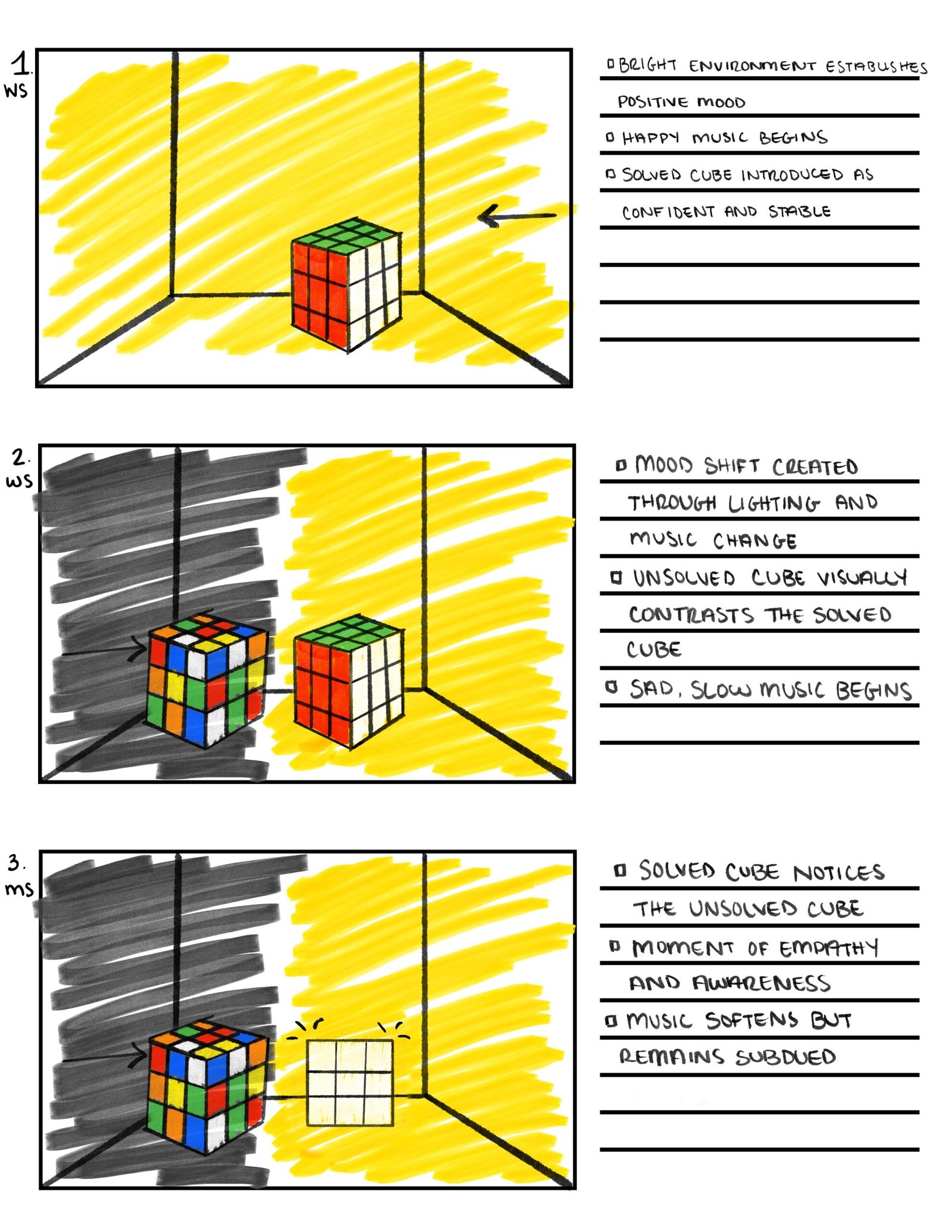
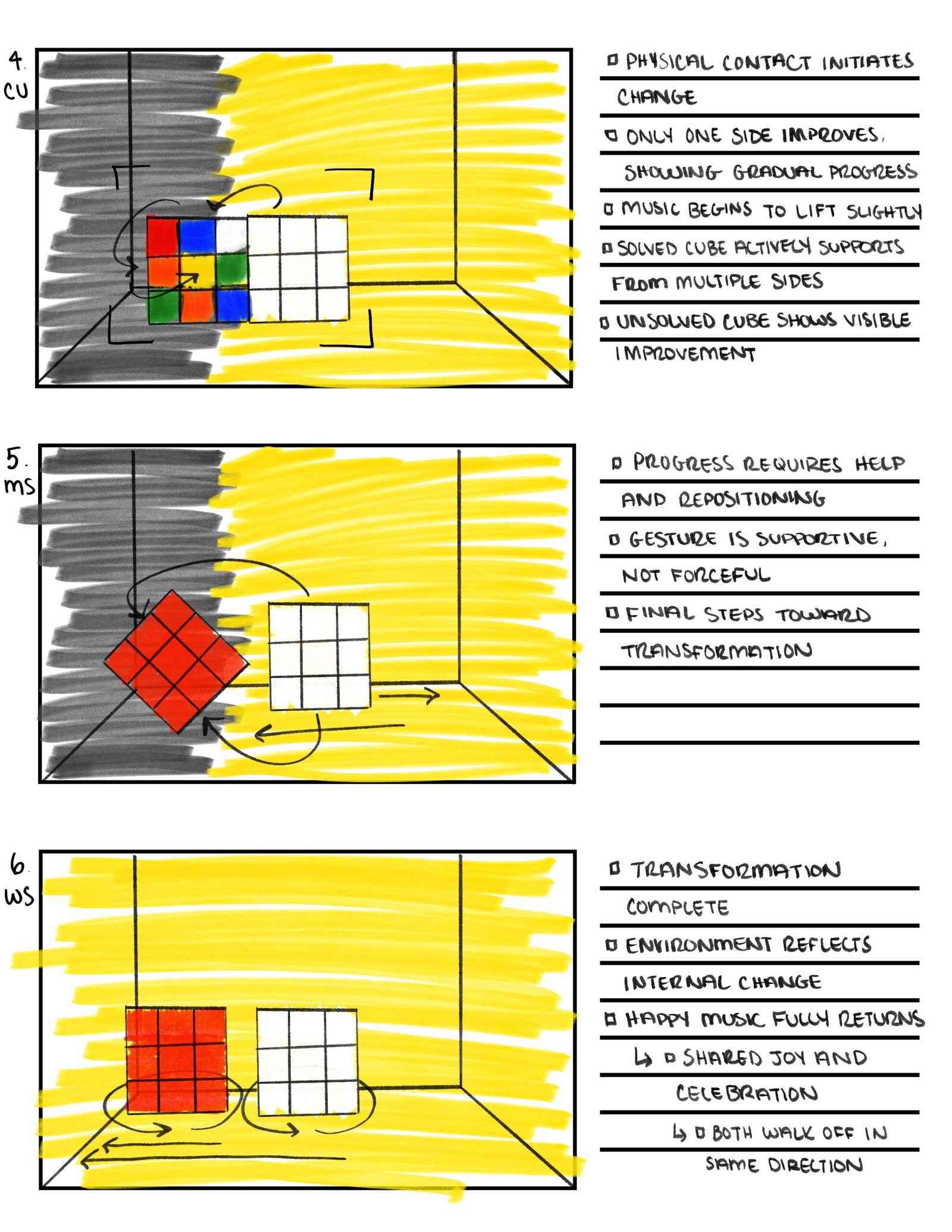
For my linear storyline, I wanted to explore a simple but emotionally driven narrative using clear visual symbolism. The story of a solved Rubik’s Cube helping an unsolved one felt like a natural metaphor for personal growth, mental health, and the importance of support systems. I chose a linear format because it allows the emotional arc to unfold clearly from beginning to end, with visible cause-and-effect progression. Color, lighting, and music play a major role in reinforcing the mood. Shifting from darker, muted tones to brighter, more saturated ones as the unsolved cube transforms. One challenge I anticipate is maintaining smooth movement and consistency while animating physical cubes frame by frame, especially when showing gradual change rather than sudden transformation. Overall, this concept feels more meaningful to me, as it tells a story with emotional depth and a clear message that viewers can easily connect to.
Read more here:
Non-Linear Storyline: Hamburger and Fries
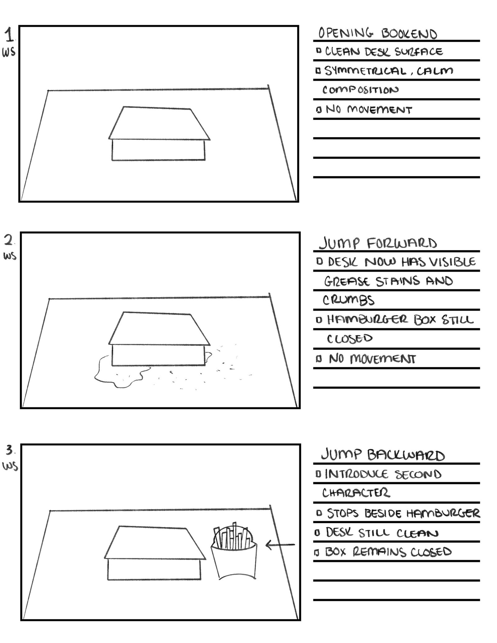
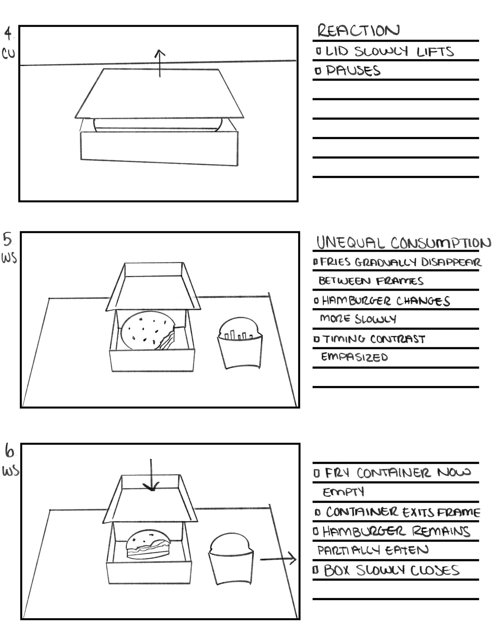
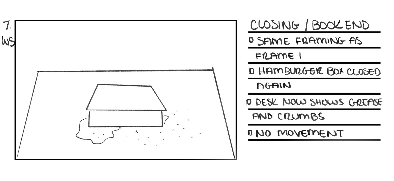
The non-linear, book-ending story focuses on a quieter, more observational moment using everyday objects. I chose this format to experiment with time, pacing, and visual storytelling without relying on traditional narrative structure. By beginning and ending with nearly identical compositions, the story emphasizes what has changed in between (grease, crumbs, and absence becoming evidence of time passing). The biggest challenge with this concept is clarity; because the story unfolds out of order and relies on subtle movement, it must be carefully storyboarded so the viewer still understands what happened. While I enjoy the conceptual nature of this piece and its understated humor, it feels more like a formal experiment than an emotional story.
Read more here:
Reflection
Between the two, I am leaning more toward the linear Rubik’s Cube storyline. While both ideas allowed me to think critically about structure and visual communication, the linear story feels stronger in terms of meaning and emotional impact. It aligns more closely with my interest in using design and animation to communicate feeling, growth, and connection, rather than just showcasing structure or concept alone.
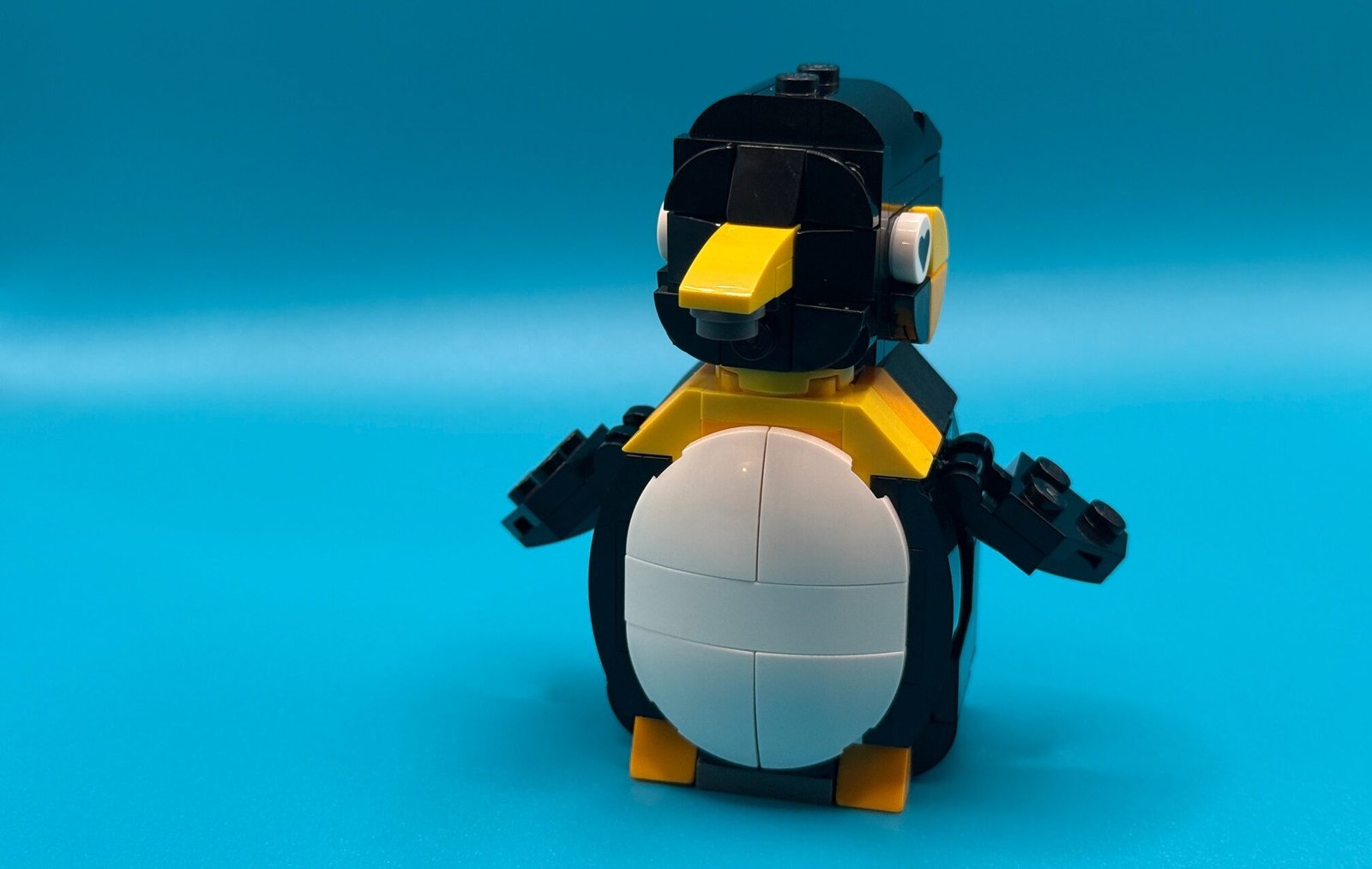
First Stop Motion Test
For practice, I created a short animation showing a Lego penguin being put together piece by piece. I used the Stop Motion Studio app to capture and compile the images, which made the technical side of the process fairly accessible. Overall, I had a lot of fun making this, but it also made me realize just how tedious and time-consuming stop motion animation really is. Even small movements require patience, precision, and consistency to keep everything looking smooth.
One thing that surprised me was how much frame rate affects the final result. I initially tested 12fps but found the motion felt too fast, so I lowered it to 5fps, which worked better for this simple build animation. This experience helped me understand that for my full stop-motion project, I’ll need to capture significantly more frames to achieve smoother, more controlled movement. Practicing with this Lego animation gave me a much clearer sense of the time, planning, and pacing required, and it will definitely inform how I approach my final piece.
References
Blazer, L. (2019). Animated Storytelling (2nd ed.). Peachpit Press.
No responses yet