You know that moment when you’re clicking around a website thinking, “Where the hell is anything?”
Yeah… most users don’t stick around to figure it out. They leave.
For anyone getting into UX/UI or web design, understanding navigation design is essential: it shapes how users move through a site, whether they convert, and whether they leave frustrated.
Why navigation exists – the purpose:
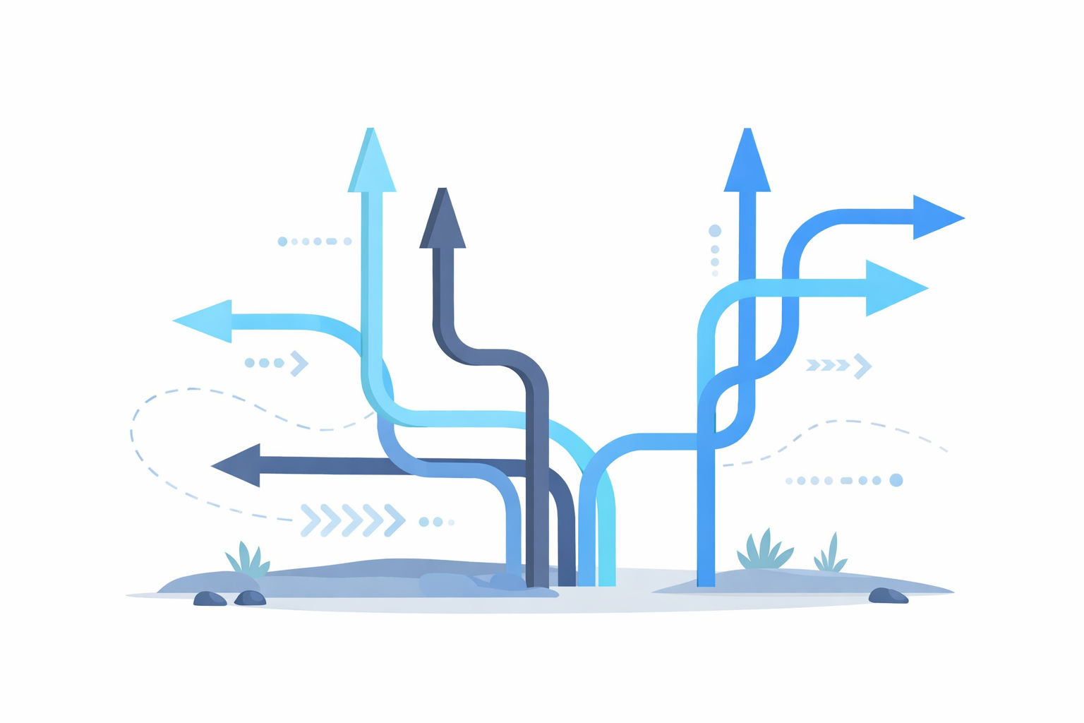
Evolution of Web Navigation
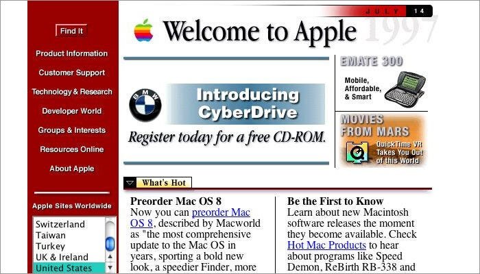
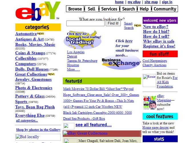
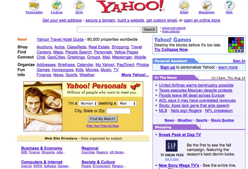
Early websites treated navigation like a checklist; everything visible, all at once, whether users needed it or not. The result? Clutter and decision fatigue.
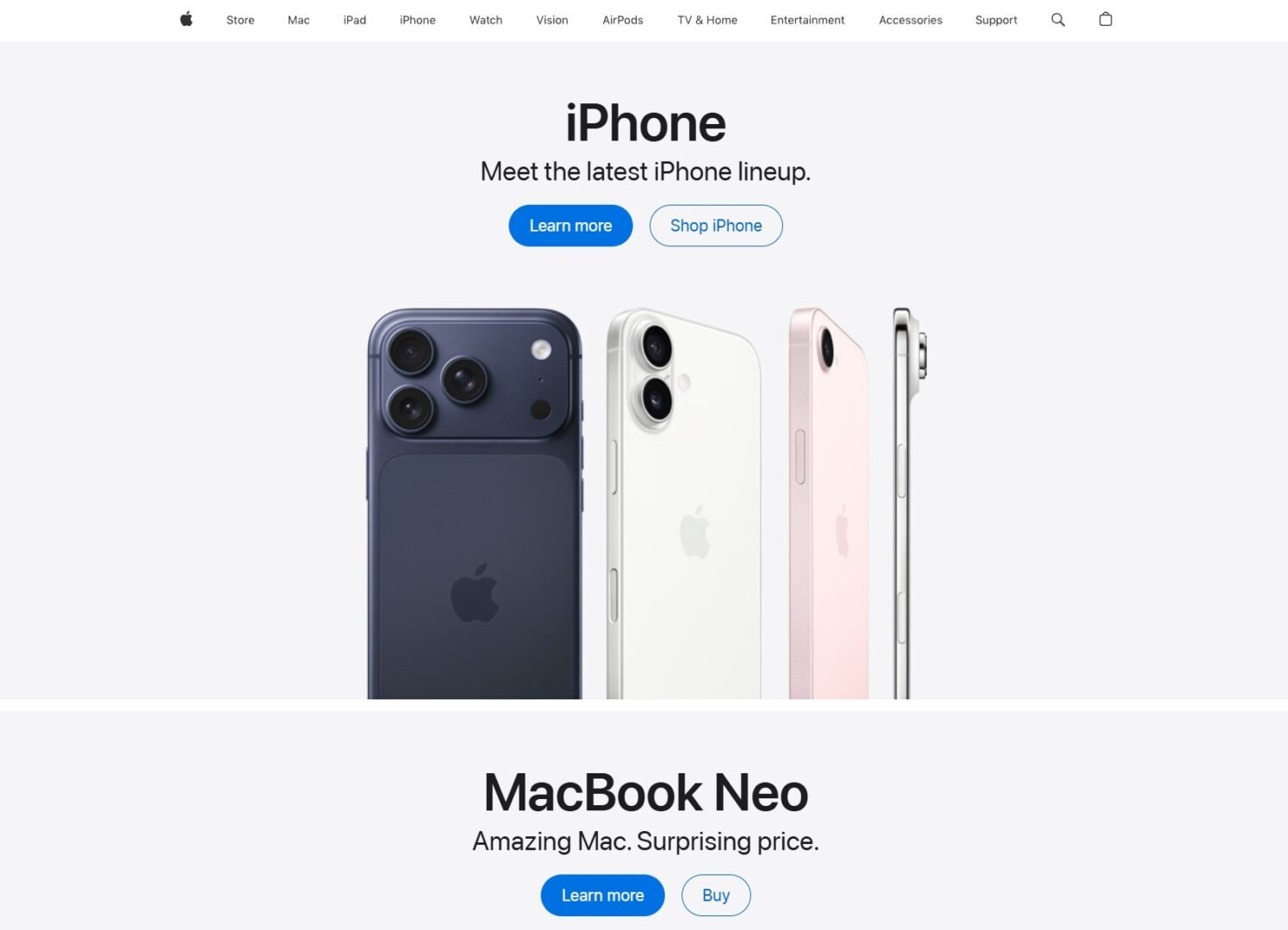
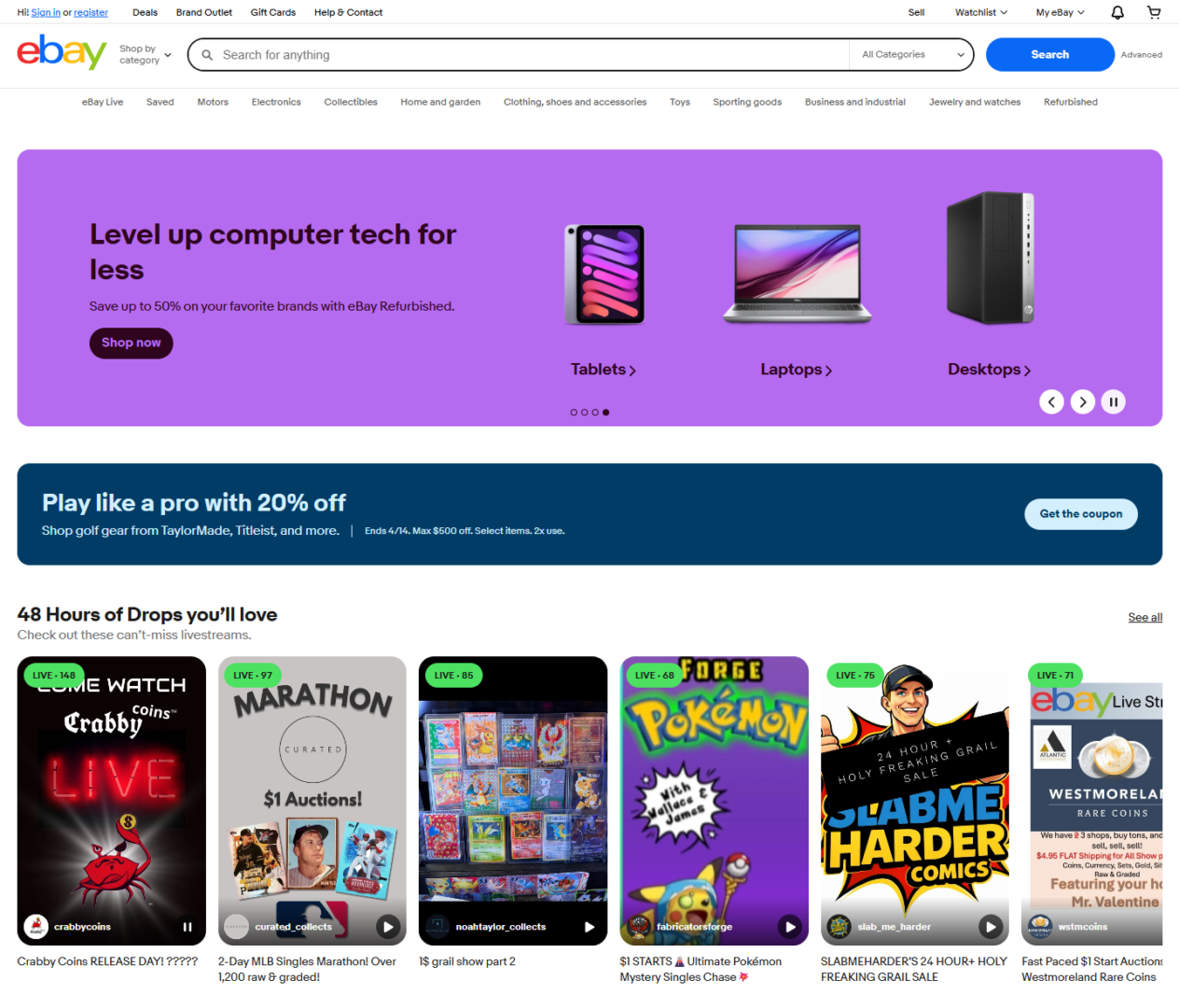
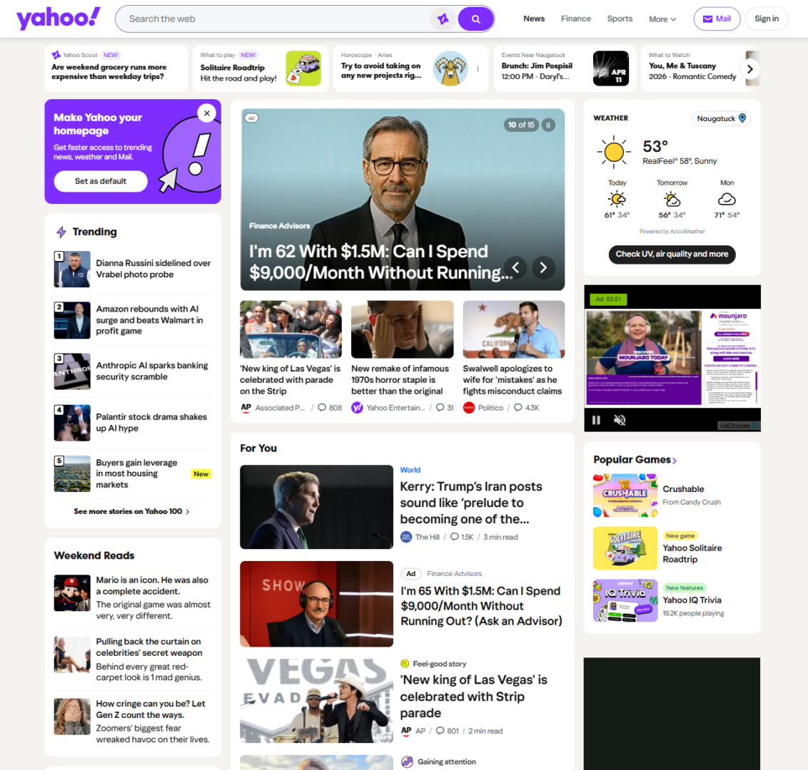
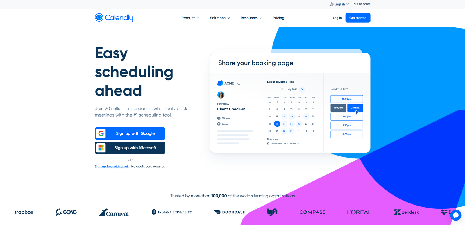
Today’s web takes the opposite approach: simplify, prioritize, and guide. Instead of throwing options at users, modern navigation is designed to quietly lead them where they need to go with less noise and a lot more intention.
Then vs. Now
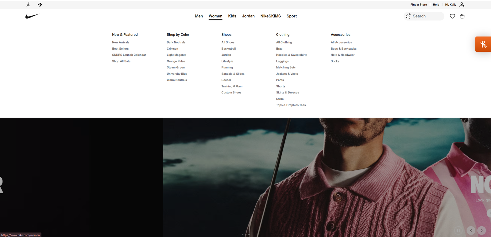
Modern Trends
Minimal top nav with focused CTAs, contextual and adaptive menus, search-first experiences.
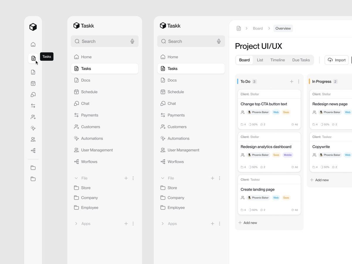
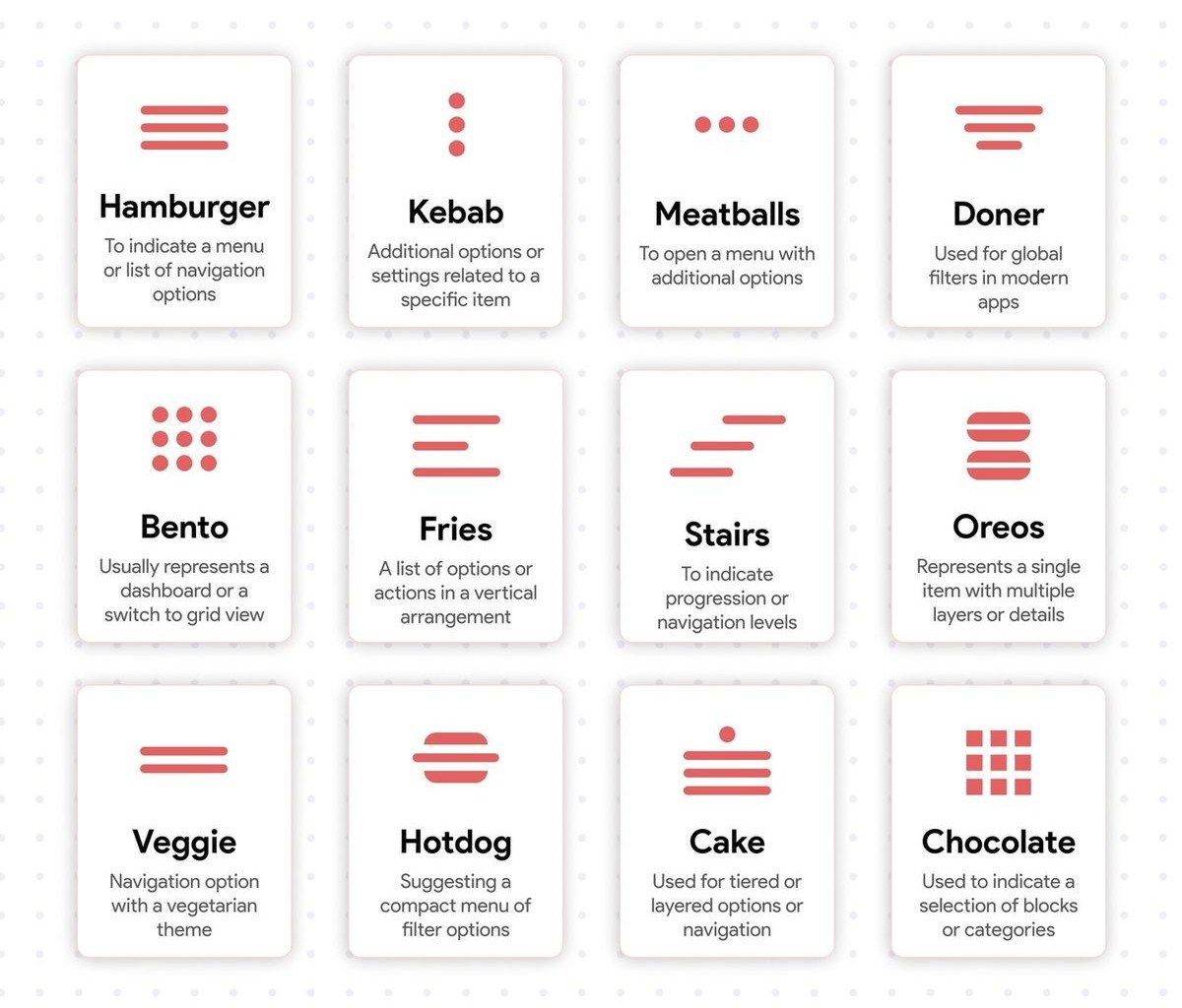
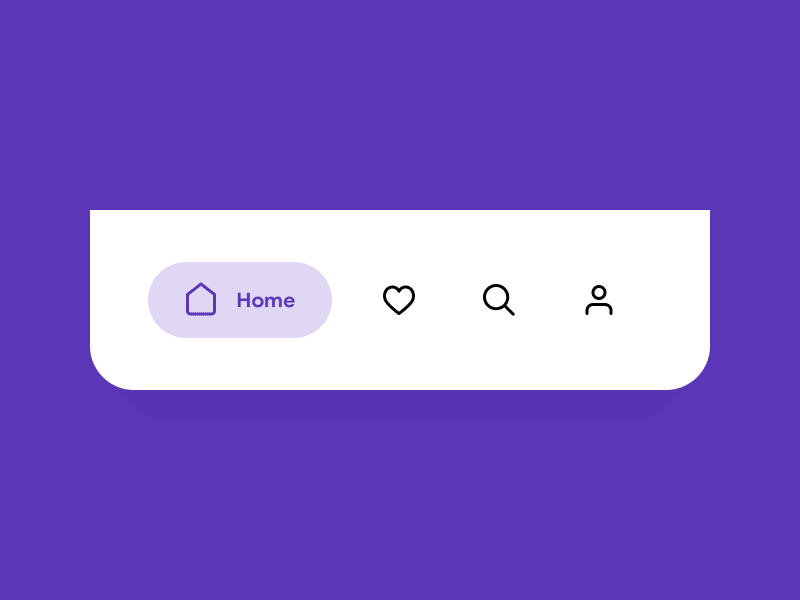
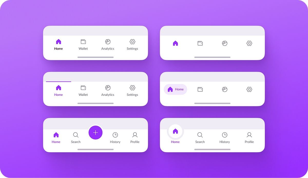
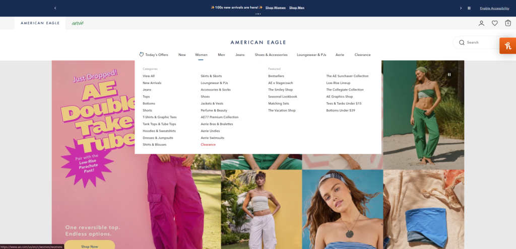
Common Navigation Patterns
… and when to use them
Intuitive vs Confusing Navigation
Intuitive Navigation:
Clear Labels
Using user-friendly language (avoid internal jargon)
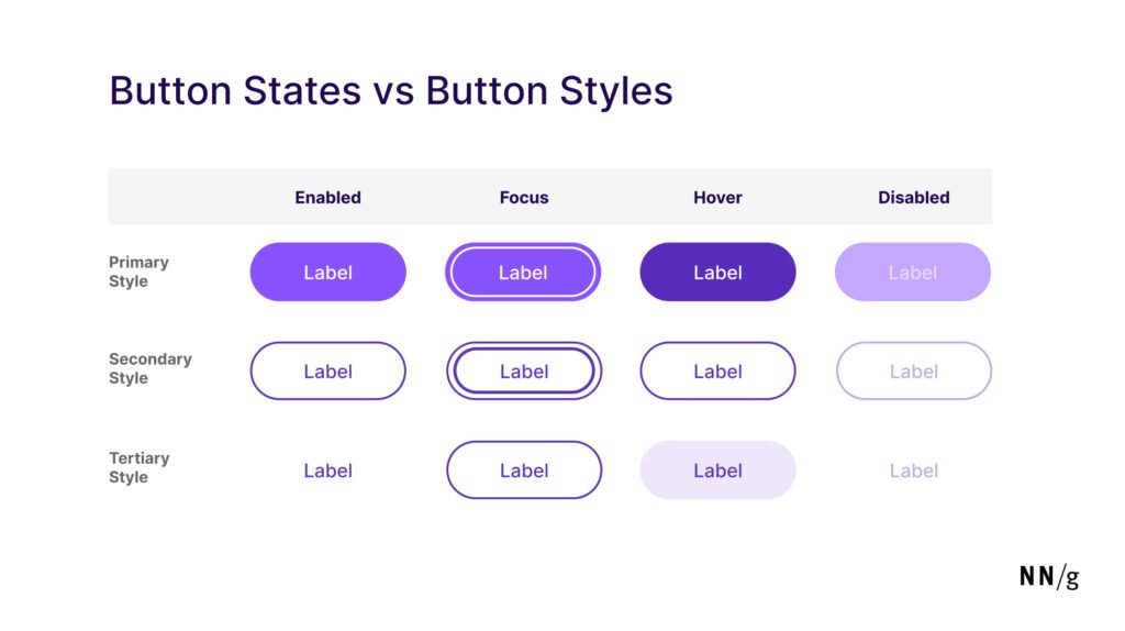
Feedback and States
Highlight current page, show hover/focus states
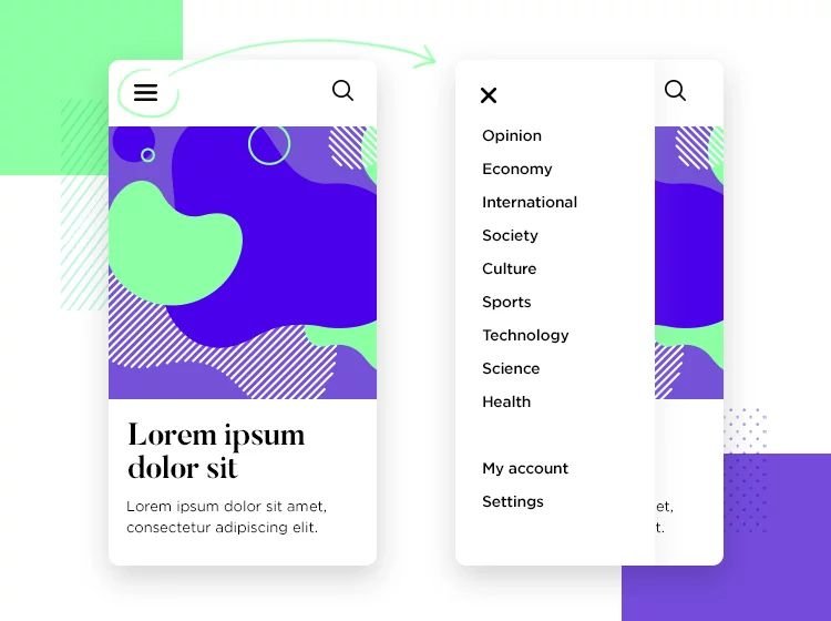
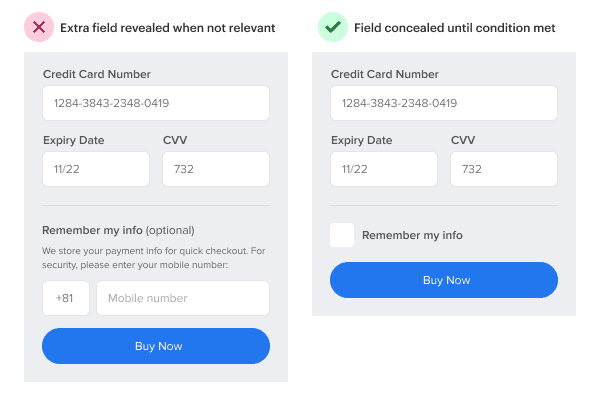
Progressive Disclosure
How only what’s needed, reveal depth gradually
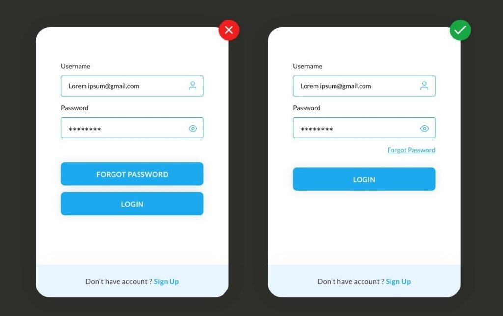
Visual Hierarchy
Primary vs secondary actions are obvious
Confusing Navigation:
Sitemaps & User Flows
Before we talk about how navigation impacts user experience, it helps to understand two tools designers use behind the scenes: sitemaps and user flow diagrams.
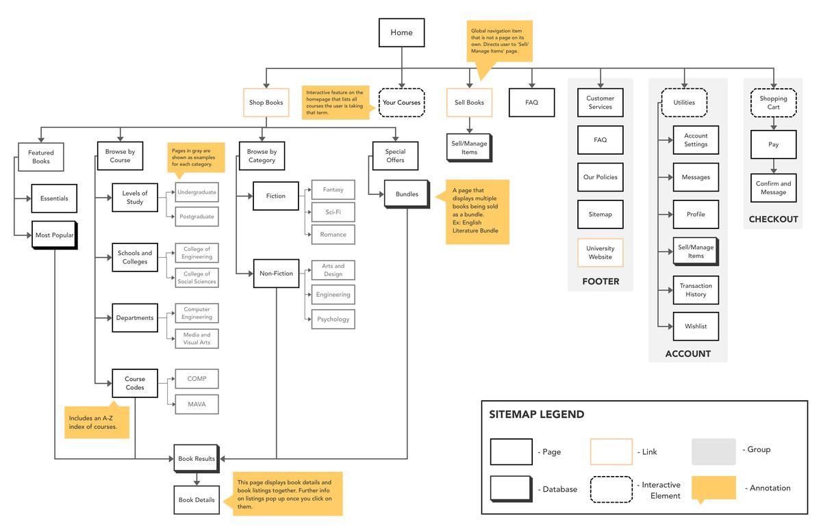
Sitemap (the structure)
A sitemap is essentially a blueprint of your website. It outlines all the pages within a site, how they’re organized, and how they connect to one another. Instead of focusing on visuals, it focuses on structure. They help designers plan a clear, logical hierarchy before anything is designed. Think of it as the foundation of your navigation: if the structure is confusing here, it will carry through to the final experience.
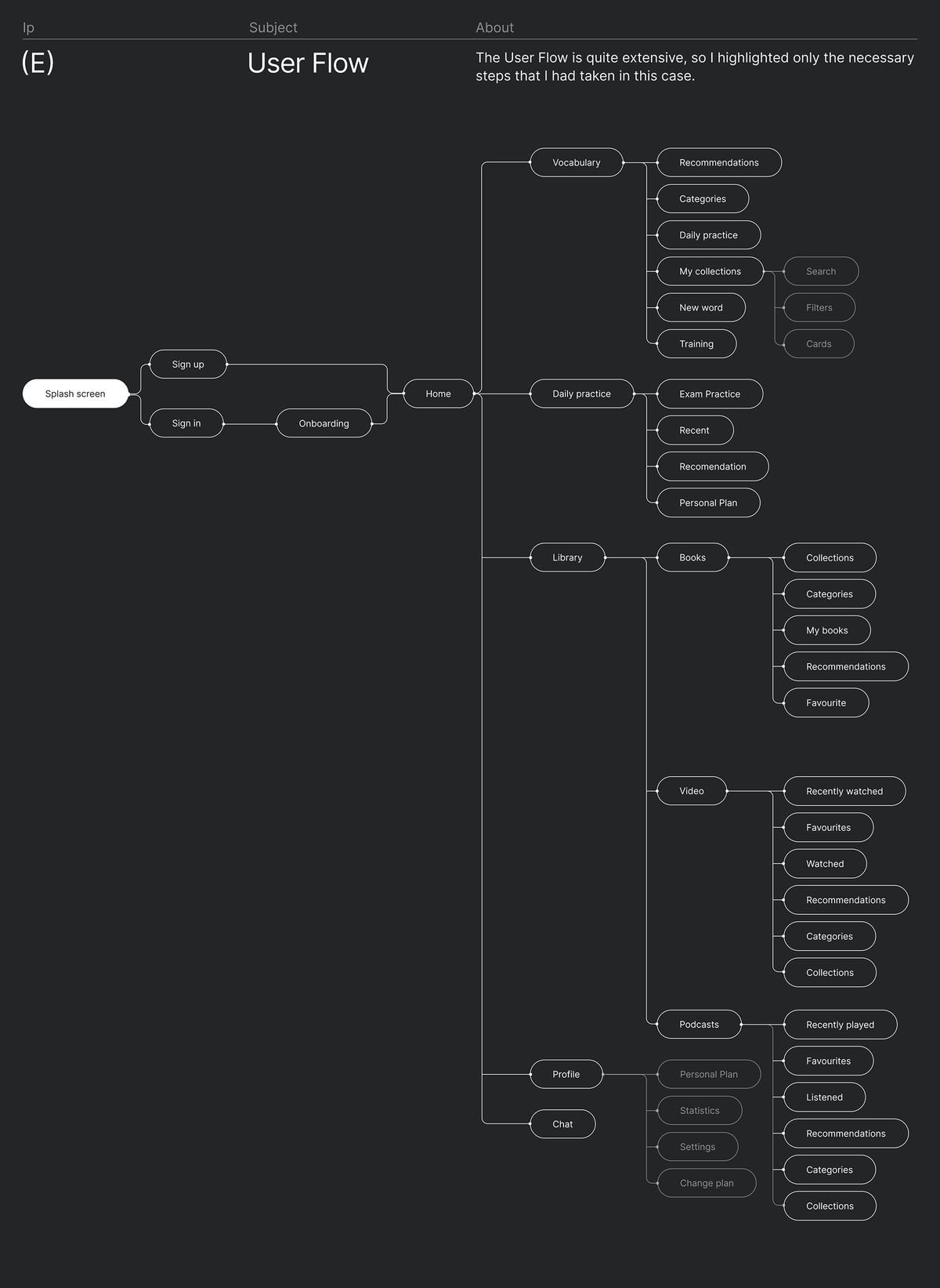
User Flow Diagram (the journey)
A user flow diagram maps out the path someone takes to complete a task on a website. It follows the user step-by-step, from landing on a page, to making decisions, to completing an action like signing up or making a purchase. Along the way, it highlights key interactions and potential drop-off points. This is where navigation really gets put to the test, because if users can’t move smoothly from one step to the next, the experience starts to break down.
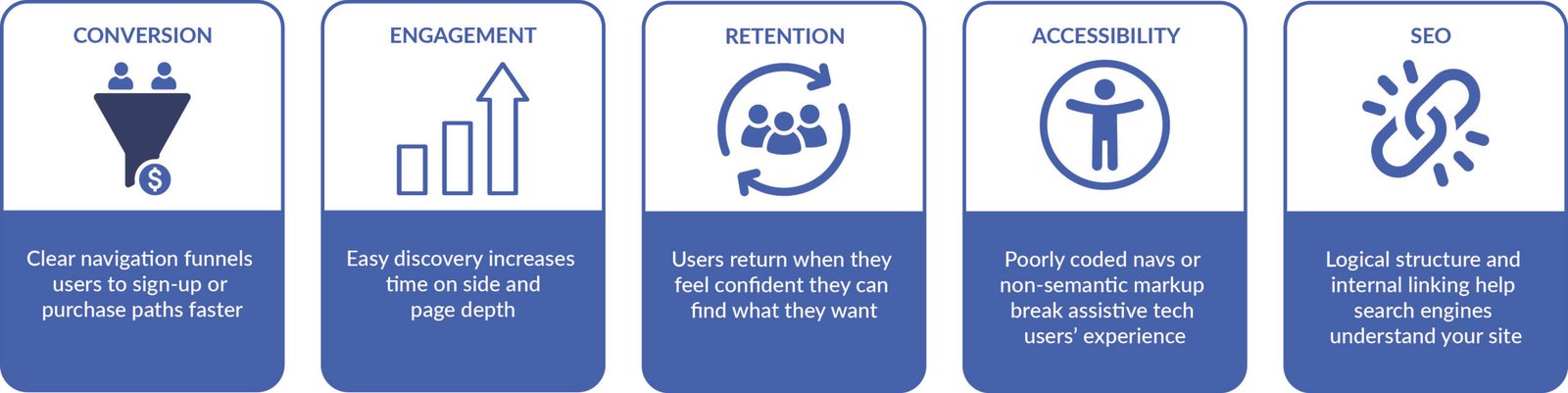
How navigation impacts user flow and experience:
Navigation Checklist
Let’s Talk
Have you ever left a website just because you couldn’t find what you needed? Share your story in the comments
References
Navigation in UX Design? (n.d.). IxDF – Interaction Design Foundation. https://ixdf.org/literature/topics/navigation
Pelegrin, J. (2024, June 25). Navigation Design: Almost everything you need to know. Justinmind. https://www.justinmind.com/blog/navigation-design-almost-everything-you-need-to-know
Nielsen, J. (2006, December 3). Progressive Disclosure. Nielsen Norman Group. https://www.nngroup.com/articles/progressive-disclosure
Perera, R. (2025, January 15). Navigation Trends for 2025: Keeping it simple and intuitive. Design Shack. https://designshack.net/articles/trends/navigation-trends
Chan, M. (2024, January 26). Mental models. Nielsen Norman Group. https://www.nngroup.com/articles/mental-models/
No responses yet